About
Here is Dialog components
Built with React and Tailwind. Copy the prompt and paste it into Claude Code, Cursor or Lovable: your agent adds The Dialog to your project and fits it to your theme.
Code
How The Dialog is used: the demo's code. The component's own source comes with a free account.
Usage.tsx
'use client'

import { Button } from '@/components/ui/button'
import {
  Dialog,
  DialogClose,
  DialogContent,
  DialogDescription,
  DialogFooter,
  DialogHeader,
  DialogTitle,
  DialogTrigger,
} from '@/components/ui/dialog'
import { Field, FieldGroup, FieldLabel } from '@/components/ui/field-1'
import { Input } from '@/components/ui/input'

export default function Dialog21() {
  return (
    <Dialog>
      <DialogTrigger asChild>
        <Button variant="outline">Nested dialog</Button>
      </DialogTrigger>
      <DialogContent className="sm:max-w-md">
        <DialogHeader>
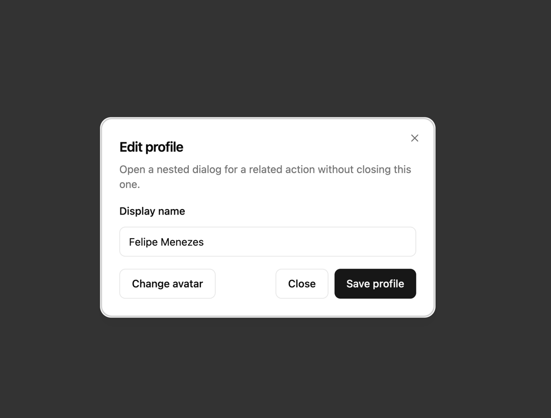
          <DialogTitle>Edit profile</DialogTitle>
          <DialogDescription>
            Open a nested dialog for a related action without closing this one.
          </DialogDescription>
        </DialogHeader>
        <FieldGroup>
          <Field>
            <FieldLabel htmlFor="dialog-21-name">Display name</FieldLabel>
            <Input id="dialog-21-name" defaultValue="Felipe Menezes" />
          </Field>
        </FieldGroup>
        <DialogFooter className="sm:justify-between">
          <Dialog>
            <DialogTrigger asChild>
              <Button type="button" variant="outline">
                Change avatar
              </Button>
            </DialogTrigger>
            <DialogContent className="sm:max-w-sm">
              <DialogHeader>
                <DialogTitle>Change avatar</DialogTitle>
                <DialogDescription>
                  Nested dialog stacks above the parent. Upload a new image or
                  remove the current one.
                </DialogDescription>
              </DialogHeader>
              <div className="bg-muted flex h-24 items-center justify-center rounded-lg border border-dashed">
                <span className="text-muted-foreground text-sm">
                  Drop image here
                </span>
              </div>
              <DialogFooter>
                <DialogClose asChild>
                  <Button type="button" variant="outline">
                    Cancel
                  </Button>
                </DialogClose>
                <Button type="button">Save avatar</Button>
              </DialogFooter>
            </DialogContent>
          </Dialog>
          <div className="flex gap-2">
            <DialogClose asChild>
              <Button type="button" variant="outline">
                Close
              </Button>
            </DialogClose>
            <Button type="button">Save profile</Button>
          </div>
        </DialogFooter>
      </DialogContent>
    </Dialog>
  )
}
Dependencies
More by felipemenezes098
View all
Centered Hero with Image Fan
930
Editorial Collage Hero
430
Split Hero With Image Cards
402
Editorial Image Hero
388
Scroll 01
341
Real Estate Search Hero
190
Editorial Hero
173
Hero with Dashboard Mockup
123
More in Buttons
View all

Button
14
Button
34
Texture Button
92
Button Save
46

Button
64

Button Group
3

Notification Button
103

App Store Button
454

