
About
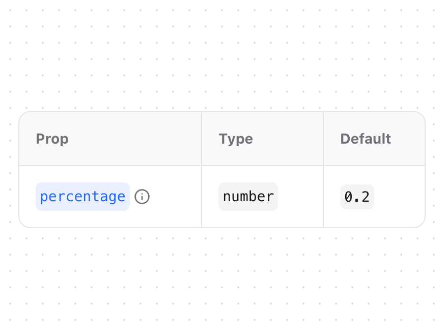
A table component for displaying type definitions and props documentation. Features - Prop descriptions with tooltips - Type information display - Default value support - Links to type documentation - Responsive design - Dark mode support
Built with React and Tailwind. Copy the prompt and paste it into Claude Code, Cursor or Lovable: your agent adds Type Table to your project and fits it to your theme.
Code
How Type Table is used: the demo's code. The component's own source comes with a free account.
Usage.tsx
import { TypeTable } from "@/components/ui/type-table"

function TypeTableDemo() {
  return (
    <TypeTable
      type={{
        percentage: {
          description: "The percentage of scroll position to display the roll button",
          type: "number",
          default: "0.2"
        }
      }}
      className="min-w-[400px]"
    />
  )
}

export { TypeTableDemo }
Dependencies
More by Fuma Nama
View all
Banner
270
Zoomable Image
166
Accordion
28
Root Toggle
21
Inline Table of Content
7
Tabs
6