
About
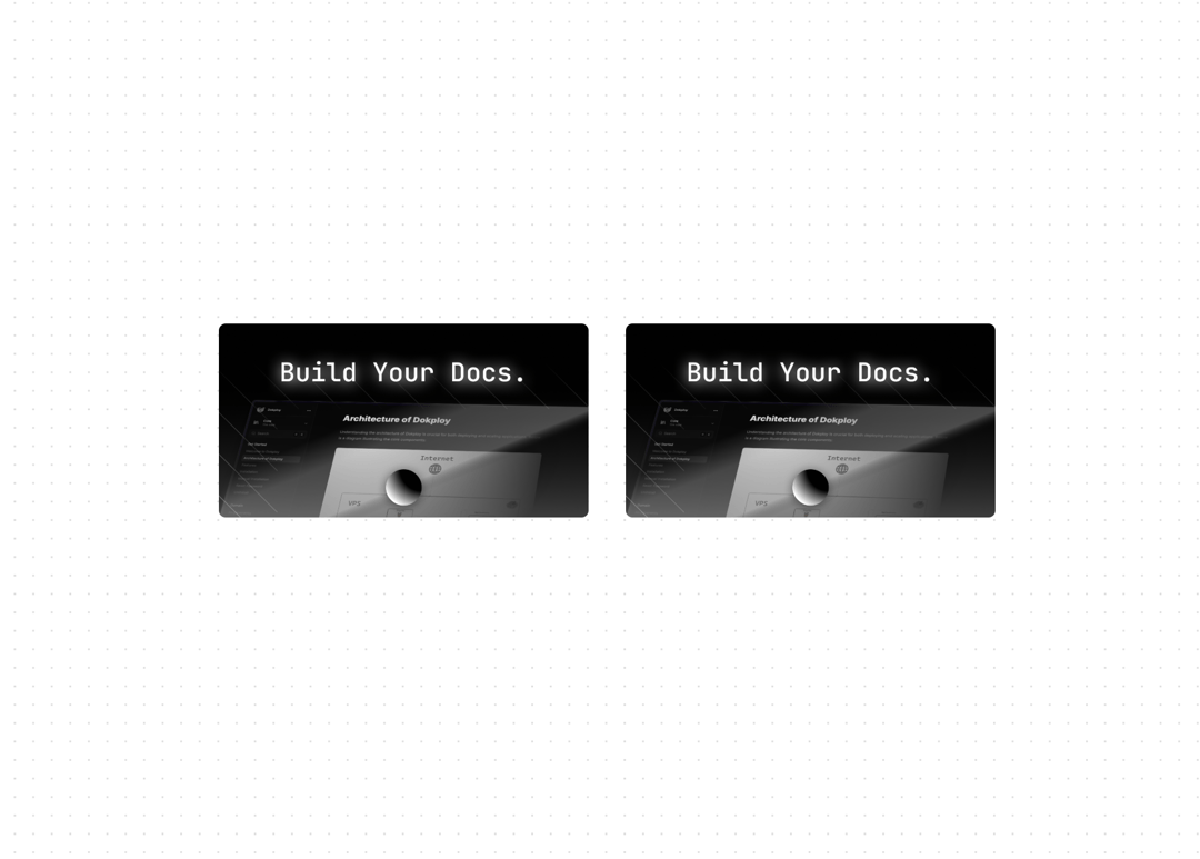
A responsive image component with zoom functionality, built on top of Next.js Image and react-medium-image-zoom. Features - Built on top of Next.js Image - Smooth zoom animations - Keyboard navigation - Screen reader support - Responsive design - Custom zoom controls - Reduced motion support
Built with React and Tailwind. Copy the prompt and paste it into Claude Code, Cursor or Lovable: your agent adds Zoomable Image to your project and fits it to your theme.
Code
How Zoomable Image is used: the demo's code. The component's own source comes with a free account.
Usage.tsx
import { ImageZoom } from "@/components/ui/zoomable-image"

function ImageZoomDemo() {
  return (
    <div className="mx-auto max-w-2xl space-y-8">
      <div className="grid gap-8 sm:grid-cols-2">
        <ImageZoom
          src="https://cdn.21st.dev/assets/mirror/50/5013bdd93ee53f8a7c05cc54442a7fc55db83b4b2252dc402abaf0ead1551883.png"
          alt="Fumadocs Banner"
          width={400}
          height={300}
        />

        <ImageZoom
          src="https://cdn.21st.dev/assets/mirror/50/5013bdd93ee53f8a7c05cc54442a7fc55db83b4b2252dc402abaf0ead1551883.png"
          alt="Fumadocs Banner"
          width={400}
          height={300}
        />
      </div>
    </div>
  )
}

export { ImageZoomDemo }
Dependencies
More by Fuma Nama
View all
Banner
270
Accordion
28
Type Table
26
Root Toggle
21
Inline Table of Content
7
Tabs
6