
About
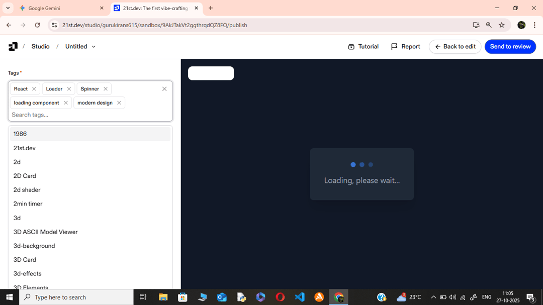
A clean,reusable React loader component styled with Tailwind CSS. It uses a custom CSS keyframe animation to create three sequential pulsing dots, providing visual feedback during data fetching or page transitions.
Built with React and Tailwind. Copy the prompt and paste it into Claude Code, Cursor or Lovable: your agent adds Dot Loader to your project and fits it to your theme.
Code
How Dot Loader is used: the demo's code. The component's own source comes with a free account.
Usage.tsx
import Loader from "@/components/ui/dot-loader";

export default function DemoOne() {
  return (
    <div className="app-container">
      <div className="loader-box">
        <div className="loader-content">
          <Loader />
          <p className="loader-text">Loading, please wait...</p>
        </div>
      </div>
    </div>
  );
}More by Guru kiran.s
View all
Orb Button