
About
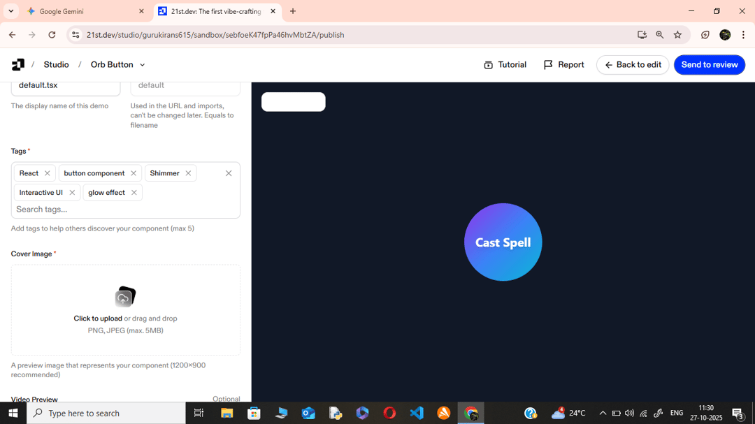
A modern, interactive React UI component styled as a "magic orb." It features a gradient background, a CSS keyframe glow animation, and a shimmering light effect that activates on hover. It's built as a button element, ready for onClick events.
Built with React and Tailwind. Copy the prompt and paste it into Claude Code, Cursor or Lovable: your agent adds Orb Button to your project and fits it to your theme.
Code
How Orb Button is used: the demo's code. The component's own source comes with a free account.
Usage.tsx
import  MagicOrb  from "@/components/ui/orb-button";

export default function DemoOne() {
  const handleOrbClick = () => {
    // Replaced alert with console.log as requested by guidelines
    console.log('Magic Unleashed!');
  };
return (
    <div className="app-container">
      <MagicOrb onClick={handleOrbClick}>
        Cast Spell
      </MagicOrb>
    </div>
  );
}More by Guru kiran.s
View all
Dot Loader
More in Buttons
View all
Button Save
46

Button
20

Eclipse Button
5

Button
6

Button
14

Button Group
37

Button
32
Split Button
32

