
About
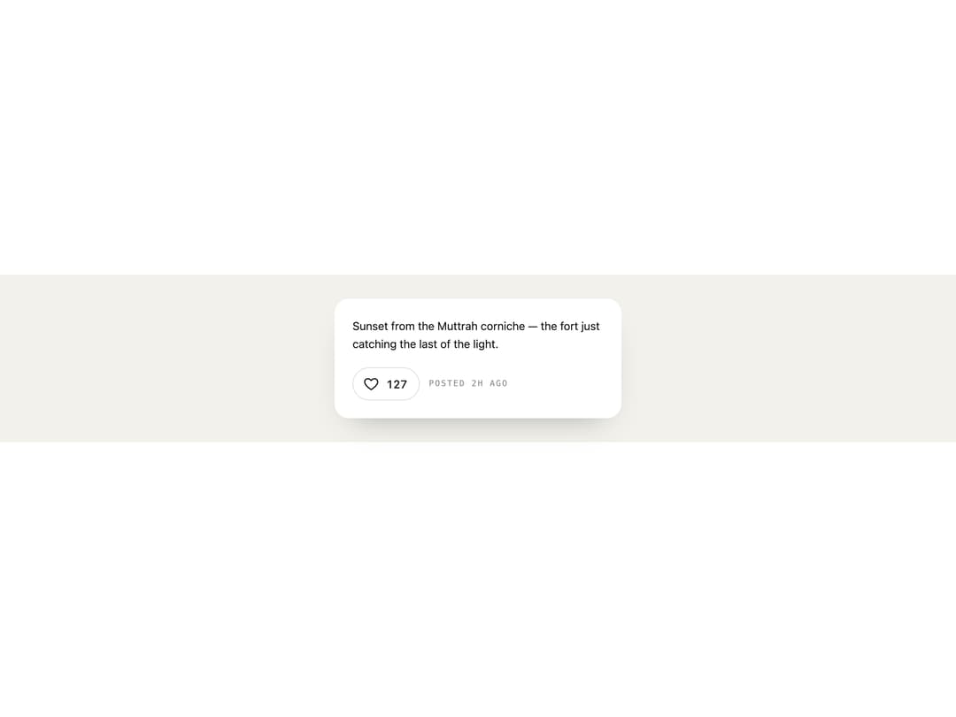
A like button whose heart pops red with a blooming ring and flying sparks, and whose count rolls up a digit when liked.
Built with React and Tailwind. Copy the prompt and paste it into Claude Code, Cursor or Lovable: your agent adds Heart Burst to your project and fits it to your theme.
Code
How Heart Burst is used: the demo's code. The component's own source comes with a free account.
Usage.tsx
"use client";

import { HeartBurst } from "@/components/ui/heart-burst";

export default function Demo() {
  return (
    <div className="flex min-h-full w-full items-center justify-center p-8 bg-[#f3f1ec] text-[#1b1a17]">
      <div className="flex w-full max-w-sm flex-col gap-5 rounded-[20px] p-6 bg-white shadow-[0_20px_40px_-24px_rgb(0_0_0/0.35)]">
        <p className="text-[15px] leading-relaxed">
          Sunset from the Muttrah corniche — the fort just catching the last of
          the light.
        </p>
        <div className="flex items-center gap-3">
          <HeartBurst count={127} />
          <span className="font-mono text-[11px] uppercase tracking-[0.14em] opacity-50">
            Posted 2h ago
          </span>
        </div>
      </div>
    </div>
  );
}
More by ham7a311
View all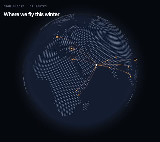
Route Globe
12
Wave Mesh
7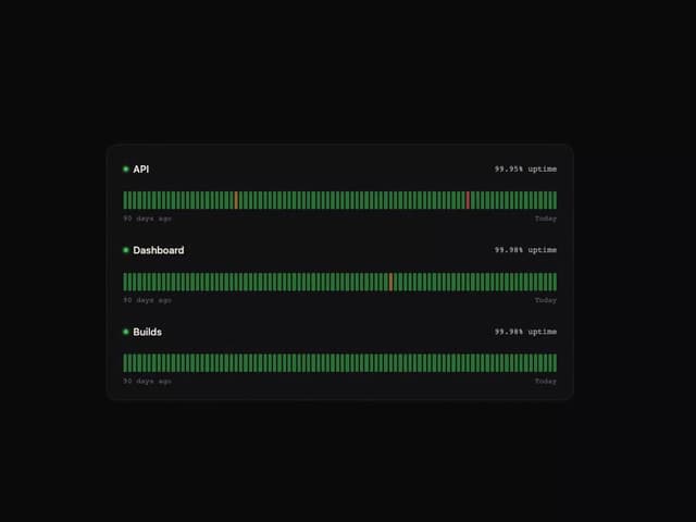
Uptime Ribbon
6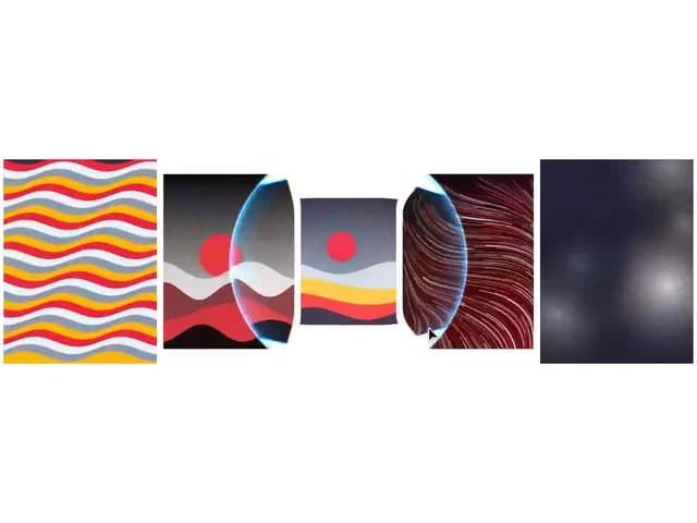
Glass Carousel
6
Glass Tiles
6
Streak Field Stats
5
Wind Map
5
Time Window
4