
About
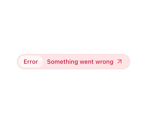
A compound badge designed to display an announcement.
Built with React and Tailwind. Copy the prompt and paste it into Claude Code, Cursor or Lovable: your agent adds Announcement to your project and fits it to your theme.
Code
How Announcement is used: the demo's code. The component's own source comes with a free account.
Usage.tsx
'use client';

import {
  Announcement,
  AnnouncementTag,
  AnnouncementTitle,
} from '@/components/ui/announcement';
import { ArrowUpRightIcon } from 'lucide-react';

const Example = () => (
  <div className="flex flex-col w-full h-screen items-center justify-center gap-4">

    <Announcement themed className="bg-rose-100 text-rose-700">
      <AnnouncementTag>Error</AnnouncementTag>
      <AnnouncementTitle>
        Something went wrong
        <ArrowUpRightIcon size={16} className="shrink-0 opacity-70" />
      </AnnouncementTitle>
    </Announcement>

  </div>
);

export { Example };
Dependencies
More by Hayden Bleasel
View all
Spinner
613
Gantt
343
Stories Carousel
335
Kanban
206
Pill
124
Dropzone
112
Calendar
112
Table
94