
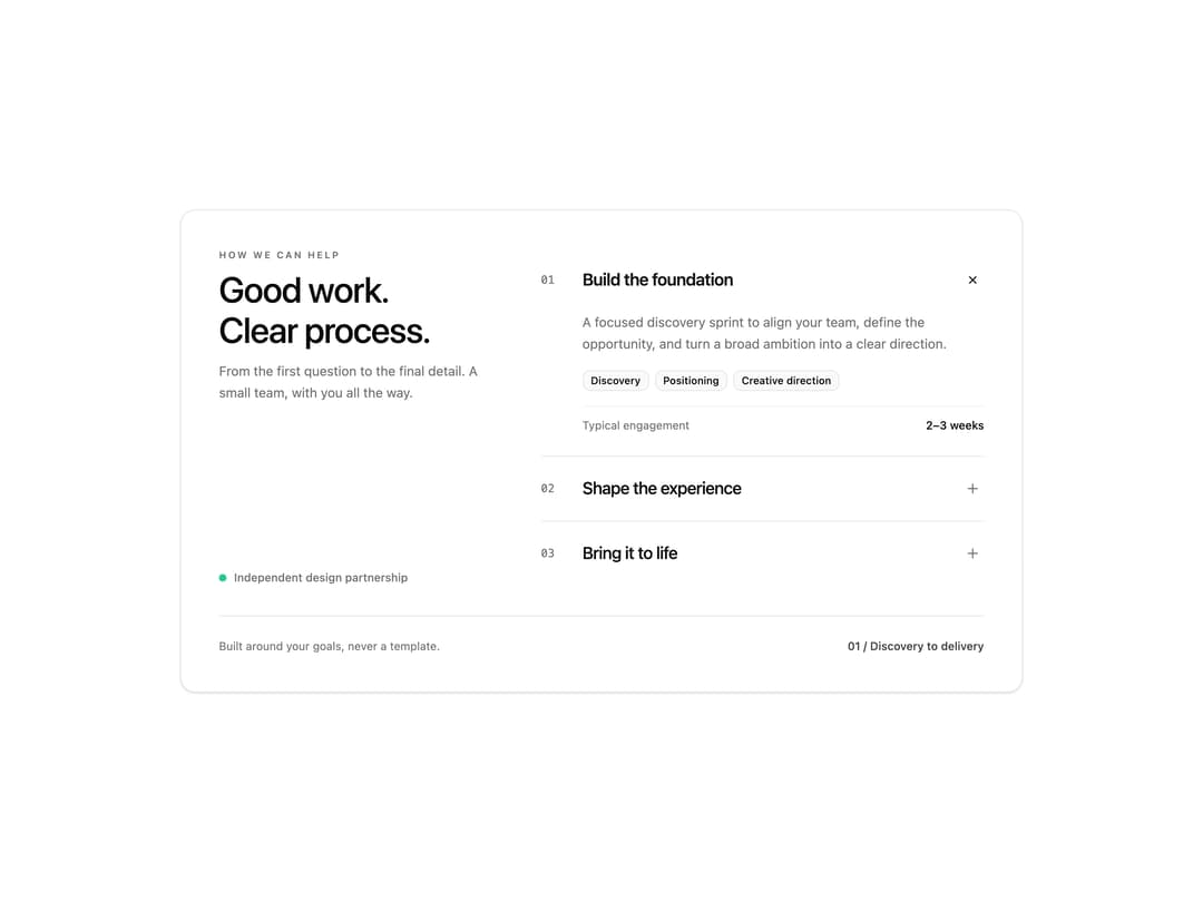
About
A two-column service accordion block revealing scope summaries, deliverable tags, and project timelines. Useful in creative agency portfolios, design studios, and consulting websites to present offerings.
Built with React and Tailwind. Copy the prompt and paste it into Claude Code, Cursor or Lovable: your agent adds Expanding service details to your project and fits it to your theme.
Code
How Expanding service details is used: the demo's code. The component's own source comes with a free account.
Usage.tsx
"use client";

import * as React from "react";
import Component, { type Props, type State } from "@/components/ui/expanding-service-details";

const settings = { title: "Good work.\nClear process." };
export const loopDuration = 6;

const ease = (x: number) => {
  const n = Math.max(0, Math.min(1, x));
  return n * n * (3 - 2 * n);
};

// Pure timeline: export frame n by passing n / 60. No timers or network calls.
export function showcase(time: number): State {
  const t = ((time % loopDuration) + loopDuration) % loopDuration;
  if (t < 1) return { expanded: 0, reveal: 1 };
  if (t < 1.25) return { expanded: 0, reveal: 1 - ease((t - 1) / 0.25) };
  if (t < 2.75) return { expanded: 1, reveal: ease((t - 1.25) / 0.3) };
  if (t < 3) return { expanded: 1, reveal: 1 - ease((t - 2.75) / 0.25) };
  if (t < 4.4) return { expanded: 2, reveal: ease((t - 3) / 0.3) };
  if (t < 4.65) return { expanded: 2, reveal: 1 - ease((t - 4.4) / 0.25) };
  return { expanded: 0, reveal: ease((t - 4.65) / 0.3) };
}

export default function Demo(props: any = {}) {
  const { showcaseTime, ...incoming } = props;
  const merged = { ...settings, ...incoming };
  return (
    <div className="w-full min-h-[500px] flex items-center justify-center p-4 sm:p-6 bg-background">
      <Component
        {...merged}
        state={showcaseTime === undefined ? incoming.state : showcase(showcaseTime)}
        seeking={showcaseTime !== undefined || incoming.seeking}
      />
    </div>
  );
}
More by Waqar H. Syed
View all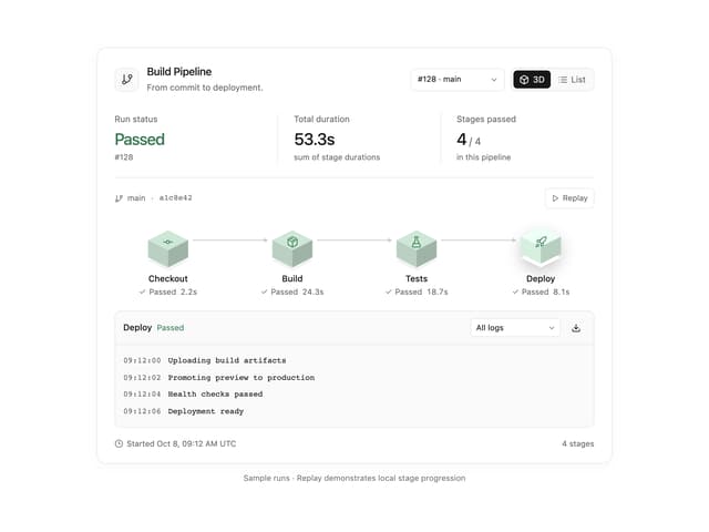
Build Pipeline
153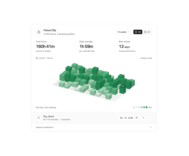
Focus City
118
Scroll animated timeline
116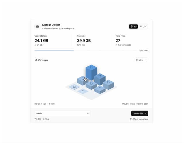
Storage District
65
Glowing Pricing Tiers
45
Thumbnail image viewer
43
Before after comparison
33
Featured Project Hero
29