
About
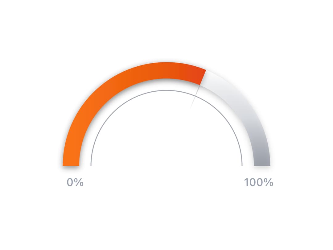
This is a dynamic radial progress chart component that animates a semi-circular arc to visually represent a percentage value, using smooth framer-motion transitions, SVG gradients, and drop shadows for a polished 3D feel. Perfect for dashboards, analytics UIs, or progress visualizations where you want to display performance, goal completion, or system usage in a clean and engaging format.
Built with React and Tailwind. Copy the prompt and paste it into Claude Code, Cursor or Lovable: your agent adds Animated Radial Chart to your project and fits it to your theme.
Code
How Animated Radial Chart is used: the demo's code. The component's own source comes with a free account.
Usage.tsx
import { AnimatedRadialChart } from "@/components/ui/animated-radial-chart";

const settings = {
  value: 74,
  size: 300,
  strokeWidth: 18,
  duration: 2,
  showLabels: true,
};

export default function Demo(props: Partial<typeof settings>) {
  const s = { ...settings, ...props };
  return (
    <div className="h-screen w-screen flex items-center justify-center">
      <AnimatedRadialChart
        value={s.value}
        size={s.size}
        strokeWidth={s.strokeWidth}
        duration={s.duration}
        showLabels={s.showLabels}
      />
    </div>
  );
}
Dependencies
More by Isaiah
View all
Agent Plan
2.2K
Video Scroll Hero
1.4K
Voice Powered Orb
1.3K
Reveal Text
1.1K
Leads Data Table
935
Portfolio Gallery
923
Message Dock
833
Ruler Carousel
618