
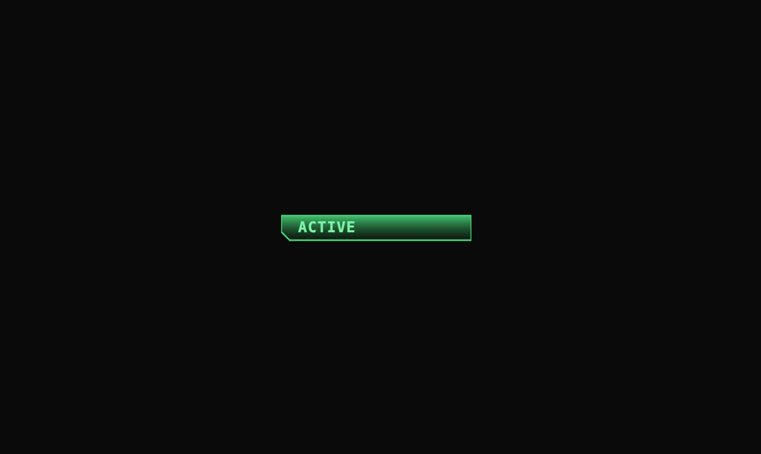
This is a themed status indicator component that renders a glowing SVG badge with animated text to signal system activity. It adapts dynamically to light/dark themes using color logic tied to the HUD palette, and uses framer-motion for a smooth entrance slide-in. The HyperText element pulses "ACTIVE" with a typewriter-style animation effect for attention. Perfect for live status dashboards, AI system UIs, bot presence indicators, or futuristic HUD overlays that require a subtle but animated signal of system readiness.
Built with React and Tailwind. Copy the prompt and paste it into Claude Code, Cursor or Lovable: your agent adds Hud Status to your project and fits it to your theme.
Code
How Hud Status is used: the demo's code. The component's own source comes with a free account.
Usage.tsx
"use client";

import { Status } from "@/components/ui/hud-status-1";

export default function Page() {
  return (
    <div className="bg-background w-full min-h-screen overflow-hidden flex items-center justify-center">
      <Status />
    </div>
  );
}
Dependencies
More by Isaiah
View all
Agent Plan
2.2K
Video Scroll Hero
1.4K
Voice Powered Orb
1.3K
Reveal Text
1.1K
Leads Data Table
935
Portfolio Gallery
923
Message Dock
833
Ruler Carousel
618