
About
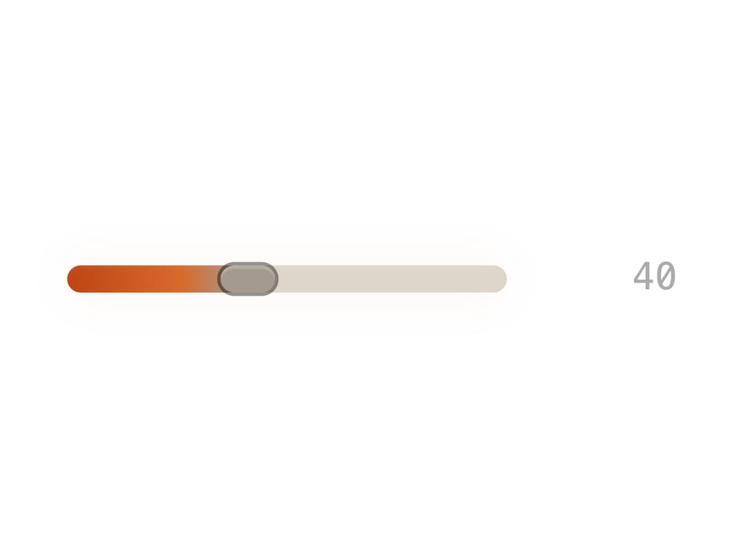
A range slider input with a custom gradient track and an optional live value readout, for adjusting numeric settings like volume or brightness.
Built with React and Tailwind. Copy the prompt and paste it into Claude Code, Cursor or Lovable: your agent adds Bjork Slider to your project and fits it to your theme.
Code
How Bjork Slider is used: the demo's code. The component's own source comes with a free account.
Usage.tsx
import { BjorkSlider } from "@/components/ui/primitive-slider";
import { useState } from "react";

const settings = { min: 0, max: 100, step: 1, defaultValue: 40 };

export default function Demo(props: Partial<typeof settings>) {
  const s = { ...settings, ...props };
  const [value, setValue] = useState(s.defaultValue);

  return (
    <div className="flex w-full max-w-sm items-center p-8">
      <BjorkSlider
        min={s.min}
        max={s.max}
        step={s.step}
        value={value}
        onValueChange={setValue}
        displayValue={value}
      />
    </div>
  );
}
More by Isaiah
View all
Agent Plan
2.2K
Video Scroll Hero
1.4K
Voice Powered Orb
1.3K
Reveal Text
1.1K
Leads Data Table
935
Portfolio Gallery
922
Message Dock
833
Ruler Carousel
617
More in Forms
View all

Premium Auth
500

Login 1
52

Book A Demo 3
83
Authentication Card
47

Contact Card
1K

Login Card
32
Book A Demo 1
69

Login 2
7
