
About
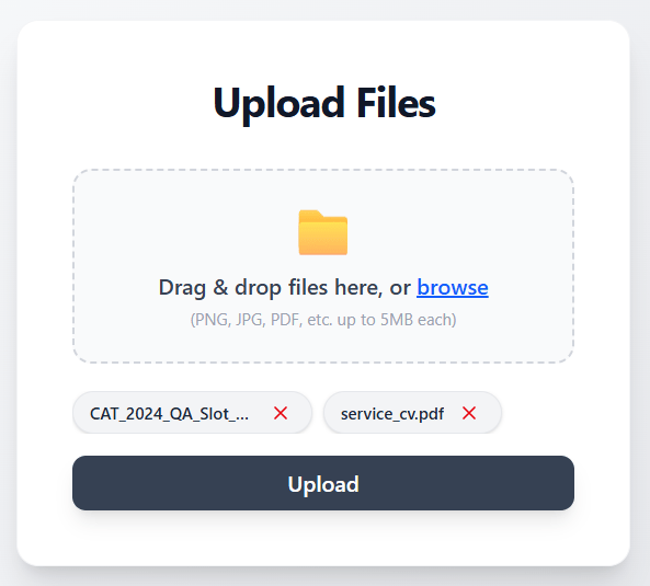
A clean, modern, and accessible file upload component for React/Next.js. Features drag-and-drop support, multi-file selection with badge-style display, single-file image preview, animated upload progress, and a compact, monochromatic design. Includes accessible remove actions, file name truncation, and a scrollable badge list for large selections.
Built with React and Tailwind. Copy the prompt and paste it into Claude Code, Cursor or Lovable: your agent adds File Uploader to your project and fits it to your theme.
Code
How File Uploader is used: the demo's code. The component's own source comes with a free account.
Usage.tsx
import { Component } from "@/components/ui/file-uploader";

export default function DemoOne() {
  return <Component />;
}
More by Ankit Verma
View all

Stack Card
306
Animated Menu Bar
161
Scroll-linked spring animation
54
Error 404 Page
47
Dialog box
21
Path morphing
18
Pricing Page
5
3D Card
1