
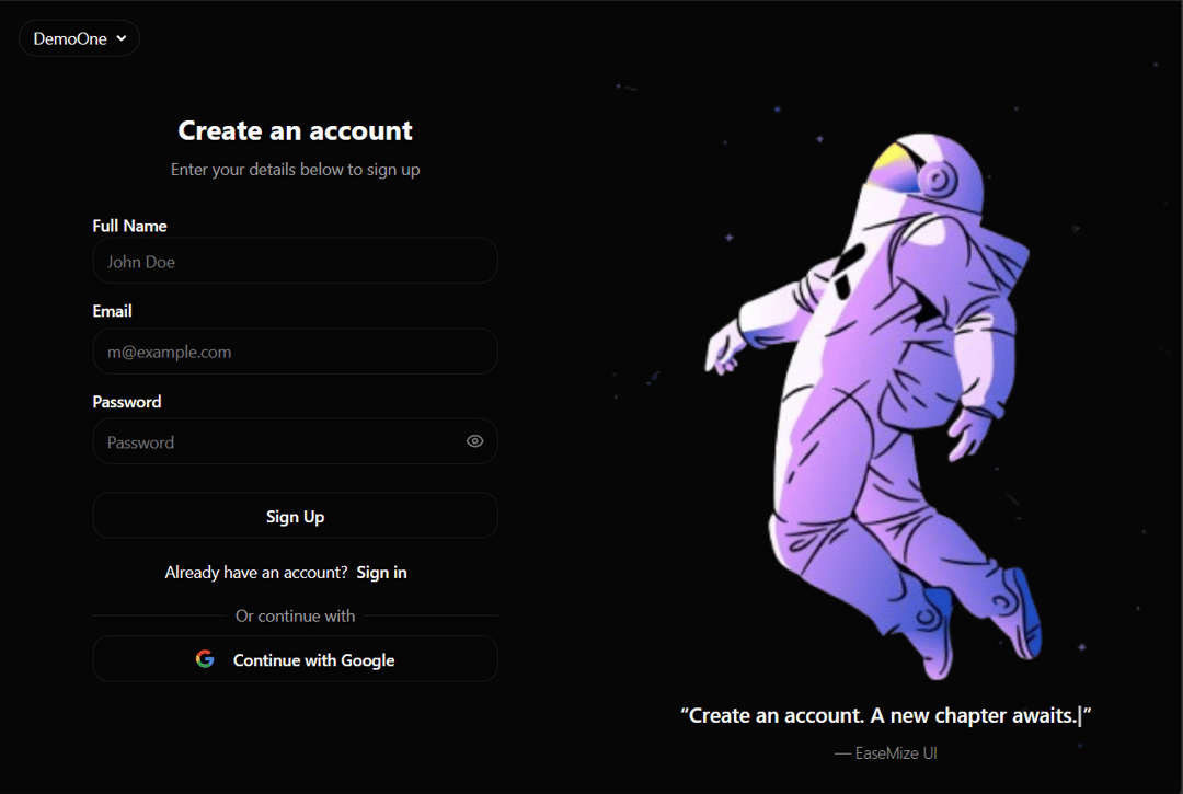
AuthFuse: The All-in-One Animated React Authentication Component AuthFuse is a sleek, all-in-one authentication UI component for React, designed to fuse a seamless user experience with powerful functionality. It provides a complete, visually engaging solution for user sign-in, sign-up, and social logins, all within a single, easy-to-integrate package. Built with Tailwind CSS and Radix UI, AuthFuse is both beautiful and accessible right out of the box. Core Features Fluid Sign-In & Sign-Up: A smooth, single-component interface allows users to toggle between sign-in and sign-up forms without a page refresh. Dynamic Text Animations: Captivate users with an elegant, built-in typewriter effect for quotes and welcome messages, adding a professional, dynamic touch. One-Click Social Logins: Integrated "Continue with Google" button provides users with a fast and secure way to register and log in. Deeply Customizable Visuals: Easily tailor the component to your brand by customizing the display images and quotes for both the sign-in and sign-up experiences. Fully Responsive & Mobile-Ready: Guarantees a flawless user experience on any device, from large desktops to small mobile screens. Enhanced UX Controls: Features a built-in password visibility toggle, improving usability and reducing user friction. Built for Accessibility: Leverages Radix UI primitives to ensure the entire component is WAI-ARIA compliant and accessible to all users. Modern, Developer-Friendly Stack: Built with React, TypeScript, and Tailwind CSS for a type-safe and highly efficient development experience. Usage Integrating AuthFuse is as simple as dropping a single component into your application. It manages its own state for the auth form, allowing you to focus on your application's core logic while providing your users with a polished and intuitive authentication flow.
Built with React and Tailwind. Copy the prompt and paste it into Claude Code, Cursor or Lovable: your agent adds AuthFuse to your project and fits it to your theme.
Code
How AuthFuse is used: the demo's code. The component's own source comes with a free account.
Usage.tsx
import { AuthUI } from "@/components/ui/auth-fuse";

const DemoOne = () => {
  return <AuthUI />;
};

export default DemoOne;
Dependencies
More by Hossain Jahed
View all

Spotlight Card
8.8K
Cinematic landing Hero
5.6K
Motion Footer
5.6K
Sign In
4.6K
AI prompt Box
3K
Glassmorphism Trust Hero
2.8K
Limelight Nav
2K
Ai chat input
1.7K
More in Forms
View all

Premium Auth
500

Login 2
7
Authentication Card
47

Login 1
52

Contact Card
1K
Login Form
6

Form
16

Book A Demo 3
83
