
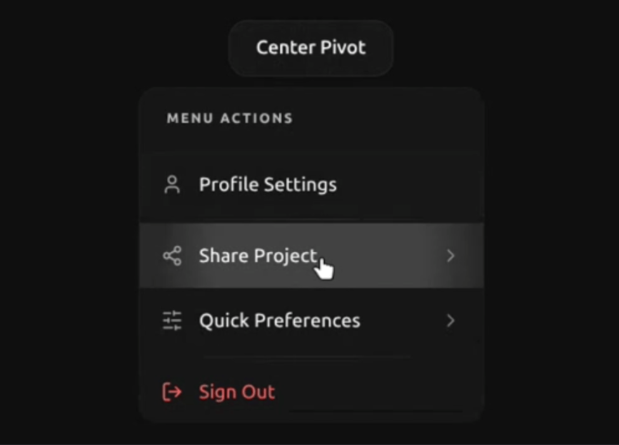
A highly sophisticated Material Design 3 Dropdown Menu built on top of shadcn/ui and Radix UI. Engineered with a custom Dual-Physics Ripple Engine via the Web Animations API for true geometric haptic-like feedback. Features a seamless drill-down navigation system with smooth, dynamic height adjustments using ResizeObserver. Includes SSR-compatible cinematic sweep & staggered entry animations driven by local CSS variables. Fully WCAG compliant, keyboard navigable, and perfectly bundled as a zero-dependency, single-file portable component.
Built with React and Tailwind. Copy the prompt and paste it into Claude Code, Cursor or Lovable: your agent adds Material UI Dropdown Menu to your project and fits it to your theme.
Code
How Material UI Dropdown Menu is used: the demo's code. The component's own source comes with a free account.
Usage.tsx
import React from "react";
import {
  DropdownMenu,
  DropdownMenuContent,
  DropdownMenuItem,
  DropdownMenuLabel,
  DropdownMenuSeparator,
  DropdownMenuTrigger,
  DropdownMenuPage,
  DropdownMenuPageTrigger,
  DropdownMenuCheckboxItem,
  DropdownMenuRadioGroup,
  DropdownMenuRadioItem
} from "@/components/ui/material-ui-dropdown-menu";
import {
  User,
  LogOut,
  Share2,
  Mail,
  MessageSquare,
  SlidersHorizontal,
  Moon,
  Sun,
  Bell,
  ShieldCheck,
  Zap
} from "lucide-react";

export default function LayoutStressDemo() {
  return (
    <div className="relative w-full h-screen bg-muted/20 overflow-hidden font-sans">

      {/* 1. CORNERS */}
      <div className="absolute top-6 left-6">
        <TriggerMenu label="Top Left" side="bottom" align="start" />
      </div>
      <div className="absolute top-6 right-6">
        <TriggerMenu label="Top Right" side="bottom" align="end" />
      </div>
      <div className="absolute bottom-6 left-6">
        <TriggerMenu label="Bottom Left" side="top" align="start" />
      </div>
      <div className="absolute bottom-6 right-6">
        <TriggerMenu label="Bottom Right" side="top" align="end" />
      </div>

      {/* 2. TOP & BOTTOM CENTERS */}
      <div className="absolute top-6 left-1/2 -translate-x-1/2">
        <TriggerMenu label="Top Center" side="bottom" align="center" />
      </div>
      <div className="absolute bottom-6 left-1/2 -translate-x-1/2">
        <TriggerMenu label="Bottom Center" side="top" align="center" />
      </div>

      {/* 3. SIDE CENTERS */}
      <div className="absolute left-6 top-1/2 -translate-y-1/2">
        <TriggerMenu label="Left Side" side="right" align="center" />
      </div>
      <div className="absolute right-6 top-1/2 -translate-y-1/2">
        <TriggerMenu label="Right Side" side="left" align="center" />
      </div>

      {/* 4. CENTER SCREEN */}
      <div className="absolute top-1/2 left-1/2 -translate-x-1/2 -translate-y-1/2">
        <TriggerMenu label="Center Pivot" side="bottom" align="center" />
      </div>

    </div>
  );
}

function TriggerMenu({
    label,
    side = "bottom",
    align = "center"
}: {
    label: string,
    side?: "top" | "bottom" | "left" | "right",
    align?: "start" | "center" | "end"
}) {
    // State for Radio Group
    const [theme, setTheme] = React.useState("dark");

    // State for Checkbox Items
    const [notifications, setNotifications] = React.useState(true);
    const [securityAlerts, setSecurityAlerts] = React.useState(false);
    const [performanceMode, setPerformanceMode] = React.useState(true);

    return (
        <DropdownMenu>
            <DropdownMenuTrigger className="px-5 py-2.5 bg-card border border-border/60 rounded-xl shadow-sm text-sm font-semibold hover:bg-muted transition-all active:scale-[0.98]">
                {label}
            </DropdownMenuTrigger>

            <DropdownMenuContent className="min-w-[16rem] w-auto" side={side} align={align}>

                {/* --- MAIN PAGE --- */}
                <DropdownMenuPage id="main">
                    <DropdownMenuLabel>Menu Actions</DropdownMenuLabel>

                    <DropdownMenuItem>
                        <User className="w-4 h-4 text-muted-foreground" />
                        <span>Profile Settings</span>
                    </DropdownMenuItem>

                    <DropdownMenuSeparator />

                    <DropdownMenuPageTrigger targetId="share">
                        <Share2 className="w-4 h-4 text-muted-foreground" />
                        <span>Share Project</span>
                    </DropdownMenuPageTrigger>

                    {/* NEW: Navigation to Preferences Submenu */}
                    <DropdownMenuPageTrigger targetId="preferences">
                        <SlidersHorizontal className="w-4 h-4 text-muted-foreground" />
                        <span>Quick Preferences</span>
                    </DropdownMenuPageTrigger>

                    <DropdownMenuSeparator />

                    <DropdownMenuItem className="text-destructive focus:bg-destructive/10">
                        <LogOut className="w-4 h-4" />
                        <span>Sign Out</span>
                    </DropdownMenuItem>
                </DropdownMenuPage>

                {/* --- SHARE SUBMENU PAGE --- */}
                <DropdownMenuPage id="share">
                    <DropdownMenuItem>
                        <Mail className="w-4 h-4 text-muted-foreground" />
                        <span>Send Email</span>
                    </DropdownMenuItem>

                    <DropdownMenuItem>
                        <MessageSquare className="w-4 h-4 text-muted-foreground" />
                        <span>Copy Link</span>
                    </DropdownMenuItem>
                </DropdownMenuPage>

                {/* --- PREFERENCES SUBMENU PAGE (Radio & Checkbox) --- */}
                <DropdownMenuPage id="preferences">
                    <DropdownMenuLabel>Theme Mode</DropdownMenuLabel>
                    <DropdownMenuRadioGroup value={theme} onValueChange={setTheme}>
                        <DropdownMenuRadioItem value="light">
                            <Sun className="mr-2 w-4 h-4 opacity-50" />
                            Light Mode
                        </DropdownMenuRadioItem>
                        <DropdownMenuRadioItem value="dark">
                            <Moon className="mr-2 w-4 h-4 opacity-50" />
                            Dark Mode
                        </DropdownMenuRadioItem>
                    </DropdownMenuRadioGroup>

                    <DropdownMenuSeparator />

                    <DropdownMenuLabel>Notifications</DropdownMenuLabel>
                    <DropdownMenuCheckboxItem
                        checked={notifications}
                        onCheckedChange={setNotifications}
                        onSelect={(e) => e.preventDefault()} // Keep menu open
                    >
                        <Bell className="mr-2 w-4 h-4 opacity-50" />
                        Enable Audio
                    </DropdownMenuCheckboxItem>

                    <DropdownMenuCheckboxItem
                        checked={securityAlerts}
                        onCheckedChange={setSecurityAlerts}
                        onSelect={(e) => e.preventDefault()}
                    >
                        <ShieldCheck className="mr-2 w-4 h-4 opacity-50" />
                        Security Alerts
                    </DropdownMenuCheckboxItem>
                </DropdownMenuPage>

            </DropdownMenuContent>
        </DropdownMenu>
    );
}
Dependencies
More by Hossain Jahed
View all

Spotlight Card
8.8K
Cinematic landing Hero
5.6K
Motion Footer
5.6K
Sign In
4.6K
AI prompt Box
3K
Glassmorphism Trust Hero
2.8K
Limelight Nav
2K
Ai chat input
1.7K