
About
Single value card with circular icon, title, and description. Used in 'why us' grids. Subtle hover border highlight, suitable for 2-4 column grids.
Built with React and Tailwind. Copy the prompt and paste it into Claude Code, Cursor or Lovable: your agent adds Value Card to your project and fits it to your theme.
Code
How Value Card is used: the demo's code. The component's own source comes with a free account.
Usage.tsx
import { Sparkles, Clock, HeartHandshake, ThumbsUp } from 'lucide-react'
import ValueCard from '@/components/ui/valuecard'

export default function Demo() {
  return (
    <div className="grid grid-cols-1 sm:grid-cols-2 lg:grid-cols-4 gap-4 p-8 bg-slate-50 max-w-6xl mx-auto">
      <ValueCard
        icon={Sparkles}
        title="Vakmanschap"
        description="3 generaties ervaring in schilder- en timmerwerk — wij weten wat werkt."
      />
      <ValueCard
        icon={Clock}
        title="Betrouwbaar"
        description="Heldere planning, vaste prijzen en we komen onze afspraken na."
      />
      <ValueCard
        icon={HeartHandshake}
        title="Persoonlijk"
        description="Eén vast aanspreekpunt voor uw hele project — geen callcenters."
      />
      <ValueCard
        icon={ThumbsUp}
        title="Garantie"
        description="5 jaar garantie op schilderwerk en volledige ondersteuning na oplevering."
      />
    </div>
  )
}
Dependencies
More by Jason Mohab-Ali
View all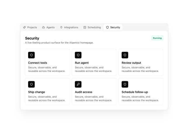

Alqemist Interactive Demo
9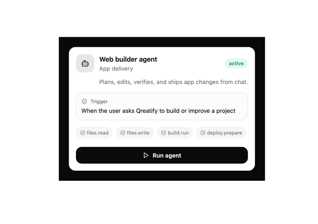
Qreatify Super Agent Card
5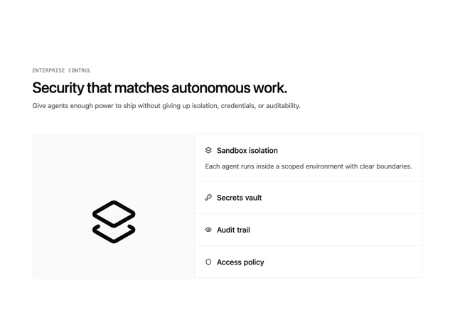
Alqemist Security
4
Alqemist Hero
4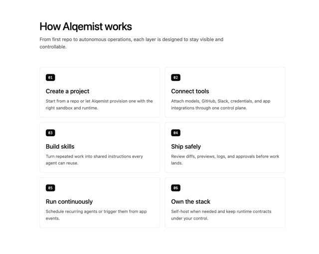
Alqemist How It Works
3
Alqemist Cta
2
What Saa SApp Shell
2
FirstReply Product Detail flow
More in Cards
View all
Stats cards with links
33

Course Design Cards
1.1K

Card
70
Statistics Card 2
264
Statistics Card 10
263

Card
17

Card Studio
9
The Item one
3
