
About
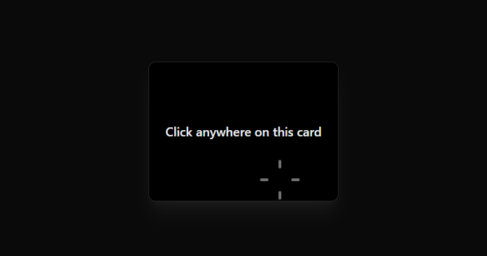
An interactive card with click animation effects. When clicked, it displays animated rectangles forming a plus shape that slide outward from the click position and fade way.
Built with React and Tailwind. Copy the prompt and paste it into Claude Code, Cursor or Lovable: your agent adds ClickTrigger to your project and fits it to your theme.
Code
How ClickTrigger is used: the demo's code. The component's own source comes with a free account.
Usage.tsx
import ClickTrigger from "@/components/ui/click-trigger";

export default function DemoOne() {
  return <ClickTrigger />;
}
More by Jatin Yadav
View all
Radial Orbital Timeline
7.4K
Expand Map
2.8K
Sign In Card
2.6K
Project Showcase
2.2K
Etheral Shadow
2.1K
Vapour Text Effect
2K
Animated AI Chat
1.6K
Vertical Image Stack
1.6K
More in Cards
View all
Stats cards with links
33

Course Design Cards
1.1K

Card
70
Statistics Card 2
264
Statistics Card 10
263

Card
17

Card Studio
9
The Item one
3
