
About
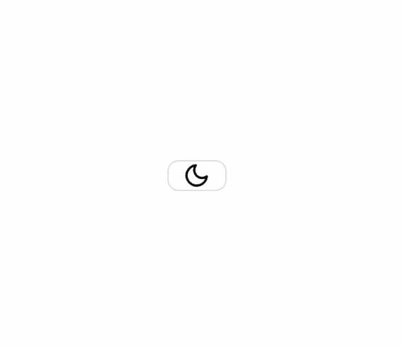
Smooth dark/light mode toggle with sun-to-moon SVG morph animation. Built with Framer Motion and next-themes integration.
Built with React and Tailwind. Copy the prompt and paste it into Claude Code, Cursor or Lovable: your agent adds Animated Theme Toggle to your project and fits it to your theme.
Code
How Animated Theme Toggle is used: the demo's code. The component's own source comes with a free account.
Usage.tsx
import { ThemeProvider } from "next-themes"
import { AnimatedThemeToggle } from "@/components/ui/animated-theme-toggle"

export default function AnimatedThemeToggleDemo() {
  return (
    <ThemeProvider attribute="class" defaultTheme="dark">
      <div className="flex items-center justify-center min-h-screen bg-background p-8">
        <AnimatedThemeToggle />
      </div>
    </ThemeProvider>
  )
}
Dependencies
More by johuniq
View all

Liquid Metal Button
3.2K
Date Wheel Picker
189
AI Prompt Box
154
Joly Button
76
More in Buttons
View all

Button
14
Button
34
Texture Button
92
Button Save
46

Button
64

Button Group
3

App Store Button
454

Notification Button
103

