
About
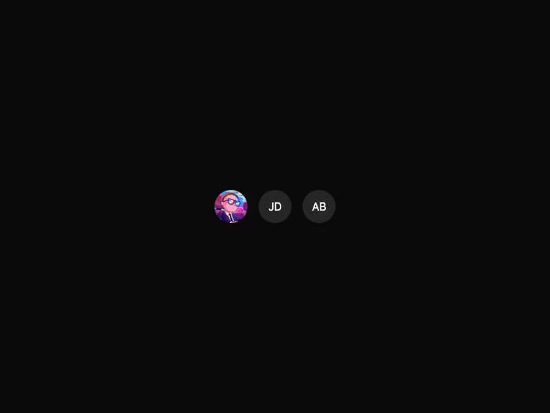
An image element with a fallback for representing the user. Built with Radix UI Avatar primitives.
Built with React and Tailwind. Copy the prompt and paste it into Claude Code, Cursor or Lovable: your agent adds Avatar to your project and fits it to your theme.
Code
How Avatar is used: the demo's code. The component's own source comes with a free account.
Usage.tsx
import { Avatar, AvatarFallback, AvatarImage } from "@/components/ui/avatar-variants-interfacesds"

export default function AvatarVariantsDefault() {
  return (
    <div className="flex items-center justify-center w-full min-h-screen bg-background p-8 overflow-hidden">
      <div className="flex items-center gap-4">
        <Avatar className="size-12">
          <AvatarImage
            src="https://cdn.21st.dev/assets/mirror/51/513d06f542692036ff0bb17938f04b3efd60567ba2cae08049469d21f18e0524.jpg"
            alt="@shadcn"
          />
          <AvatarFallback>SC</AvatarFallback>
        </Avatar>
        <Avatar className="size-12">
          <AvatarImage src="" alt="broken" />
          <AvatarFallback>JD</AvatarFallback>
        </Avatar>
        <Avatar className="size-12">
          <AvatarFallback>AB</AvatarFallback>
        </Avatar>
      </div>
    </div>
  )
}
Dependencies
More by jshguo
View all

Progress
426
Select
369
Textarea
258
Input OTP
160
Interfaces Carousel
160
Switch
136
Hover Card
109
Card
85