
About
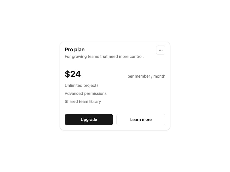
Card component from Interfaces DS — a flexible card shell with header, action, content, and footer slots.
Built with React and Tailwind. Copy the prompt and paste it into Claude Code, Cursor or Lovable: your agent adds Card to your project and fits it to your theme.
Code
How Card is used: the demo's code. The component's own source comes with a free account.
Usage.tsx
import { Card, CardAction, CardContent, CardDescription, CardFooter, CardHeader, CardTitle } from "@/components/ui/interfaces-card"
import { MoreHorizontal } from "lucide-react"

export default function CardDemo() {
  return (
    <div className="flex min-h-screen w-full items-center justify-center bg-background p-8">
      <Card className="w-full max-w-sm shadow-sm">
        <CardHeader>
          <div>
            <CardTitle>Pro plan</CardTitle>
            <CardDescription>For growing teams that need more control.</CardDescription>
          </div>
          <CardAction>
            <button
              type="button"
              aria-label="More options"
              className="inline-flex size-8 items-center justify-center rounded-md border bg-background text-foreground hover:bg-accent"
            >
              <MoreHorizontal className="size-4" />
            </button>
          </CardAction>
        </CardHeader>
        <CardContent className="space-y-3">
          <div className="flex items-end justify-between">
            <span className="text-3xl font-semibold">$24</span>
            <span className="text-sm text-muted-foreground">per member / month</span>
          </div>
          <ul className="space-y-2 text-sm text-muted-foreground">
            <li>Unlimited projects</li>
            <li>Advanced permissions</li>
            <li>Shared team library</li>
          </ul>
        </CardContent>
        <CardFooter className="gap-3">
          <button type="button" className="inline-flex h-10 w-full items-center justify-center rounded-md bg-primary px-4 py-2 text-sm font-medium text-primary-foreground hover:bg-primary/90">
            Upgrade
          </button>
          <button type="button" className="inline-flex h-10 w-full items-center justify-center rounded-md border bg-background px-4 py-2 text-sm font-medium text-foreground hover:bg-accent">
            Learn more
          </button>
        </CardFooter>
      </Card>
    </div>
  )
}
Dependencies
More by jshguo
View all

Progress
426
Select
369
Textarea
258
Interfaces Carousel
160
Input OTP
159
Switch
136
Hover Card
109
Interfaces Breadcrumb
63
More in Pricing
View all
Pricing Section
578

Pricing Section
173

Pricing Card
364
Glowing Pricing Tiers
41

Pricing Cards
86
Single Pricing Card
794
pricing section
157
Colorful-Pricing
84


