
About
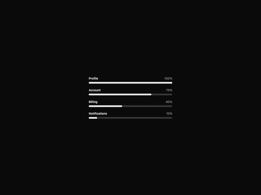
Progress bar component built on Radix UI with smooth value transitions.
Built with React and Tailwind. Copy the prompt and paste it into Claude Code, Cursor or Lovable: your agent adds Progress to your project and fits it to your theme.
Code
How Progress is used: the demo's code. The component's own source comes with a free account.
Usage.tsx
"use client"

import { Progress } from "@/components/ui/interfaces-progress"

export default function ProgressStepsDemo() {
  const steps = [
    { label: "Profile", value: 100 },
    { label: "Account", value: 75 },
    { label: "Billing", value: 40 },
    { label: "Notifications", value: 10 },
  ]

  return (
    <div className="flex w-full min-h-screen items-center justify-center bg-background p-8 overflow-hidden">
      <div className="w-full max-w-sm space-y-5">
        {steps.map((step) => (
          <div key={step.label} className="space-y-1.5">
            <div className="flex items-center justify-between text-sm">
              <span className="font-medium">{step.label}</span>
              <span className="text-muted-foreground">{step.value}%</span>
            </div>
            <Progress value={step.value} />
          </div>
        ))}
      </div>
    </div>
  )
}
Dependencies
More by jshguo
View all

Select
369
Textarea
258
Input OTP
160
Interfaces Carousel
160
Switch
136
Hover Card
109
Card
85
Interfaces Breadcrumb
63