

About
Text input primitive with focus ring and disabled states for the AI Dimensie design system
Built with React and Tailwind. Copy the prompt and paste it into Claude Code, Cursor or Lovable: your agent adds Aidimension Ui Input to your project and fits it to your theme.
Code
How Aidimension Ui Input is used: the demo's code. The component's own source comes with a free account.
Usage.tsx
import * as React from "react";
import { Input } from "@/components/ui/ai-dimensie-input";

const settings = {
  placeholder: "you@aidimension.io",
  type: "email",
};

export default function Demo({
  placeholder = settings.placeholder,
  type = settings.type,
}: Partial<typeof settings>) {
  return (
    <div className="flex min-h-[300px] items-center justify-center bg-background p-8">
      <div className="w-full max-w-sm">
        <Input type={type as any} placeholder={placeholder} />
      </div>
    </div>
  );
}
More by jason-mohabali
View all

Path to Resilience Orbital Timeline
112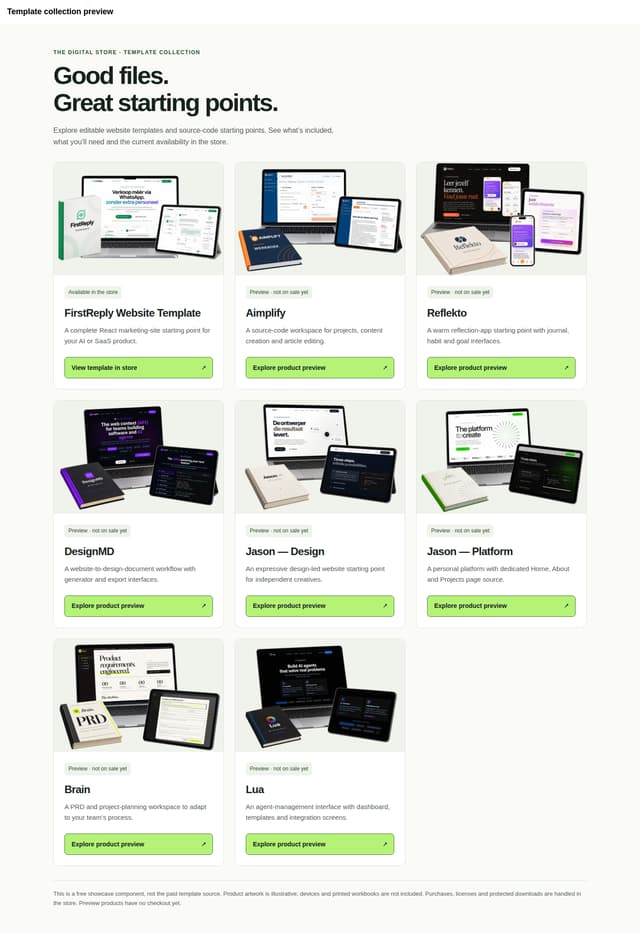
The Digital Store — Template Showcase
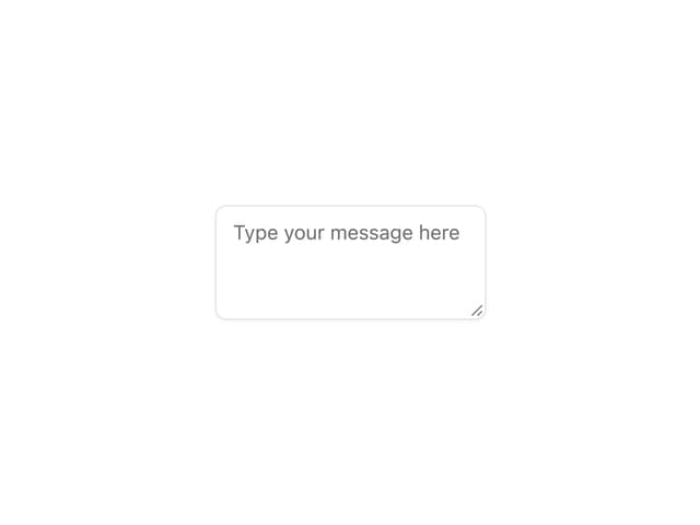
Aidimension Ui Textarea

Aidimension Ui Switch
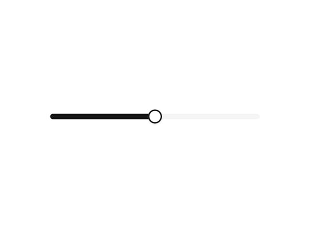
Aidimension Ui Slider
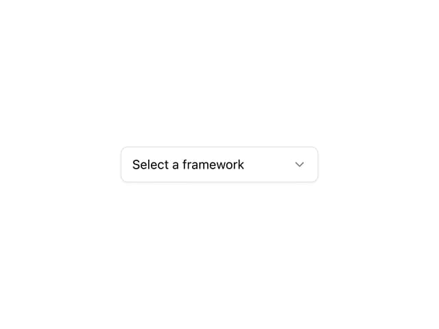
Aidimension Ui Select
Aidimension Ui Tabs
Aidimension Ui Separator