
About
Compact status label from aidimension-ui with six variants (default, secondary, destructive, outline, success, warning). Built on class-variance-authority.
Built with React and Tailwind. Copy the prompt and paste it into Claude Code, Cursor or Lovable: your agent adds Aidimension Ui Badge to your project and fits it to your theme.
Code
How Aidimension Ui Badge is used: the demo's code. The component's own source comes with a free account.
Usage.tsx
import Component from "@/components/ui/aidimension-ui-badge"

export default function Demo() {
  return <Component />
}
Dependencies
More by jason-mohabali
View all

Path to Resilience Orbital Timeline
112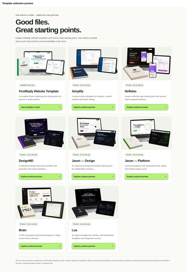
The Digital Store — Template Showcase
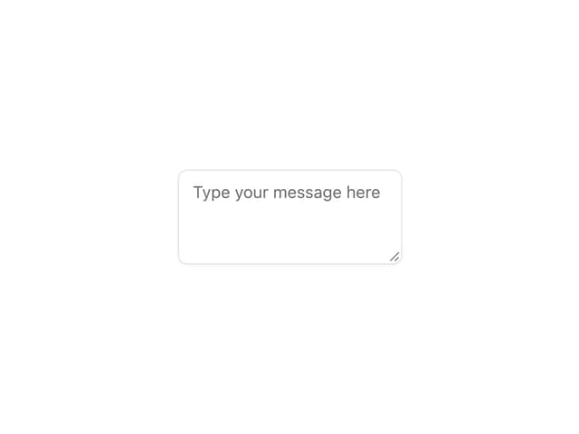
Aidimension Ui Textarea

Aidimension Ui Switch
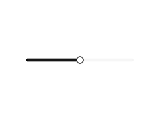
Aidimension Ui Slider
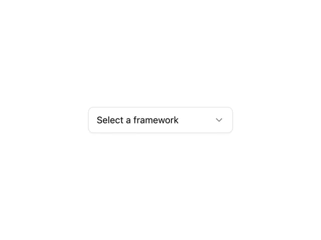
Aidimension Ui Select
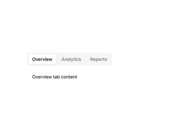
Aidimension Ui Tabs
Aidimension Ui Separator