
About
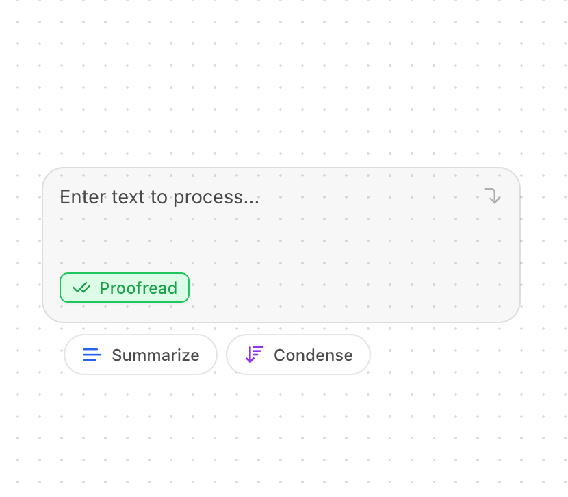
A sophisticated text input component with selectable action buttons. It features an auto-resizing textarea, customizable actions, and visual feedback. Features: • Customizable action buttons • Auto-resizing textarea • Visual feedback for selected actions • Dark mode support • Keyboard shortcuts • Animated transitions • Mobile responsiveness
Built with React and Tailwind. Copy the prompt and paste it into Claude Code, Cursor or Lovable: your agent adds AI Input with Suggestions to your project and fits it to your theme.
Code
How AI Input with Suggestions is used: the demo's code. The component's own source comes with a free account.
Usage.tsx
import { AIInputWithSuggestions } from "@/components/ui/ai-input-with-suggestions";
import { Text, CheckCheck, ArrowDownWideNarrow } from "lucide-react";

const CUSTOM_ACTIONS = [
  {
    text: "Summarize",
    icon: Text,
    colors: {
      icon: "text-blue-600",
      border: "border-blue-500",
      bg: "bg-blue-100",
    },
  },
  {
    text: "Proofread",
    icon: CheckCheck,
    colors: {
      icon: "text-green-600",
      border: "border-green-500",
      bg: "bg-green-100",
    },
  },
  {
    text: "Condense",
    icon: ArrowDownWideNarrow,
    colors: {
      icon: "text-purple-600",
      border: "border-purple-500",
      bg: "bg-purple-100",
    },
  },
];

export function AIInputWithSuggestionsDemo() {
  return (
    <div className="space-y-8 min-w-[350px]">
      <div>
        <AIInputWithSuggestions
          actions={CUSTOM_ACTIONS}
          defaultSelected="Proofread"
          placeholder="Enter text to process..."
        />
      </div>
    </div>
  );
}
Dependencies
More by Kokonut UI
View all

Background Paths
5.7K
Shape Landing Hero
3.5K
Beams Background
2.8K
Bento Grid
2.2K
v0 AI Chat
2.1K
AI Voice Input
1.7K
Hand Writing Text
1.3K
Action Search Bar
1.3K
More in AI chats
View all

AI Actions
319
Agent Chat
17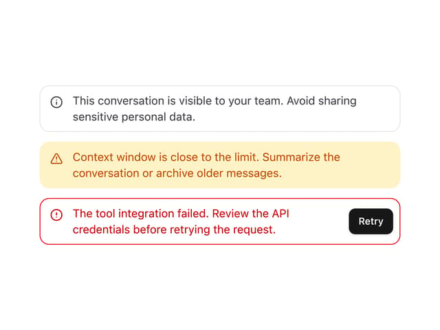

System Message
54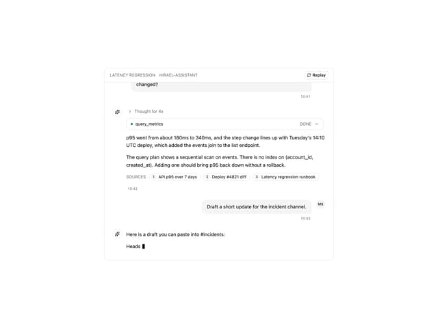
Message Thread
35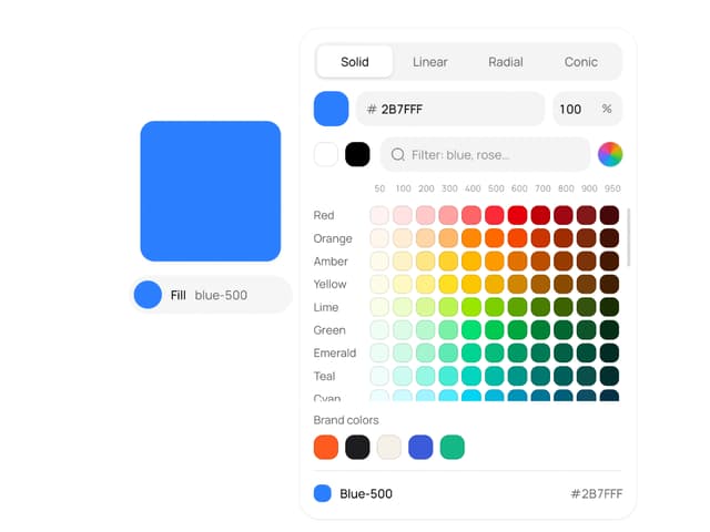
Color Picker
81

AI Task List
160

Modal Card
101
Quota Banner
21


