
About
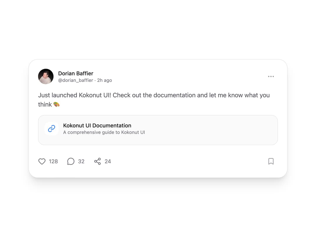
A modern, interactive social media card component with engagement features. Supports dark mode, animations, and customizable content. Features: • Interactive engagement buttons (like, comment, share, bookmark) • Link preview with custom icon • Animated interactions • Dark mode support • Responsive design • Customizable styling • TypeScript support
Built with React and Tailwind. Copy the prompt and paste it into Claude Code, Cursor or Lovable: your agent adds Social Card to your project and fits it to your theme.
Code
How Social Card is used: the demo's code. The component's own source comes with a free account.
Usage.tsx
import { SocialCard } from "@/components/ui/social-card";
import { Link as LinkIcon } from "lucide-react";
import { useState } from "react";

export function SocialCardDemo() {
  const [cards, setCards] = useState([
    {
      id: 1,
      author: {
        name: "Dorian Baffier",
        username: "dorian_baffier",
        avatar:
          "https://cdn.21st.dev/assets/localized/48105a02b5748bd2d7c738bc9b4b9ec468fe09c6f69f59d947eed2fdf03dc234.jpg",
        timeAgo: "2h ago",
      },
      content: {
        text: "Just launched Kokonut UI! Check out the documentation and let me know what you think 🎨",
        link: {
          title: "Kokonut UI Documentation",
          description: "A comprehensive guide to Kokonut UI",
          icon: <LinkIcon className="w-5 h-5 text-blue-500" />,
        },
      },
      engagement: {
        likes: 128,
        comments: 32,
        shares: 24,
        isLiked: false,
        isBookmarked: false,
      },
    },
  ]);

  const handleAction = (id: number, action: string) => {
    console.log(`Card ${id}: ${action}`);
  };

  return (
    <div className="space-y-8">
      <div>
        {cards.map((card) => (
          <SocialCard
            key={card.id}
            {...card}
            onLike={() => handleAction(card.id, "liked")}
            onComment={() => handleAction(card.id, "commented")}
            onShare={() => handleAction(card.id, "shared")}
            onBookmark={() => handleAction(card.id, "bookmarked")}
            onMore={() => handleAction(card.id, "more")}
          />
        ))}
      </div>
    </div>
  );
}

export default SocialCardDemo;
Dependencies
More by Kokonut UI
View all

Background Paths
5.7K
Shape Landing Hero
3.5K
Beams Background
2.8K
Bento Grid
2.2K
v0 AI Chat
2.1K
AI Voice Input
1.7K
Hand Writing Text
1.3K
Action Search Bar
1.3K
More in Cards
View all
Stats cards with links
33

Course Design Cards
1.1K

Card
70
Statistics Card 2
264
Statistics Card 10
263

Card
17

Card Studio
9
The Item one
3
