
About
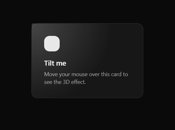
Tilt Card UI
Built with React and Tailwind. Copy the prompt and paste it into Claude Code, Cursor or Lovable: your agent adds Tilt Card to your project and fits it to your theme.
Code
How Tilt Card is used: the demo's code. The component's own source comes with a free account.
Usage.tsx
"use client"

import { TiltCard } from "@/components/ui/tilt-card"

export default function TiltCardDemo() {
  return (
    <div className="flex items-center justify-center min-h-screen bg-background p-8">
      <TiltCard className="rounded-2xl border border-border bg-card p-8 w-72 cursor-pointer">
        <div className="w-10 h-10 rounded-xl bg-primary mb-4" />
        <h3 className="font-semibold text-foreground text-lg mb-1">Tilt me</h3>
        <p className="text-sm text-muted-foreground">
          Move your mouse over this card to see the 3D effect.
        </p>
      </TiltCard>
    </div>
  )
}
Dependencies
More by Kousthubha Yadiyala
View all

Morphing Card Stack
1.8K
Animated Menu
603
Circular Command Menu
466
Fluid Dropdown
421
Trello Kanban Board
317
Real time Analytics
287
Shatter Button
276
Action Searchbar
221
More in Cards
View all
Stats cards with links
33

Course Design Cards
1.1K

Card
70
Statistics Card 2
264
Statistics Card 10
263

Card
17

Card Studio
9
The Item one
3
