
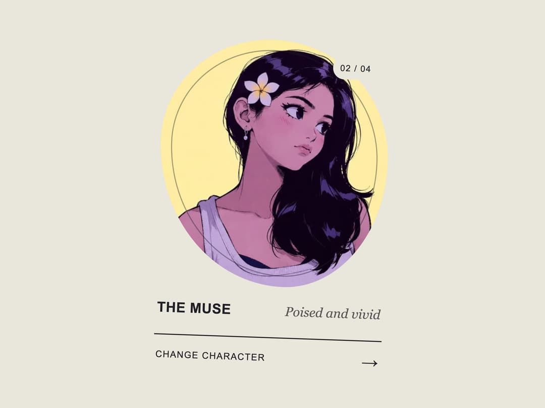
About
A visual character switcher card with animated portrait transitions, keyboard support, and an autoplay demo that showcases every state.
Built with React and Tailwind. Copy the prompt and paste it into Claude Code, Cursor or Lovable: your agent adds Interactive Character Switcher Card to your project and fits it to your theme.
Code
How Interactive Character Switcher Card is used: the demo's code. The component's own source comes with a free account.
Usage.tsx
import { CharacterSwitcherCard } from "@/components/ui/interactive-character-switcher-card"

export default function CharacterSwitcherCardDemo() {
  return <CharacterSwitcherCard autoPlay />
}
More by Kiki
View all

Filter Token Bar
522
Compose
423
Product Tour
216
Tier List Maker
138
Draggable Photo Stack
84
Morphing Scroll Navbar
81
Selection Bubble Menu
35
3D Before & After Image Slider
32