
About
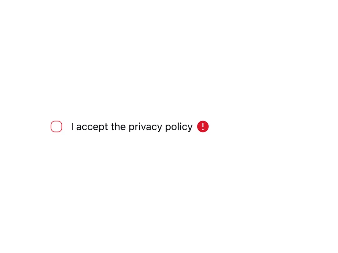
A labeled checkbox input with indeterminate state support and inline validation error messaging shown via a tooltip, for forms like terms-acceptance or select-all lists.
Built with React and Tailwind. Copy the prompt and paste it into Claude Code, Cursor or Lovable: your agent adds Checkbox to your project and fits it to your theme.
Code
How Checkbox is used: the demo's code. The component's own source comes with a free account.
Usage.tsx
import { Checkbox } from "@/components/ui/checkbox";

export default function CheckboxRequiredDemo() {
  return (
    <div className="w-full max-w-sm bg-bg-page p-6 rounded-md">
      <Checkbox label="I accept the privacy policy" required />
    </div>
  );
}
Dependencies
More by lipa88-mk
View all
Button
More in Forms
View all

Premium Auth
497

Login 2
7
Authentication Card
45

Login 1
52

Contact Card
1K

Form
16

Form
136

Card Studio
41
