
About
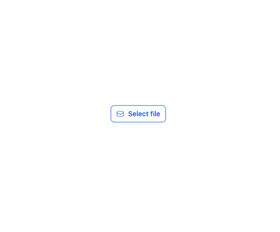
A multi-variant button component (Primary, Secondary, Tertiary, Ghost) with built-in loading spinner, icon placement, size, color, active/disabled states, plus a file-import button variant.
Built with React and Tailwind. Copy the prompt and paste it into Claude Code, Cursor or Lovable: your agent adds Button to your project and fits it to your theme.
Code
How Button is used: the demo's code. The component's own source comes with a free account.
Usage.tsx
import Button from "@/components/ui/button";
import { EnvelopeIcon } from "@heroicons/react/24/outline";

export default function ButtonImportDemo() {
  return (
    <Button.Import Icon={EnvelopeIcon} onImport={() => {}}>
      Select file
    </Button.Import>
  );
}
Dependencies
More by lipa88-mk
View all
Checkbox
More in Buttons
View all

Button
14
Button
34
Texture Button
92
Button Save
46

Button
64

Button Group
3

App Store Button
454

Notification Button
103

