
About
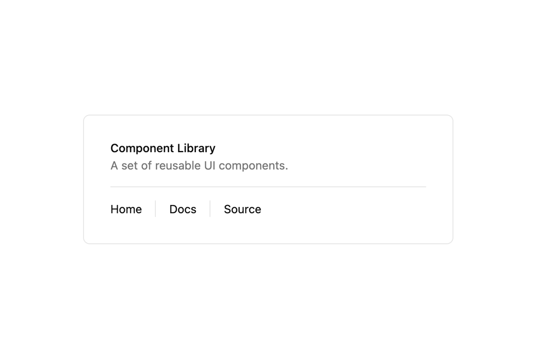
Here is separator component
Built with React and Tailwind. Copy the prompt and paste it into Claude Code, Cursor or Lovable: your agent adds indevuiSeparator to your project and fits it to your theme.
Code
How indevuiSeparator is used: the demo's code. The component's own source comes with a free account.
Usage.tsx
// demo.tsx
import Separator from '@/components/ui/indevui-separator';

function SeparatorDemo() {
  return (
    <div className="w-full max-w-md rounded-md border p-8">
      <div>
        <div className="space-y-1">
          <h4 className="text-sm font-medium leading-none">Component Library</h4>
          <p className="text-sm text-muted-foreground">A set of reusable UI components.</p>
        </div>
        <Separator className="my-4" />
        <div className="flex h-5 items-center space-x-4 text-sm">
          <div>Home</div>
          <Separator orientation="vertical" />
          <div>Docs</div>
          <Separator orientation="vertical" />
          <div>Source</div>
        </div>
      </div>
    </div>
  );
}

export { SeparatorDemo as DemoOne };
Dependencies
More by LN
View all
Pricing Interaction
1.4K
Dorpdown Navigation
1.2K
Visualize Booking
618
Assisted Password Confirmation
585
Tags Selector
531
Mega Menu
386
Feedback Slider
326
FlipButton
288
More in Cards
View all
Stats cards with links
33

Course Design Cards
1.1K

Card
70
Statistics Card 2
264
Statistics Card 10
263

Card
17

Card Studio
9
The Item one
3
