
About
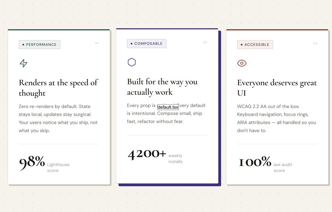
A light-theme feature card with editorial typography, physical offset shadow, animated stat counter, and smooth hover lift. Built with Cormorant Garamond + DM Sans. Zero dependencies.
Built with React and Tailwind. Copy the prompt and paste it into Claude Code, Cursor or Lovable: your agent adds Specimen Card to your project and fits it to your theme.
Code
How Specimen Card is used: the demo's code. The component's own source comes with a free account.
Usage.tsx
import { SpecimenCard } from "@/components/ui/specimen-card"

const BoltIcon = () => (
  <svg width="28" height="28" viewBox="0 0 24 24" fill="none" stroke="currentColor" strokeWidth="1.6" strokeLinecap="round" strokeLinejoin="round">
    <path d="M13 2L3 14h9l-1 8 10-12h-9l1-8z" />
  </svg>
)

const CubeIcon = () => (
  <svg width="28" height="28" viewBox="0 0 24 24" fill="none" stroke="currentColor" strokeWidth="1.6" strokeLinecap="round" strokeLinejoin="round">
    <path d="M21 16V8a2 2 0 0 0-1-1.73l-7-4a2 2 0 0 0-2 0l-7 4A2 2 0 0 0 3 8v8a2 2 0 0 0 1 1.73l7 4a2 2 0 0 0 2 0l7-4A2 2 0 0 0 21 16z" />
  </svg>
)

const EyeIcon = () => (
  <svg width="28" height="28" viewBox="0 0 24 24" fill="none" stroke="currentColor" strokeWidth="1.6" strokeLinecap="round" strokeLinejoin="round">
    <path d="M1 12s4-8 11-8 11 8 11 8-4 8-11 8-11-8-11-8z" />
    <circle cx="12" cy="12" r="3" />
  </svg>
)

export default function Demo() {
  return (
    <div
      style={{
        minHeight: "100vh",
        background: "#f5f2ec",
        backgroundImage: `radial-gradient(circle, #ccc8c0 1px, transparent 1px)`,
        backgroundSize: "28px 28px",
        display: "flex",
        alignItems: "center",
        justifyContent: "center",
        padding: "60px 24px",
        fontFamily: "'DM Sans', sans-serif",
      }}
    >
      <div
        style={{
          display: "grid",
          gridTemplateColumns: "repeat(auto-fit, minmax(280px, 1fr))",
          gap: "20px",
          maxWidth: "960px",
          width: "100%",
        }}
      >
        <SpecimenCard
          index="01"
          category="Performance"
          icon={<BoltIcon />}
          title="Renders at the speed of thought"
          description="Zero re-renders by default. State stays local, updates stay surgical. Your users notice what you ship, not what you skip."
          stat={{ value: 98, label: "Lighthouse score", suffix: "%" }}
          accentColor="#1e4d35"
        />
        <SpecimenCard
          index="02"
          category="Composable"
          icon={<CubeIcon />}
          title="Built for the way you actually work"
          description="Every prop is optional. Every default is intentional. Compose small, ship fast, refactor without fear."
          stat={{ value: 4200, label: "weekly installs", suffix: "+" }}
          accentColor="#3b2f7a"
        />
        <SpecimenCard
          index="03"
          category="Accessible"
          icon={<EyeIcon />}
          title="Everyone deserves great UI"
          description="WCAG 2.2 AA out of the box. Keyboard navigation, focus rings, ARIA attributes — all handled so you don't have to."
          stat={{ value: 100, label: "axe audit score", suffix: "%" }}
          accentColor="#7a2f1e"
        />
      </div>
    </div>
  )
}More in Features
View all

Features 8
3.1K

Feature Sections
107

Grid Feature Cards
1.9K

Feature 72
122
Features 2
322
Features 4
368
Feature Modern
9
Features Card
201

