
About
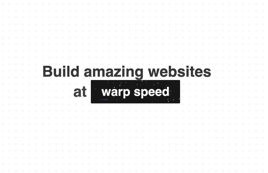
A Cover component that wraps any children, providing beams and space effect, hover to reveal speed.
Built with React and Tailwind. Copy the prompt and paste it into Claude Code, Cursor or Lovable: your agent adds Cover to your project and fits it to your theme.
Code
How Cover is used: the demo's code. The component's own source comes with a free account.
Usage.tsx
import React from "react";
import { Cover } from "@/components/ui/cover";

export function CoverDemo() {
  return (
    <div>
      <h1 className="text-4xl md:text-4xl lg:text-6xl font-semibold max-w-7xl mx-auto text-center mt-6 relative z-20 py-6 bg-clip-text text-transparent bg-gradient-to-b from-neutral-800 via-neutral-700 to-neutral-700 dark:from-neutral-800 dark:via-white dark:to-white">
        Build amazing websites <br /> at <Cover>warp speed</Cover>
      </h1>
    </div>
  );
}
Dependencies
More by Manu Arora
View all
Container Scroll Animation
10.2K
Glowing Effect
4.4K
Aurora Background
4.4K
Timeline
4.3K
Sparkles
4.1K
Lamp
3.7K
Sidebar
3.6K
Bento Grid
2.7K
More in Text
View all

Vertical Cut Reveal Characters
103

Rainbow Text Effect
47
Motion Blur Text
36
Text Loop
310
Text Reveal
27
Apple Hello Effect
610
Typography
4

Animated Text
8

