

About
A set of styled text primitives (display, heading, lead, body, muted, label) for building consistent typographic hierarchy in an interface.
Built with React and Tailwind. Copy the prompt and paste it into Claude Code, Cursor or Lovable: your agent adds Typography to your project and fits it to your theme.
Code
How Typography is used: the demo's code. The component's own source comes with a free account.
Usage.tsx
import { Typography } from "@/components/ui/typography";

export default function TypographyDemo() {
  return (
    <div
      style={{ display: "grid", gap: "var(--bs-space-4)", maxWidth: "36rem" }}
    >
      <Typography.Display>以光为影</Typography.Display>
      <Typography.Heading>The paper-and-ink system</Typography.Heading>
      <Typography.Lead>
        Interfaces are warm paper, content is ink, hierarchy is light.
      </Typography.Lead>
      <Typography.Body>
        Surfaces are never pure white; the ground rests in ambient shade.
        Primary actions default to ink — monochrome, solemn — with
        mineral-pigment accents switchable by theme.
      </Typography.Body>
      <Typography.Muted>
        Revised autumn 2026 · Typeset in the eastern studio
      </Typography.Muted>
      <Typography.Label>SECTION IV — MOTION GRAMMAR</Typography.Label>
    </div>
  );
}
Dependencies
More by bysages
View all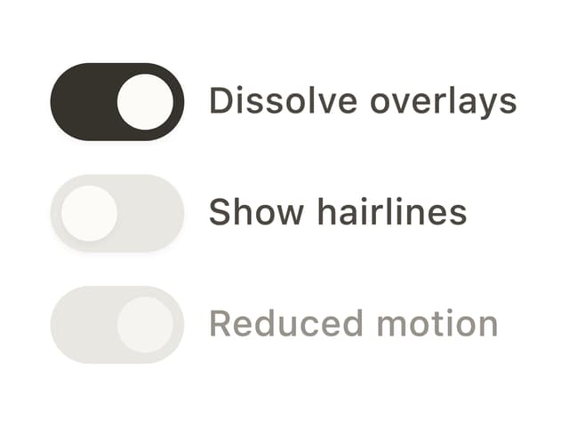
Switch
13
Avatar Group
5
Spinner
4
Grid
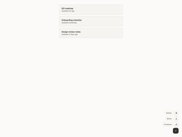
Float Button
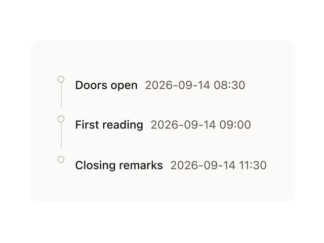
Timeline

Floating Panel
Ellipsis
More in Text
View all

Vertical Cut Reveal Characters
103

Rainbow Text Effect
47
Motion Blur Text
36
Text Loop
309
Text Reveal
27
Apple Hello Effect
610

Animated Text
8
Lightning Text
123

