
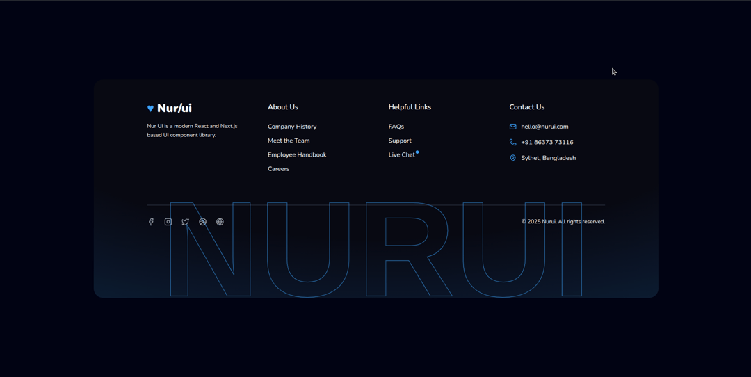
About
Hover Footer animation to our modern React and Next.js-based UI component library! Enhance your projects with this animation.
Built with React and Tailwind. Copy the prompt and paste it into Claude Code, Cursor or Lovable: your agent adds Hover Footer to your project and fits it to your theme.
Code
How Hover Footer is used: the demo's code. The component's own source comes with a free account.
Usage.tsx
"use client";
import React from "react";
import {
Mail,
Phone,
MapPin,
Facebook,
Instagram,
Twitter,
Dribbble,
Globe,
} from "lucide-react";
import {FooterBackgroundGradient} from "@/components/ui/hover-footer";
import { TextHoverEffect } from "@/components/ui/hover-footer";
function HoverFooter() {
// Footer link data
const footerLinks = [
{
title: "About Us",
links: [
{ label: "Company History", href: "#" },
{ label: "Meet the Team", href: "#" },
{ label: "Employee Handbook", href: "#" },
{ label: "Careers", href: "#" },
],
},
{
title: "Helpful Links",
links: [
{ label: "FAQs", href: "#" },
{ label: "Support", href: "#" },
{
label: "Live Chat",
href: "#",
pulse: true,
},
],
},
];
// Contact info data
const contactInfo = [
{
icon: <Mail size={18} className="text-[#3ca2fa]" />,
text: "hello@nurui.com",
href: "mailto:hello@nurui.com",
},
{
icon: <Phone size={18} className="text-[#3ca2fa]" />,
text: "+91 86373 73116",
href: "tel:+918637373116",
},
{
icon: <MapPin size={18} className="text-[#3ca2fa]" />,
text: "Sylhet, Bangladesh",
},
];
// Social media icons
const socialLinks = [
{ icon: <Facebook size={20} />, label: "Facebook", href: "#" },
{ icon: <Instagram size={20} />, label: "Instagram", href: "#" },
{ icon: <Twitter size={20} />, label: "Twitter", href: "#" },
{ icon: <Dribbble size={20} />, label: "Dribbble", href: "#" },
{ icon: <Globe size={20} />, label: "Globe", href: "#" },
];
return (
<footer className="bg-[#0F0F11]/10 relative h-fit rounded-3xl overflow-hidden m-8">
<div className="max-w-7xl mx-auto p-14 z-40 relative">
<div className="grid grid-cols-1 md:grid-cols-2 lg:grid-cols-4 gap-12 md:gap-8 lg:gap-16 pb-12">
{/* Brand section */}
<div className="flex flex-col space-y-4">
<div className="flex items-center space-x-2">
<span className="text-[#3ca2fa] text-3xl font-extrabold">
♥
</span>
<span className="text-white text-3xl font-bold">Nur/ui</span>
</div>
<p className="text-sm leading-relaxed">
Nur UI is a modern React and Next.js based UI component library.
</p>
</div>
{/* Footer link sections */}
{footerLinks.map((section) => (
<div key={section.title}>
<h4 className="text-white text-lg font-semibold mb-6">
{section.title}
</h4>
<ul className="space-y-3">
{section.links.map((link) => (
<li key={link.label} className="relative">
<a
href={link.href}
className="hover:text-[#3ca2fa] transition-colors"
>
{link.label}
</a>
{link.pulse && (
<span className="absolute top-0 right-[-10px] w-2 h-2 rounded-full bg-[#3ca2fa] animate-pulse"></span>
)}
</li>
))}
</ul>
</div>
))}
{/* Contact section */}
<div>
<h4 className="text-white text-lg font-semibold mb-6">
Contact Us
</h4>
<ul className="space-y-4">
{contactInfo.map((item, i) => (
<li key={i} className="flex items-center space-x-3">
{item.icon}
{item.href ? (
<a
href={item.href}
className="hover:text-[#3ca2fa] transition-colors"
>
{item.text}
</a>
) : (
<span className="hover:text-[#3ca2fa] transition-colors">
{item.text}
</span>
)}
</li>
))}
</ul>
</div>
</div>
<hr className="border-t border-gray-700 my-8" />
{/* Footer bottom */}
<div className="flex flex-col md:flex-row justify-between items-center text-sm space-y-4 md:space-y-0">
{/* Social icons */}
<div className="flex space-x-6 text-gray-400">
{socialLinks.map(({ icon, label, href }) => (
<a
key={label}
href={href}
aria-label={label}
className="hover:text-[#3ca2fa] transition-colors"
>
{icon}
</a>
))}
</div>
{/* Copyright */}
<p className="text-center md:text-left">
© {new Date().getFullYear()} Nurui. All rights reserved.
</p>
</div>
</div>
{/* Text hover effect */}
<div className="lg:flex hidden h-[30rem] -mt-52 -mb-36">
<TextHoverEffect text="Nurui" className="z-50" />
</div>
<FooterBackgroundGradient />
</footer>
);
}
export default HoverFooter;Dependencies
More by Md afsar mahmud
View all

banner
342
counter loader
264
tech-curosr
180
gradient text
13
gradient button
gradient hero
glowing card
More in Footers
View all

Footer 7
555
Footer section
1.9K
Footer column
265

Footer 2
201
Footer
446

Footer
80
Large Name Footer
193
Feature Section
32


