
About
Here is Content Block component
Built with React and Tailwind. Copy the prompt and paste it into Claude Code, Cursor or Lovable: your agent adds Content Block to your project and fits it to your theme.
Code
How Content Block is used: the demo's code. The component's own source comes with a free account.
Usage.tsx
import Image from 'next/image'

export default function ContentSection() {
    return (
        <section>
            <div className="py-24">
                <div className="mx-auto w-full max-w-5xl px-6">
                    <div className="mx-auto max-w-2xl">
                        <div>
                            <span className="text-3xl">🦊</span>
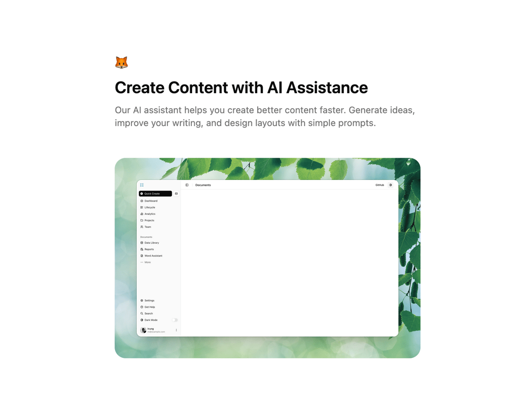
                            <h2 className="text-foreground mt-4 text-4xl font-semibold">Create Content with AI Assistance</h2>
                            <p className="text-muted-foreground mb-12 mt-4 text-xl">Our AI assistant helps you create better content faster. Generate ideas, improve your writing, and design layouts with simple prompts.</p>
                        </div>

                        <div className="relative mt-12 overflow-hidden rounded-3xl bg-black/10 md:mt-16">
                            <img
                                src="https://cdn.21st.dev/assets/mirror/79/79d046c3496bb27a73a75436cb13b50b1368bc034e549fccbe037b130ab245df.jpg"
                                alt=""
                                className="absolute inset-0 size-full object-cover"
                            />

                            <div className="bg-background rounded-(--radius) relative m-4 overflow-hidden border border-transparent shadow-xl shadow-black/15 ring-1 ring-black/10 sm:m-8 md:m-12">
                                <Image
                                    src="https://tailark.com/_next/image?url=%2Fmist%2Ftailark-2.png&w=3840&q=75"
                                    alt="app screen"
                                    width="2880"
                                    height="1842"
                                    className="object-top-left size-full object-cover"
                                />
                            </div>
                        </div>
                    </div>
                </div>
            </div>
        </section>
    )
}
Dependencies
More by Méschac Irung
View all

Features 8
3.1K
Hero Section 1
3K
Hero Section 5
2.6K
Hero Section 6
881
Hero Section 2
876
Hero Section 4
626
Features 9
594
Hero Section 3
580
More in Features
View all
Features 2
322

Grid Feature Cards
1.9K

Feature Sections
52
Feature with advantages
278
Feature Section with card gradient
169
Feature Modern
17
Features 4
368

Framework Agnostic
63


