
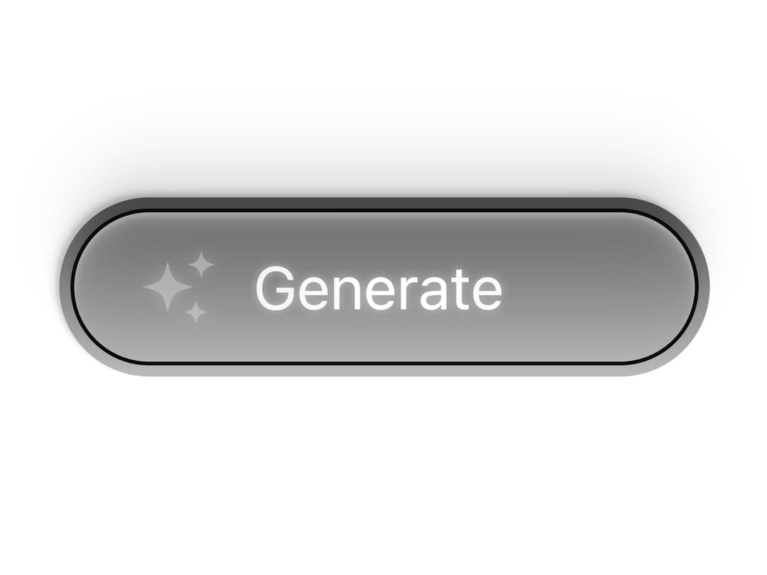
About
A reusable, accessible React button that mirrors the Uiverse “dexter-st” glow/flicker animation using Tailwind utilities and scoped CSS. It integrates with shadcn theme tokens, supports idle/active labels, a controllable generating state, and a customizable highlight hue for easy theming.
Built with React and Tailwind. Copy the prompt and paste it into Claude Code, Cursor or Lovable: your agent adds Animated Generate Button (shadcn + Tailwind) to your project and fits it to your theme.
Code
How Animated Generate Button (shadcn + Tailwind) is used: the demo's code. The component's own source comes with a free account.
Usage.tsx
import AnimatedGenerateButton from "@/components/ui/animated-generate-button-shadcn-tailwind";

export default function DemoOne() {
  return <AnimatedGenerateButton
  labelIdle="Generate"
  labelActive="Building"
  highlightHueDeg={5000}
/>;
}
Dependencies
More by Jessi
View all

Wireframe Dotted Globe
3.4K
3D Gallery Photography
3.3K
Animate Card Animation
2.4K
The Infinite Grid
1.9K
Hero Dithering Card
1.6K
Hero section with smooth bg Shader
1.3K
3D Image gallery
1.3K
Stacked Panels Cursor intereactive component
1.2K
More in AI chats
View all

AI Actions
319
Agent Chat
17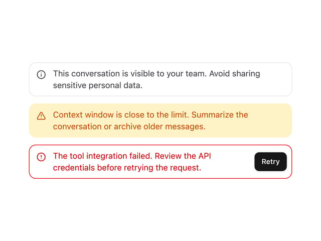

System Message
54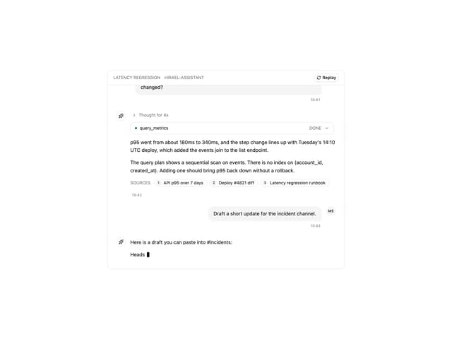
Message Thread
35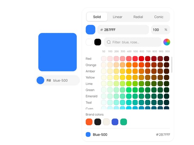
Color Picker
81

AI Task List
160

Modal Card
101
Quota Banner
21


