
About
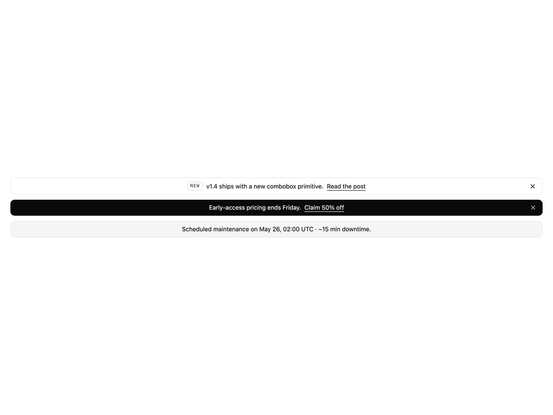
Top-of-page banner with default / primary / muted tones, optional dismiss button and localStorage persistence.
Built with React and Tailwind. Copy the prompt and paste it into Claude Code, Cursor or Lovable: your agent adds Announcement Bar to your project and fits it to your theme.
Code
How Announcement Bar is used: the demo's code. The component's own source comes with a free account.
Usage.tsx
import {
  AnnouncementBar,
  AnnouncementBarBadge,
  AnnouncementBarLink,
} from "@/components/ui/announcement-bar";

export default function AnnouncementBarDemo() {
  return (
    <div className="flex w-full flex-col gap-3 bg-background p-6 text-foreground">
      <AnnouncementBar tone="default" dismissible className="rounded-lg border">
        <AnnouncementBarBadge>New</AnnouncementBarBadge>
        <span>v1.4 ships with a new combobox primitive.</span>
        <AnnouncementBarLink href="#">Read the post</AnnouncementBarLink>
      </AnnouncementBar>

      <AnnouncementBar tone="primary" dismissible className="rounded-lg">
        <span>Early-access pricing ends Friday.</span>
        <AnnouncementBarLink href="#">Claim 50% off</AnnouncementBarLink>
      </AnnouncementBar>

      <AnnouncementBar tone="muted" className="rounded-lg border">
        <span>
          Scheduled maintenance on May 26, 02:00 UTC · ~15 min downtime.
        </span>
      </AnnouncementBar>
    </div>
  );
}
Dependencies
More by Mohammad Shehadeh
View all
Feature Problem Cards
83
Feature Grid Spotlight Cards
69
Dithered Shader CTA
63
Split Login
60
FAQ Two Column
59
Ecommerce Category Page
57
Comparison Table
57
Comparison Section
56