HomeBookmarks
HiraelHirael
Hirael

Hirael

A collection of shadcn/ui components, blocks and page templates for building modern, fast and beautiful websites. Built on Radix UI and Base UI. Works with the shadcn CLI and any preset, in light, dark and RTL.

MSby Mohammad Shehadeh
200components306.3Kviews1.2Kbookmarks

Installs all 296 components. Without our CLI, run instead.

Auto-indexed

Hirael contents

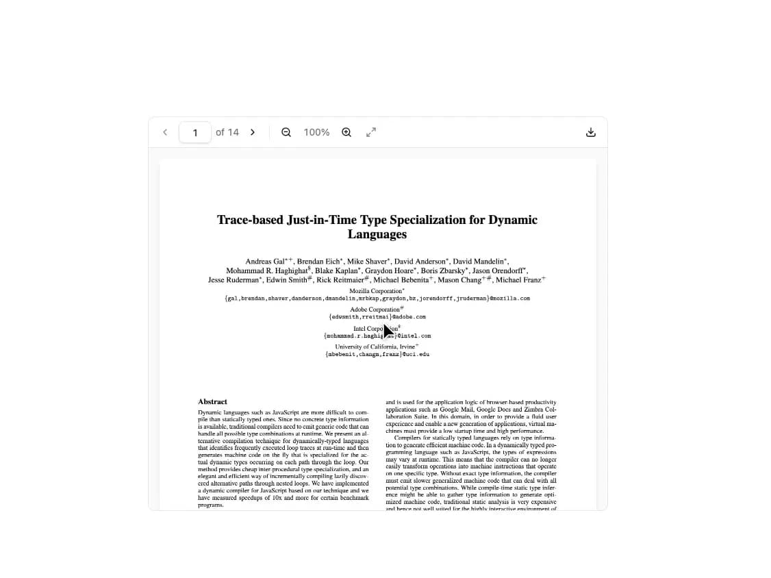
  • PDF Viewer

    PDF Viewer

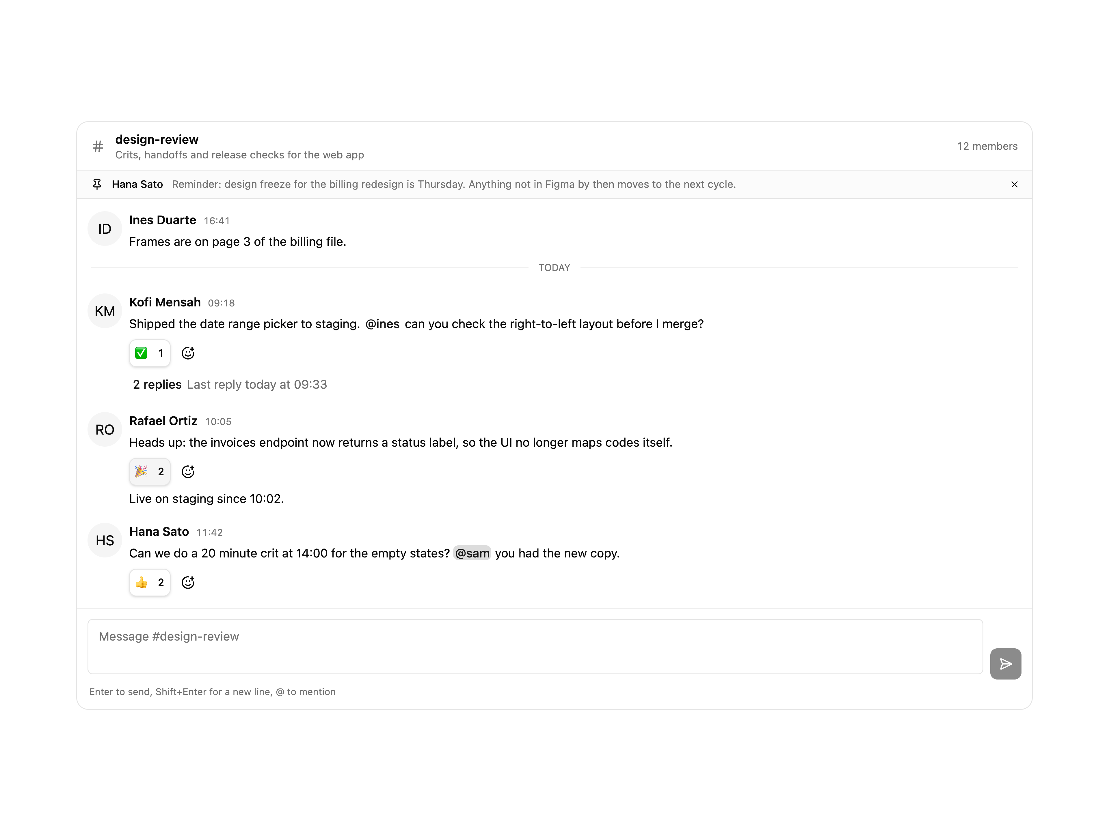
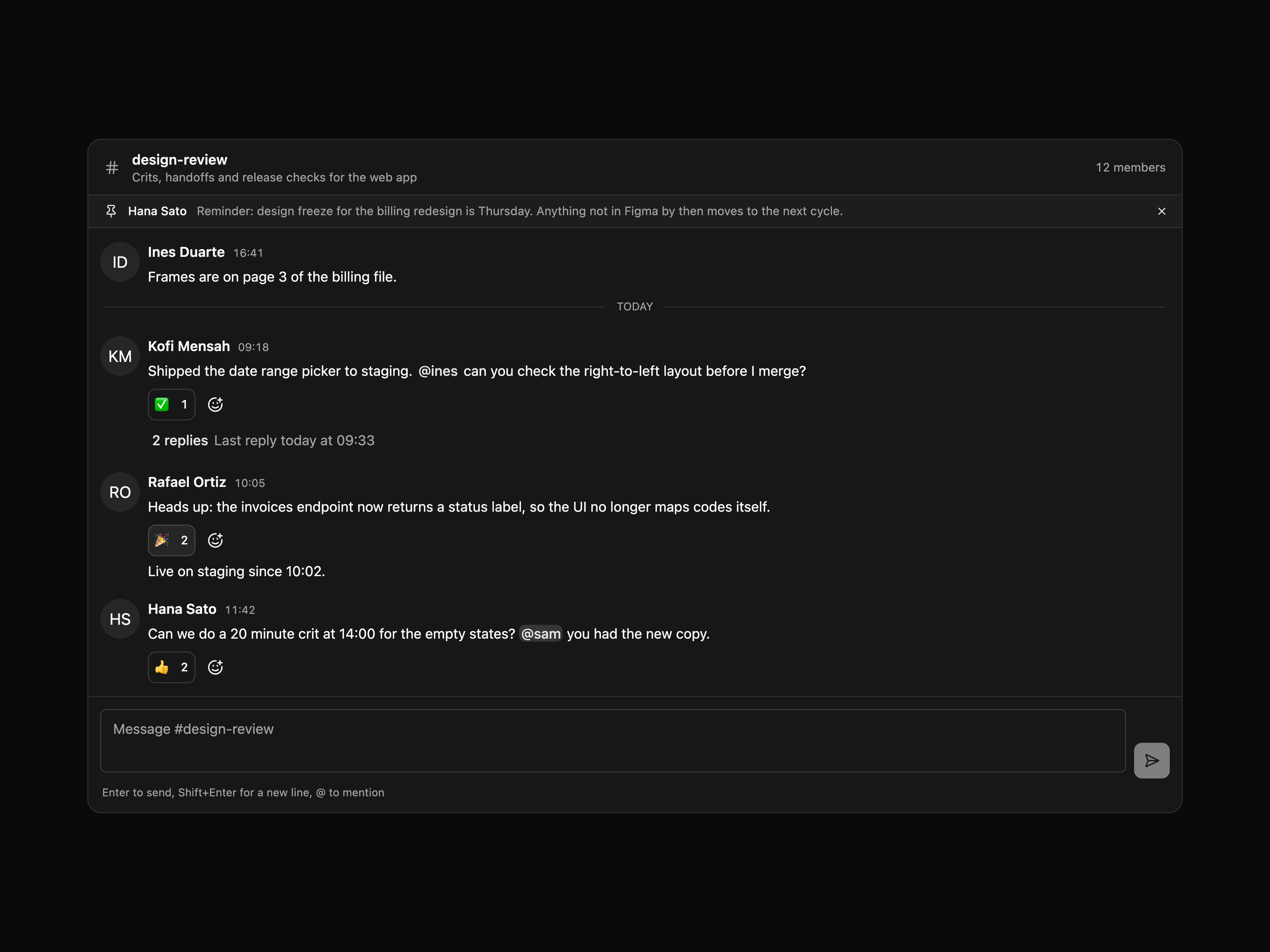
  • Team Channel with ThreadsTeam Channel with Threads

    Team Channel with Threads

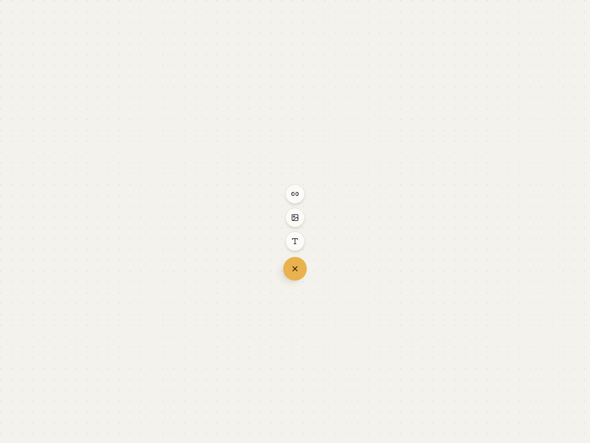
  • Floating Action Button

    Floating Action Button

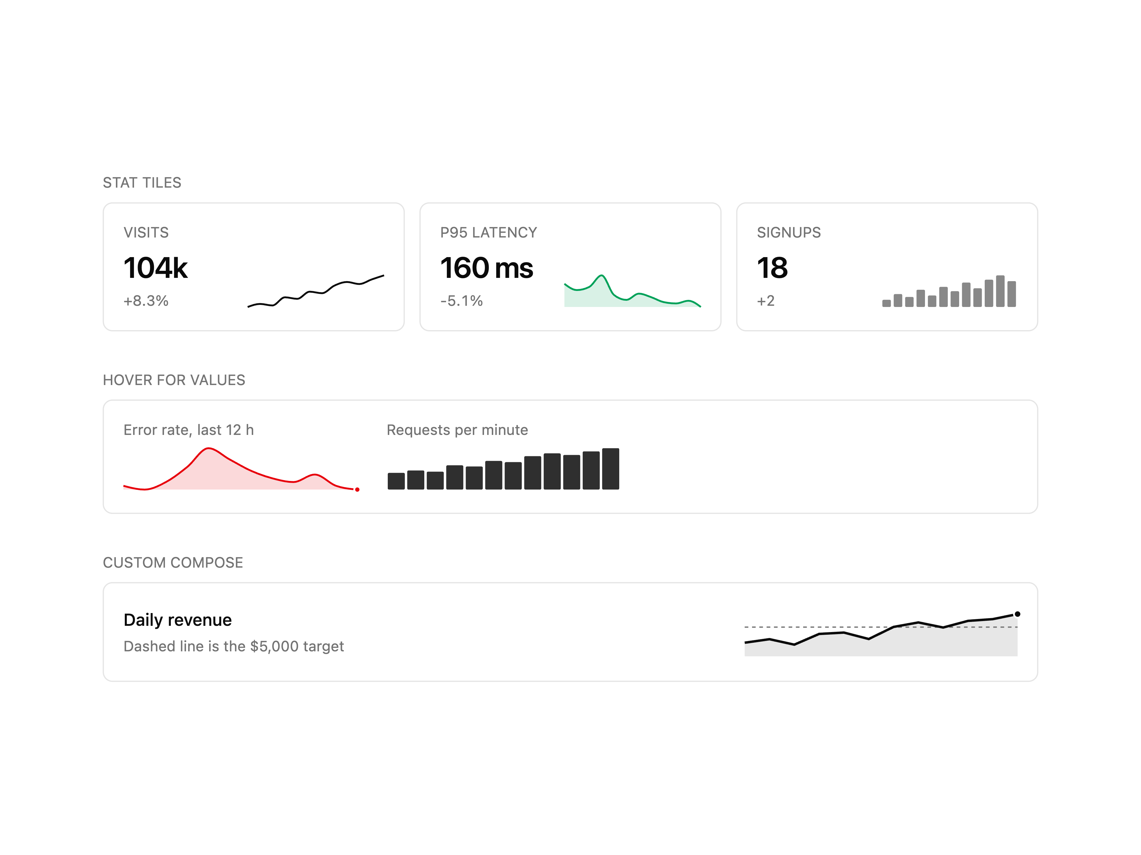
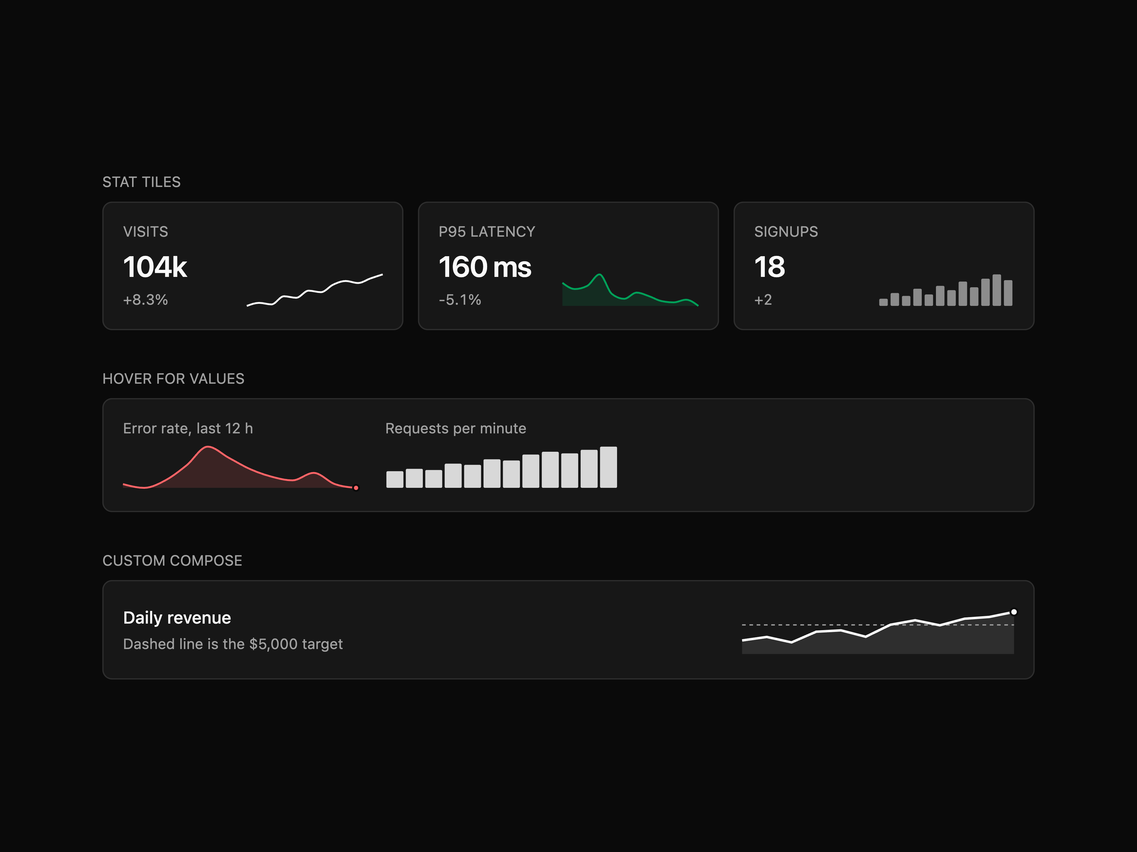
  • SparklineSparkline

    Sparkline

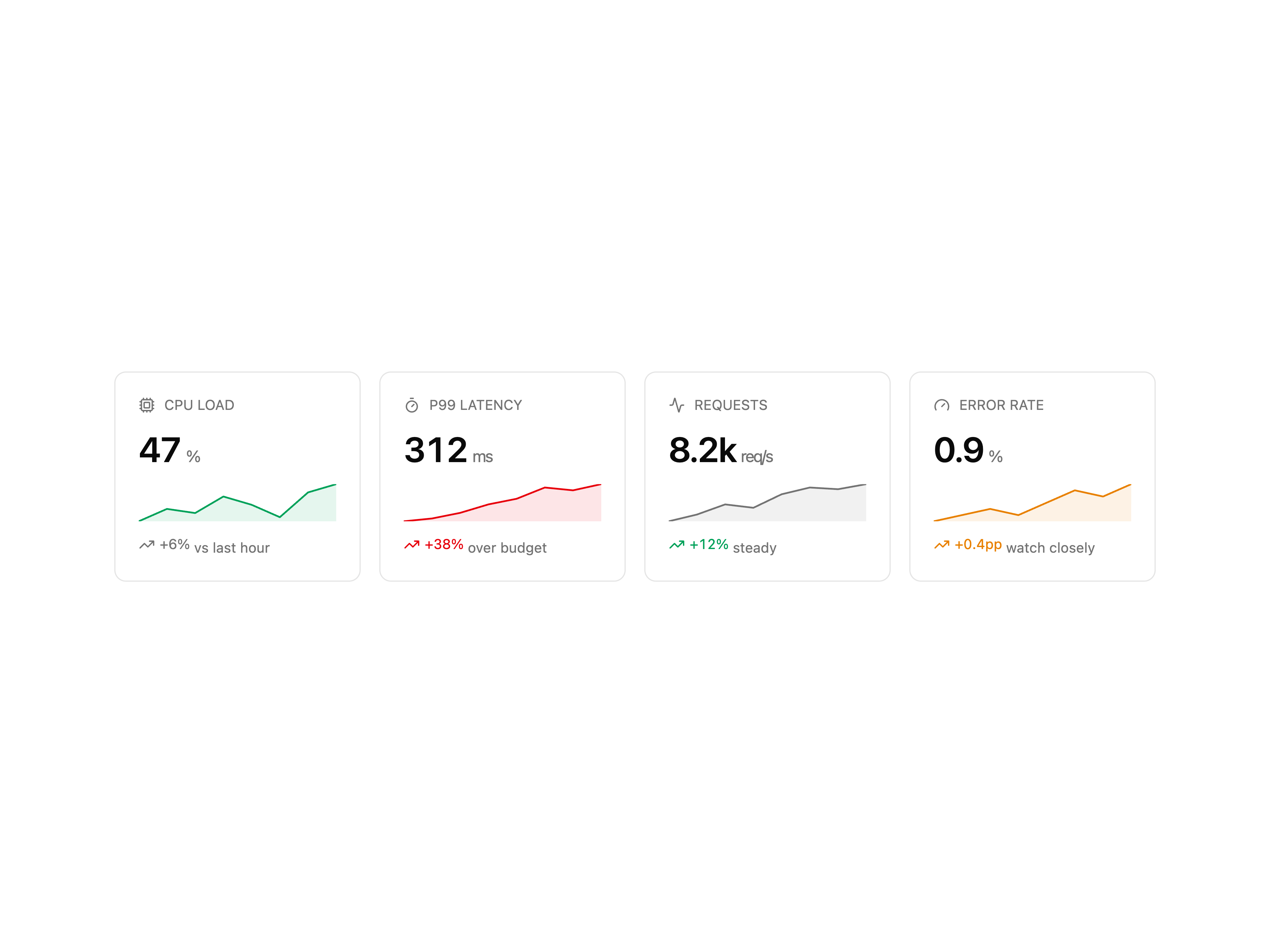
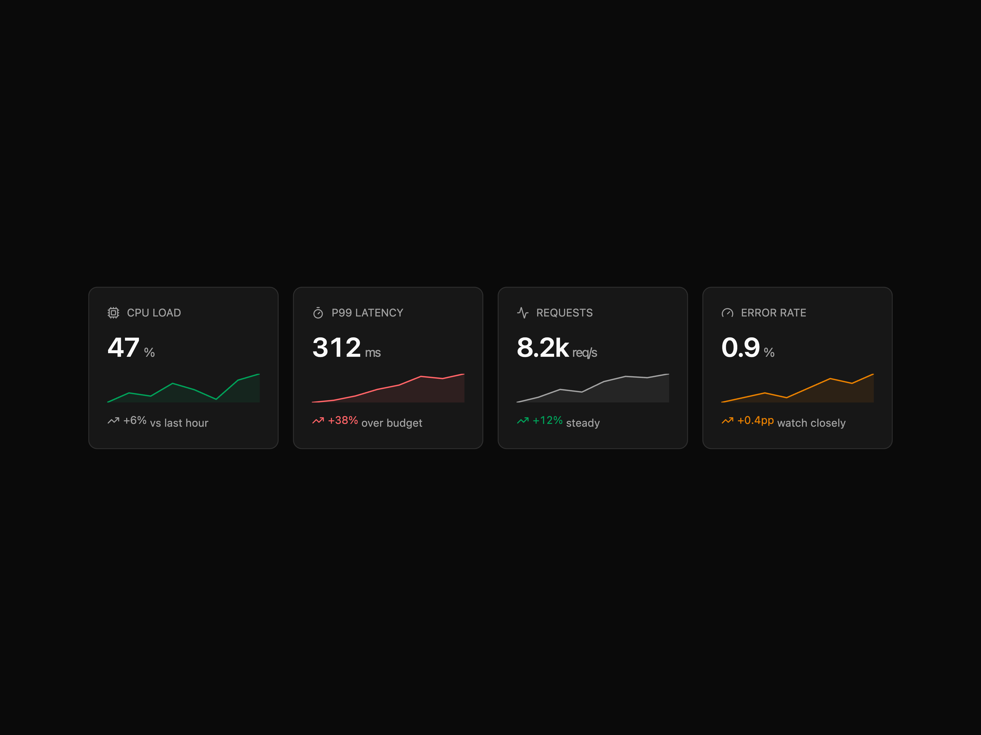
  • Metric CardMetric Card

    Metric Card

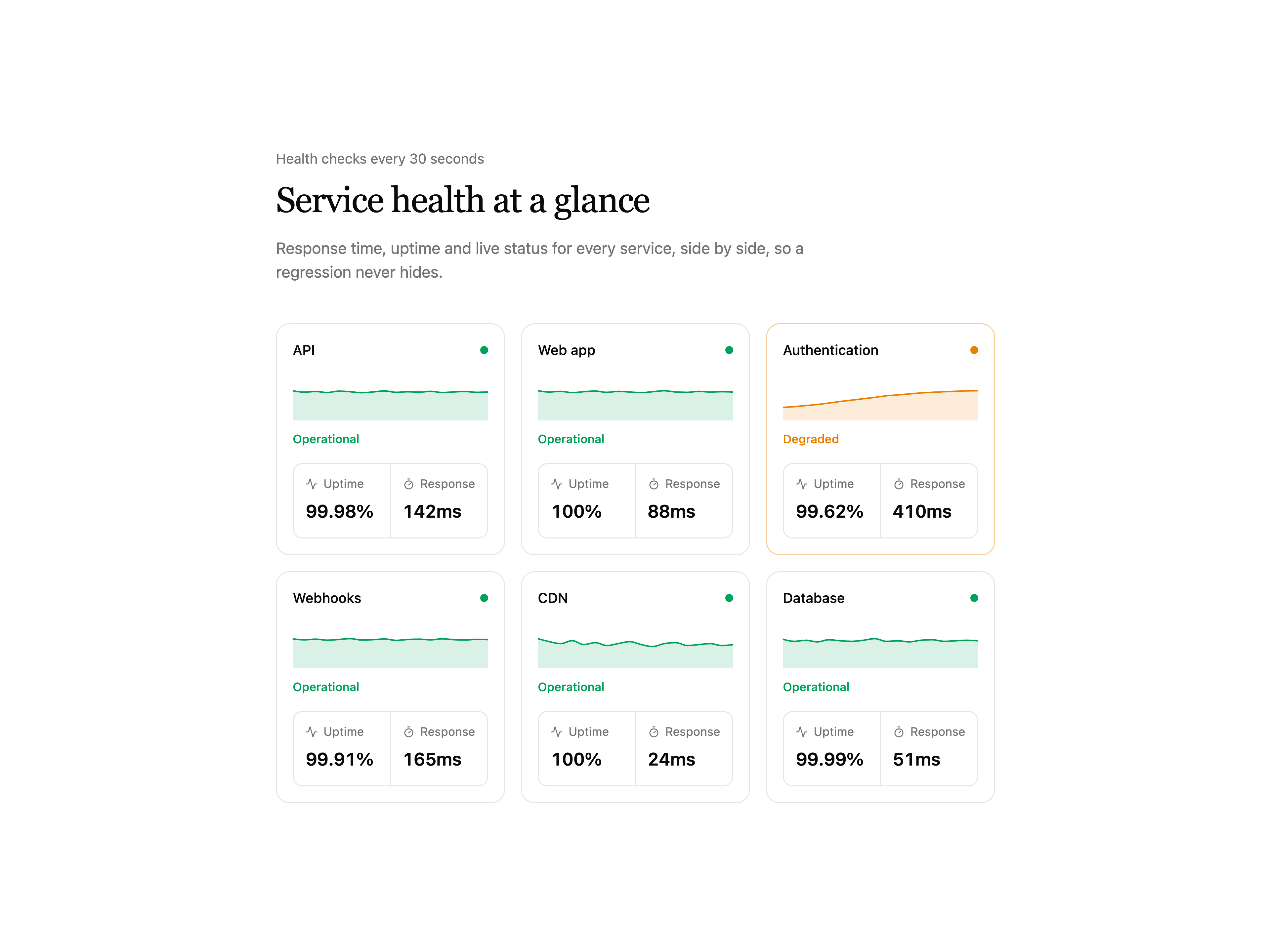
  • Service Health Grid

    Service Health Grid

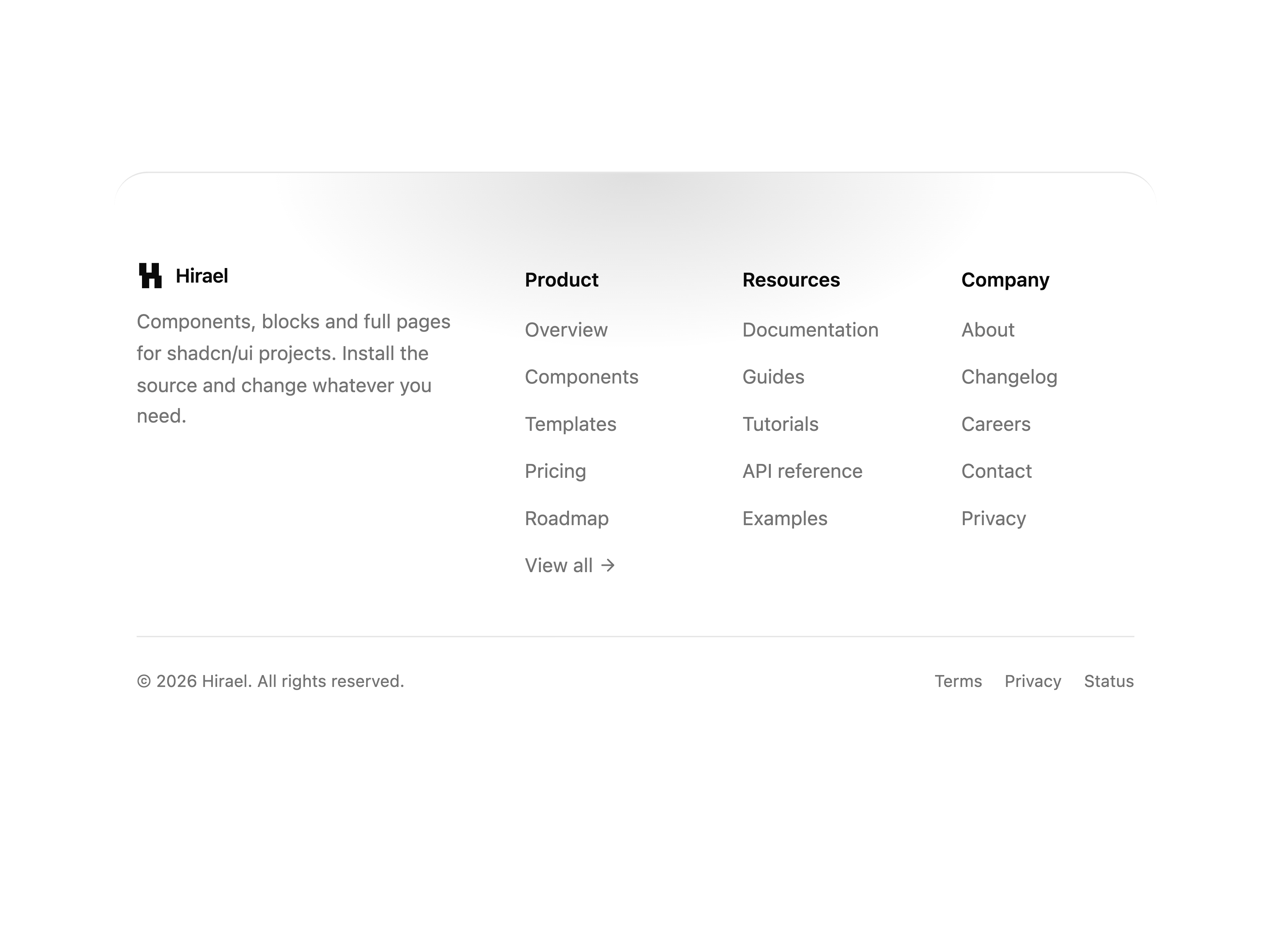
  • Rounded Top FooterRounded Top Footer

    Rounded Top Footer

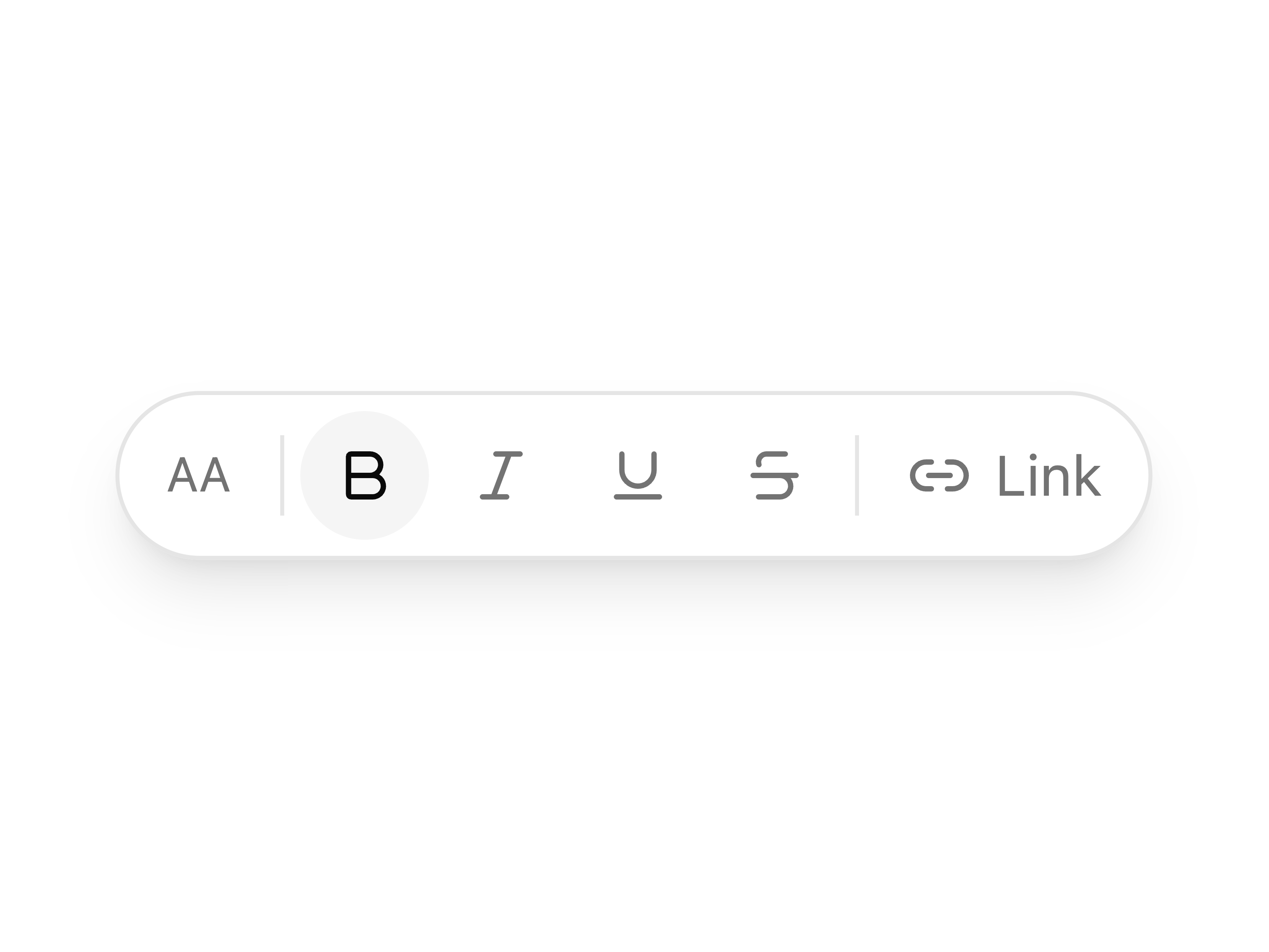
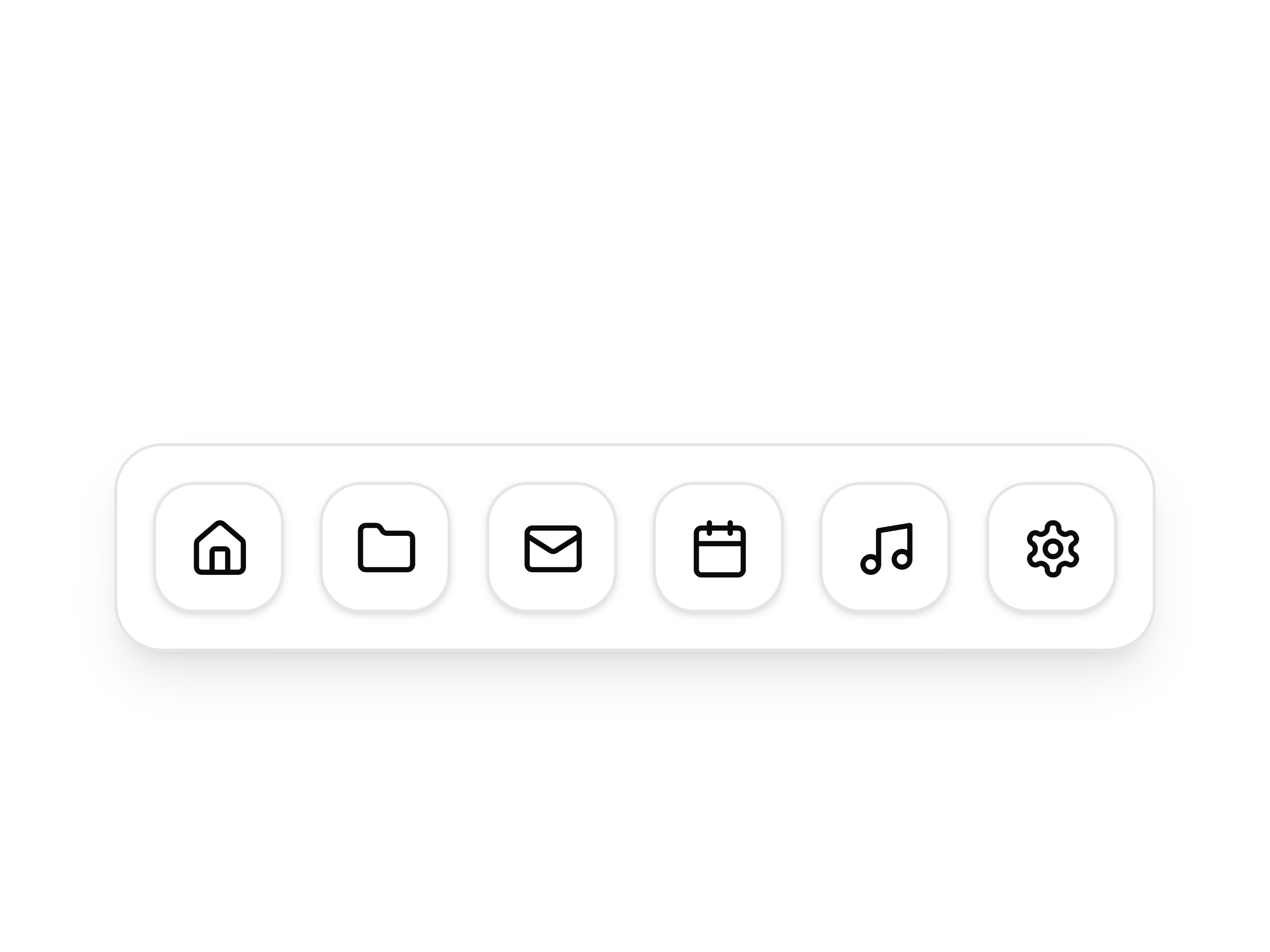
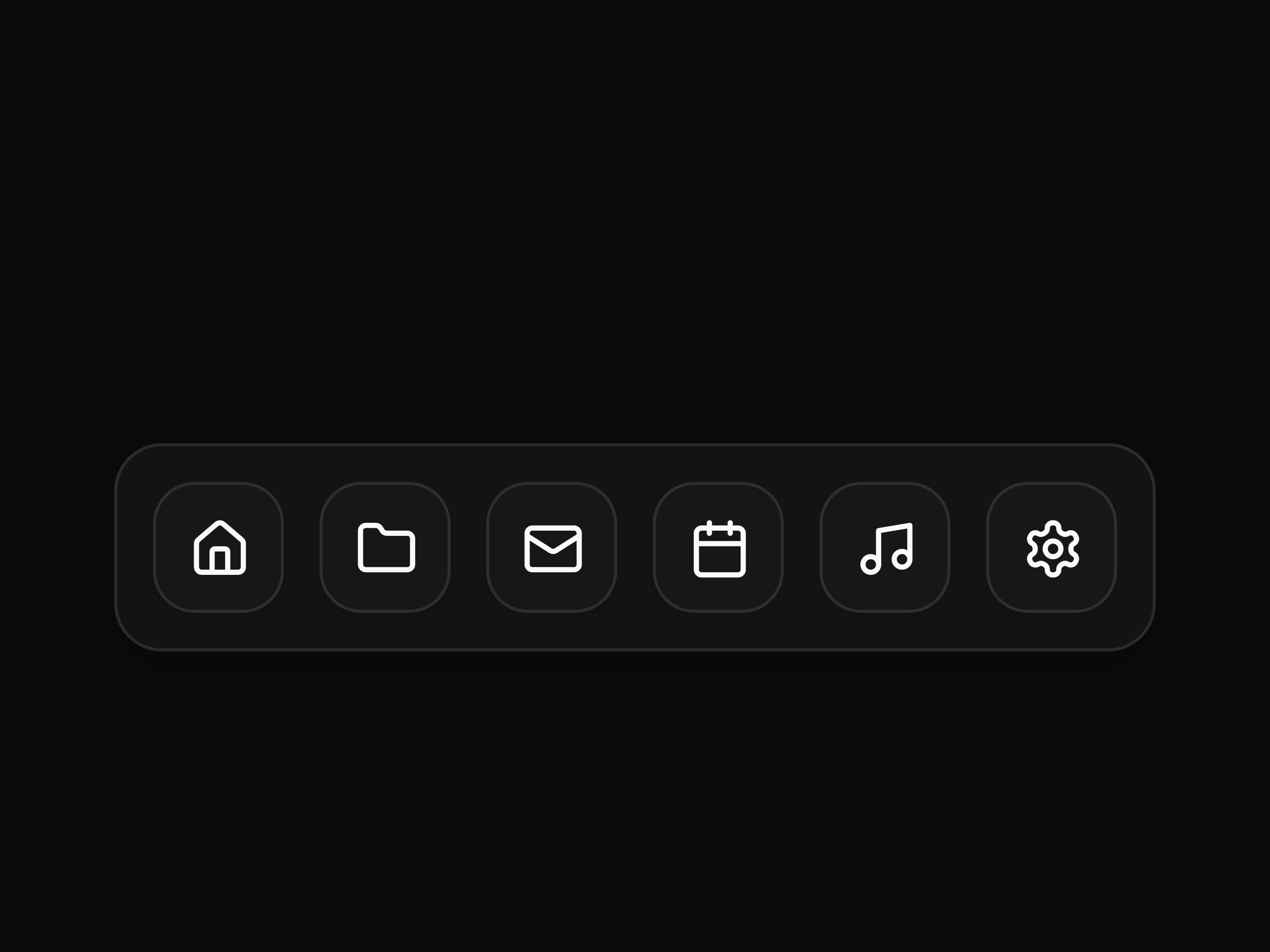
  • Floating ToolbarFloating Toolbar

    Floating Toolbar

  • DockDock

    Dock

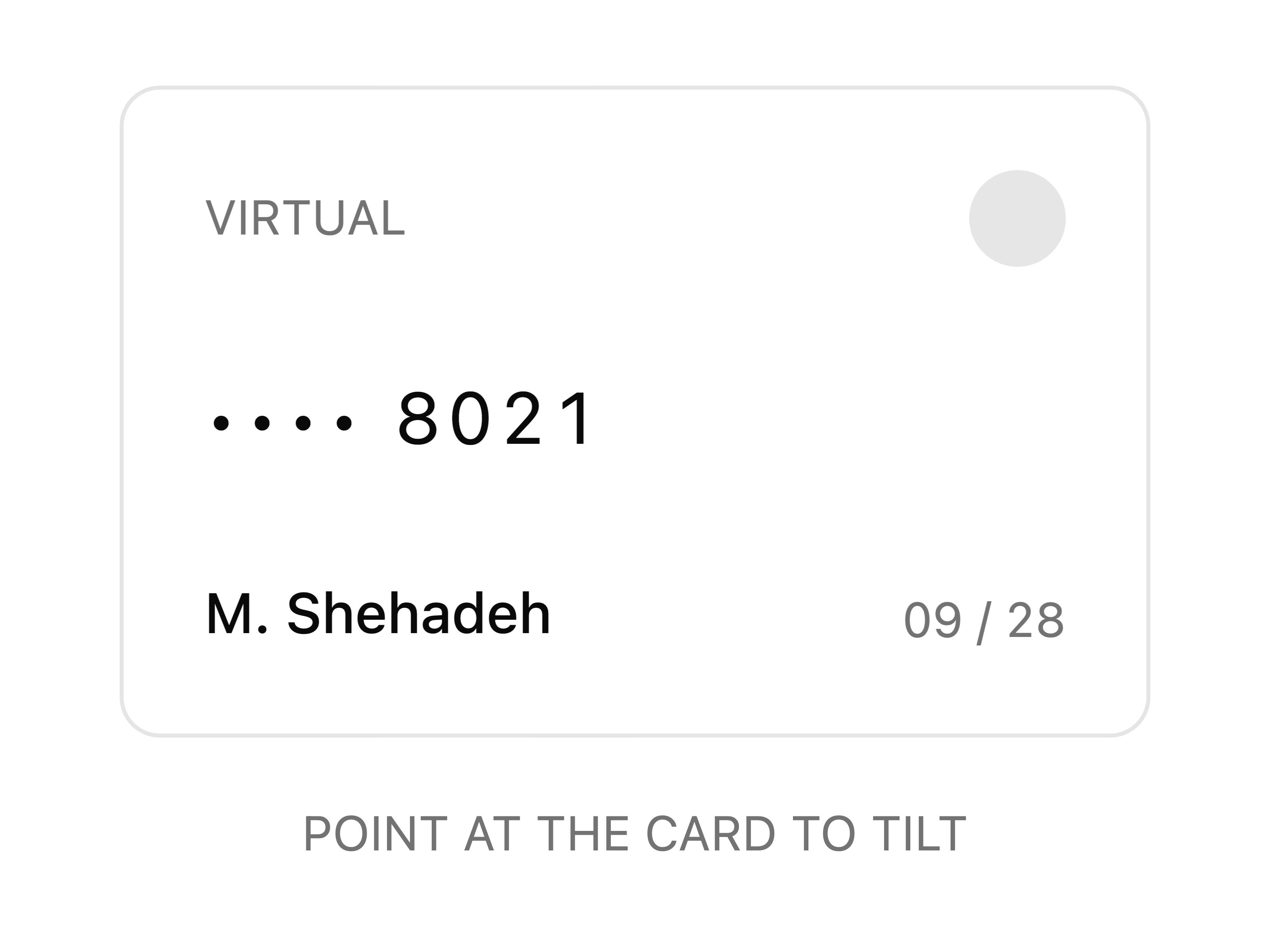
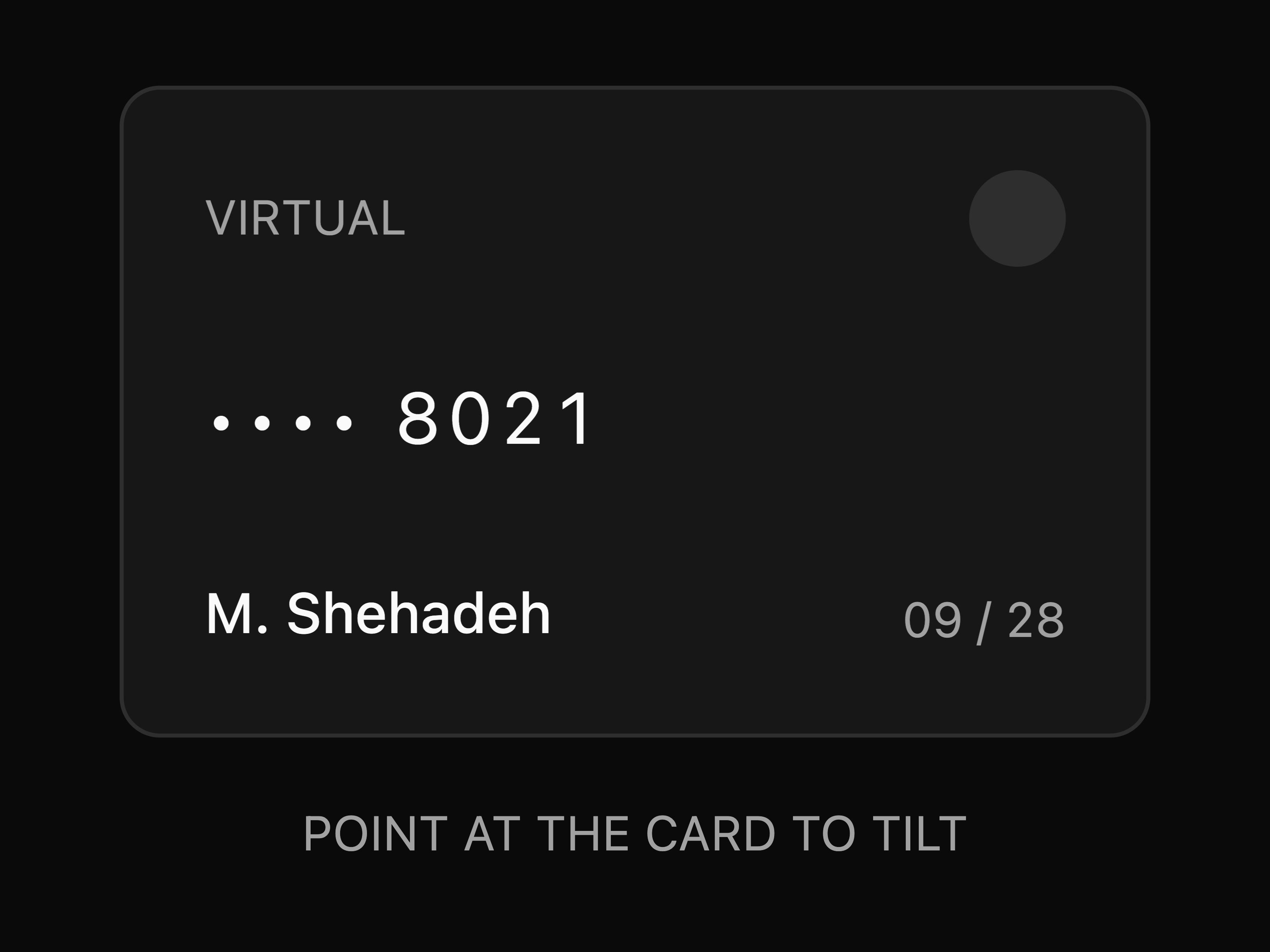
  • Tilt CardTilt Card

    Tilt Card

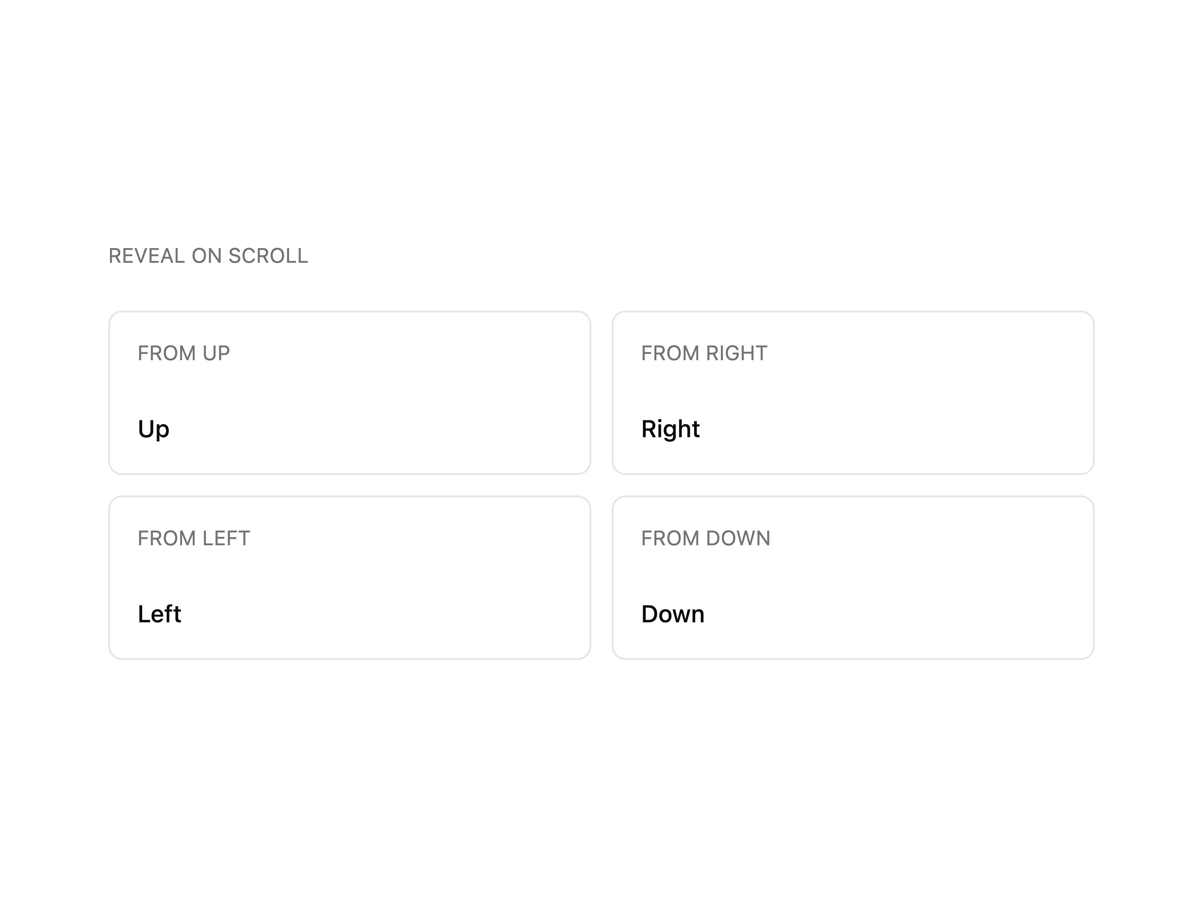
  • Scroll RevealScroll Reveal

    Scroll Reveal

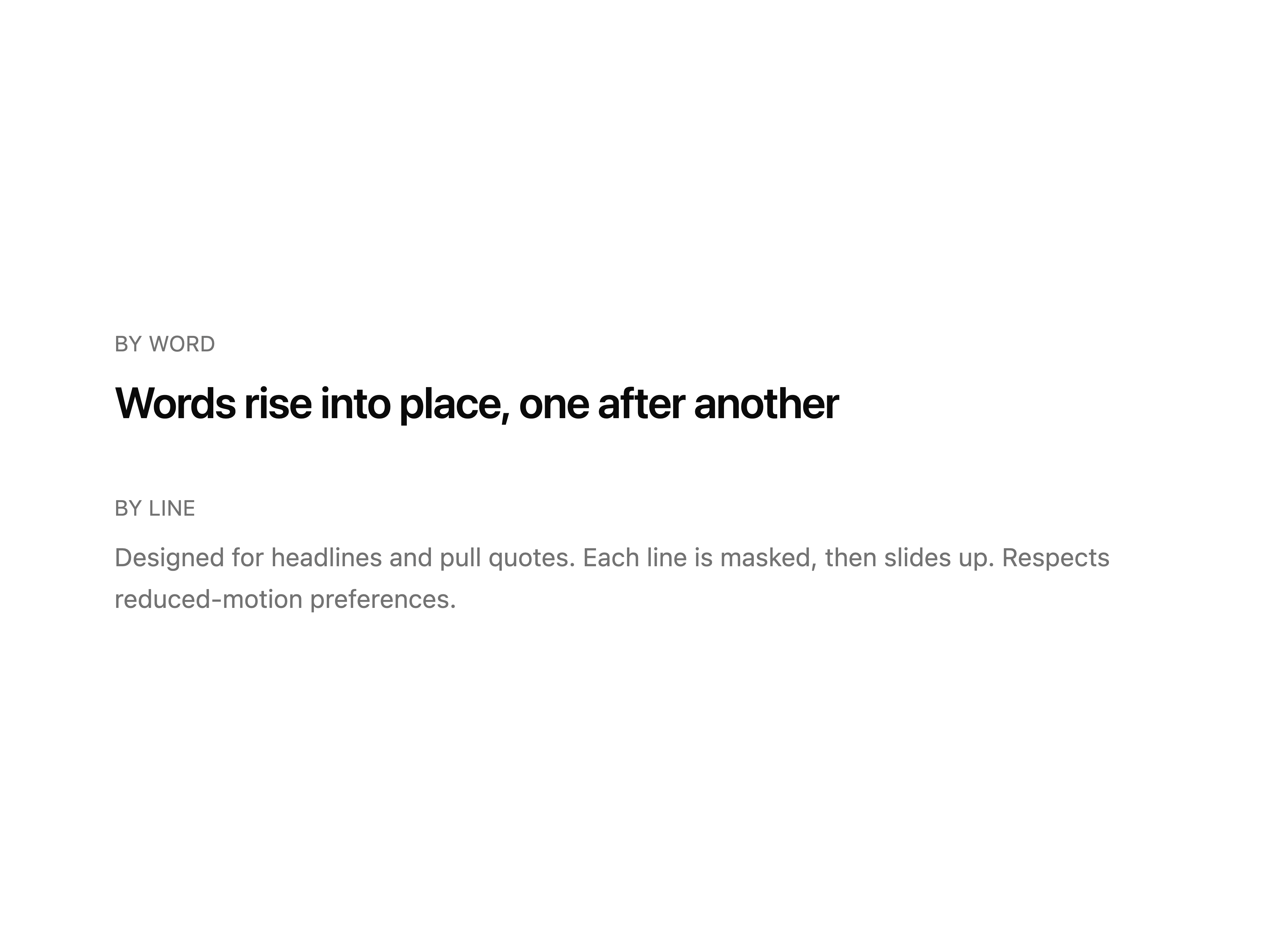
  • Text RevealText Reveal

    Text Reveal

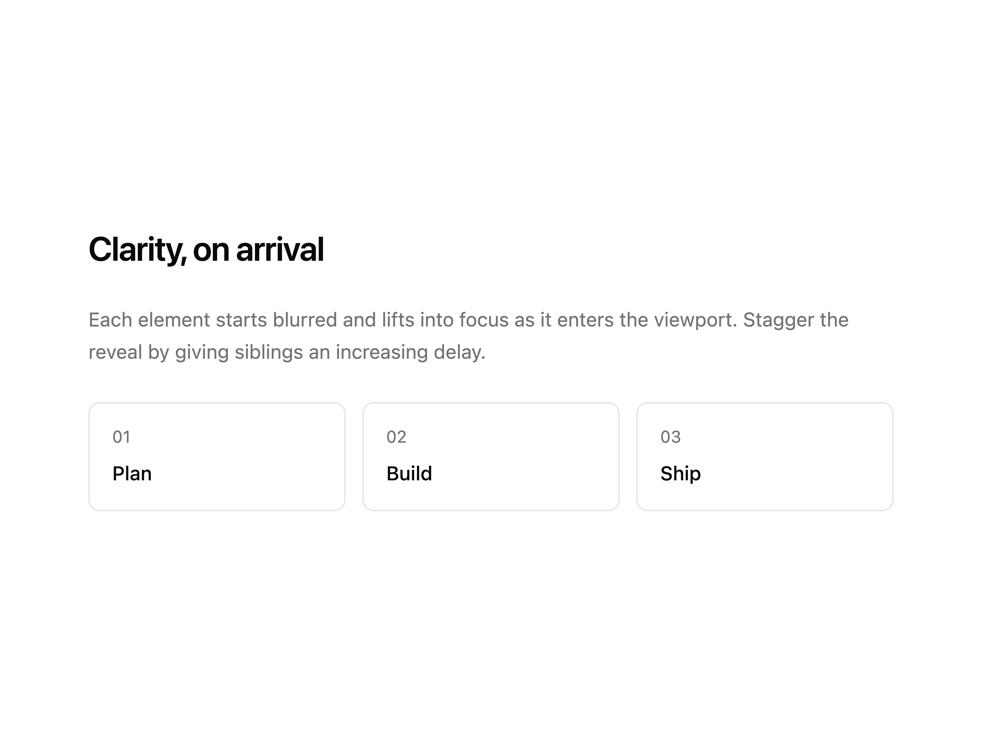
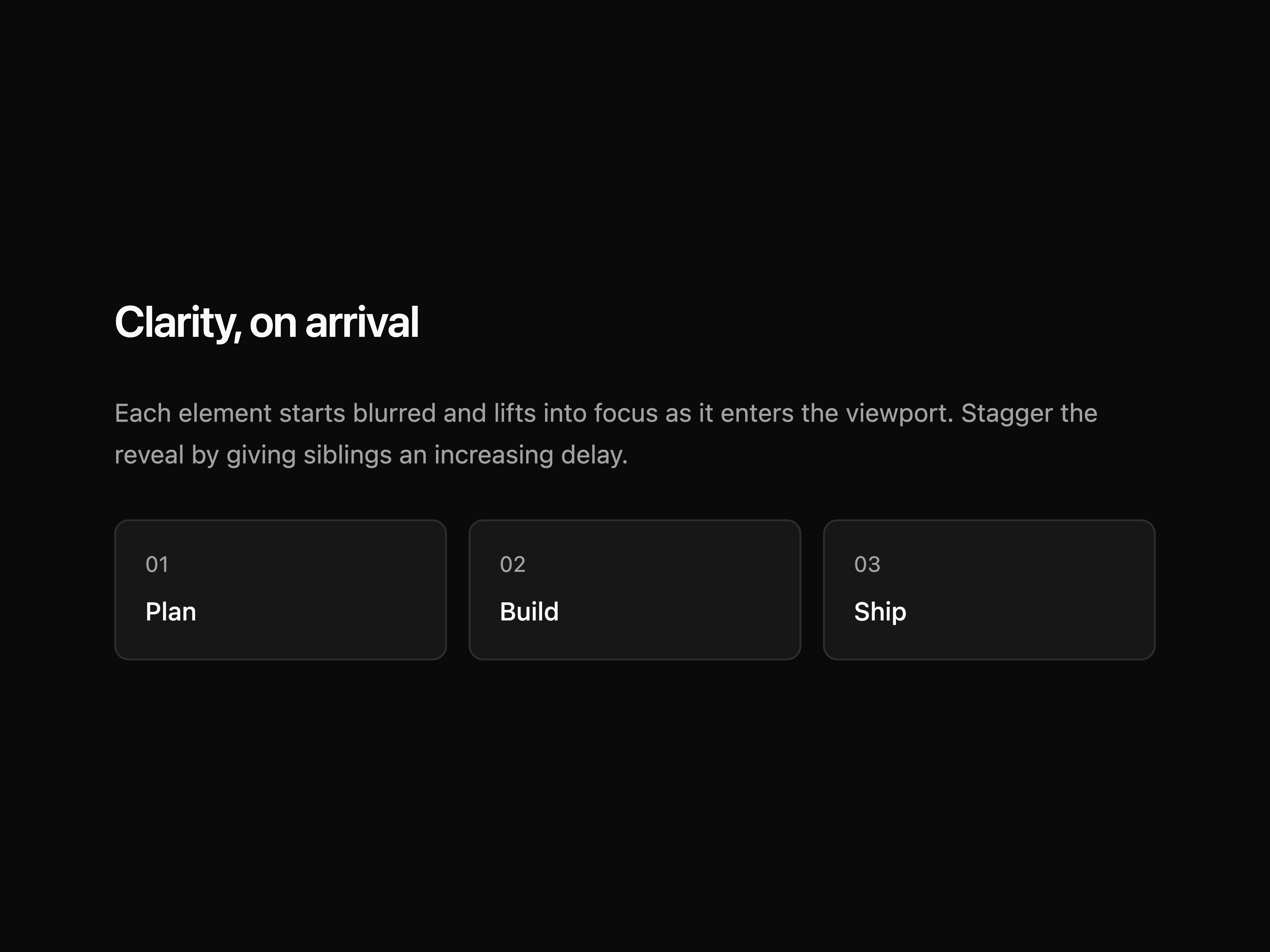
  • Blur RevealBlur Reveal

    Blur Reveal

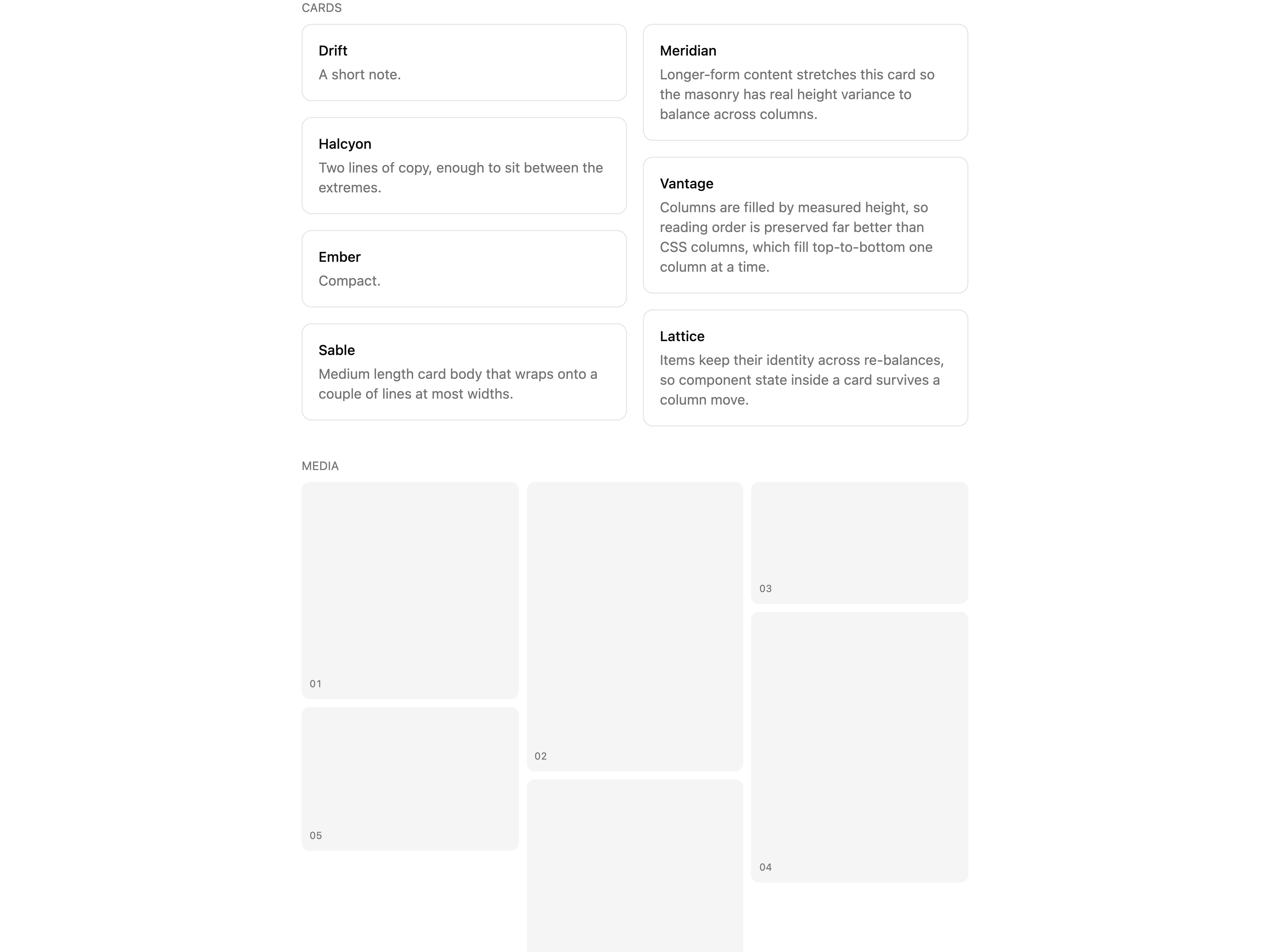
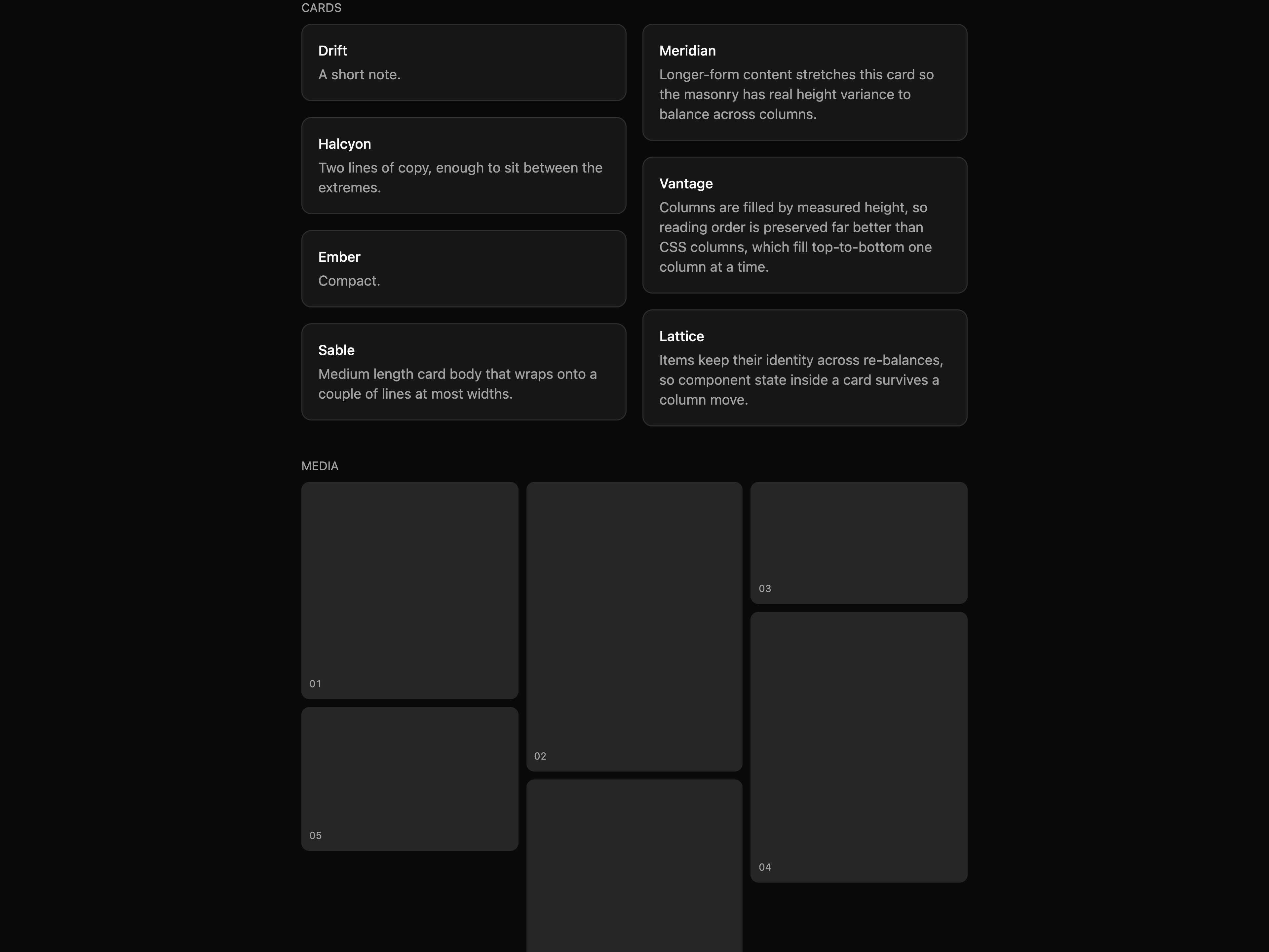
  • MasonryMasonry

    Masonry

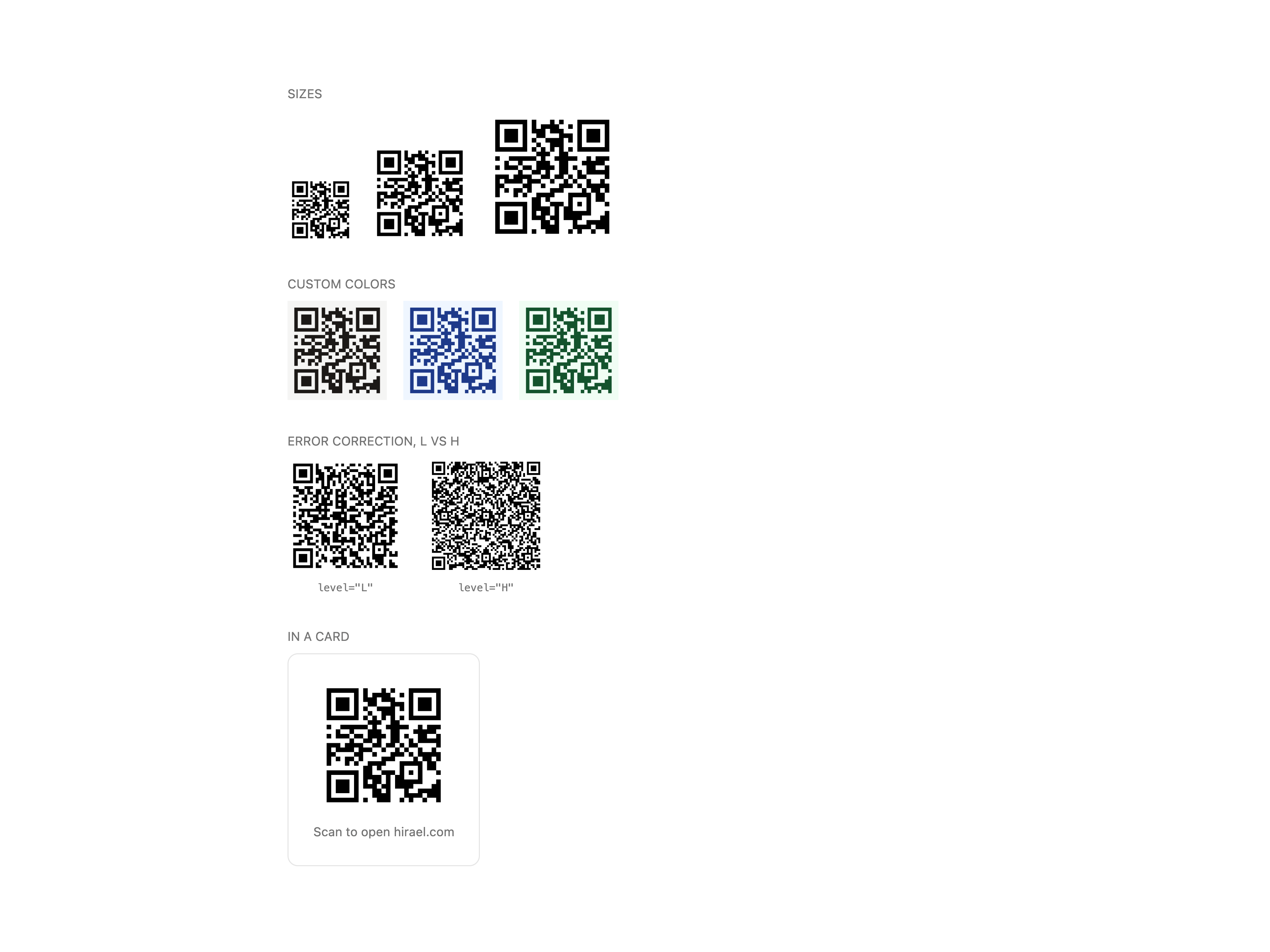
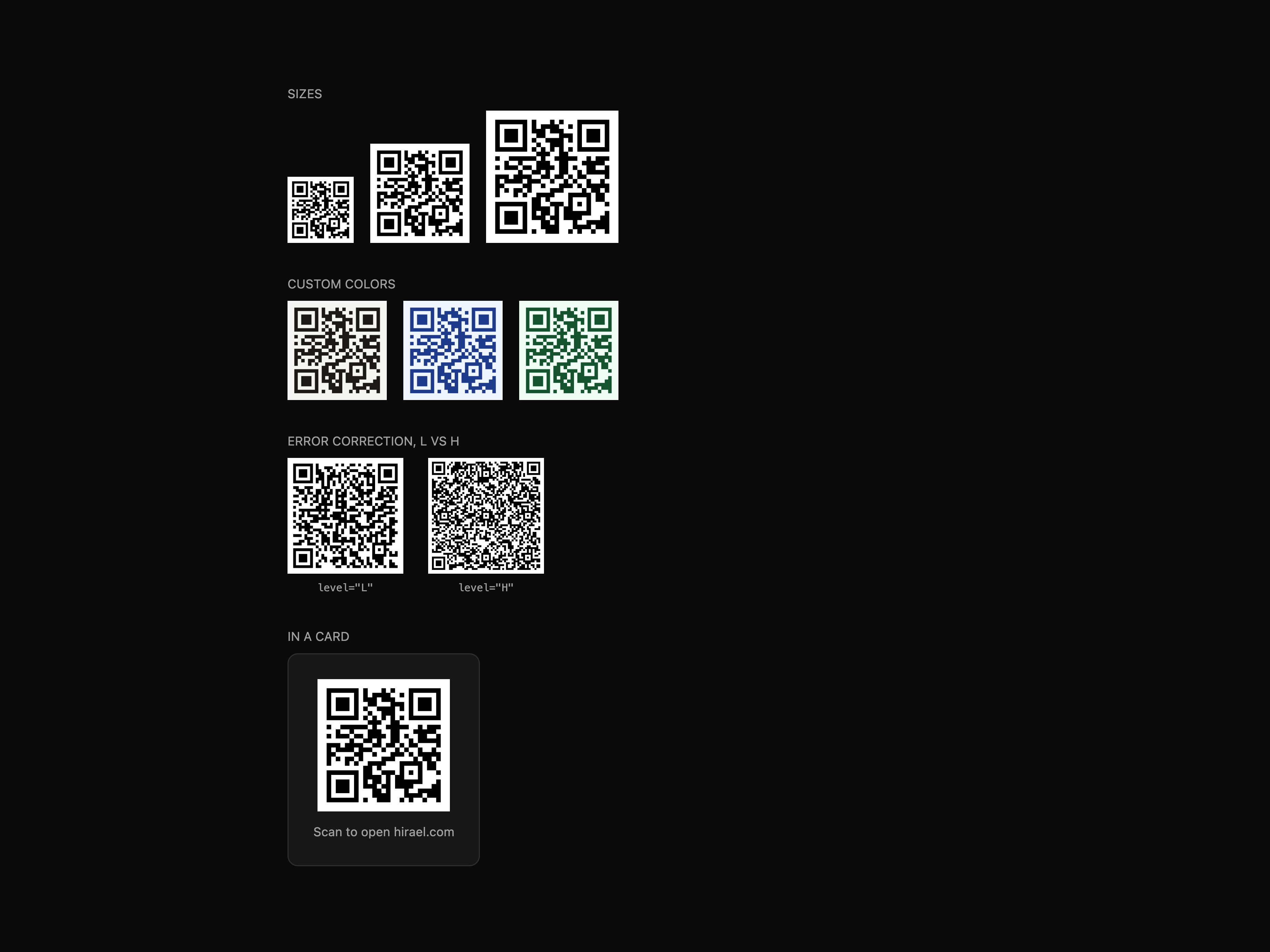
  • QR CodeQR Code

    QR Code

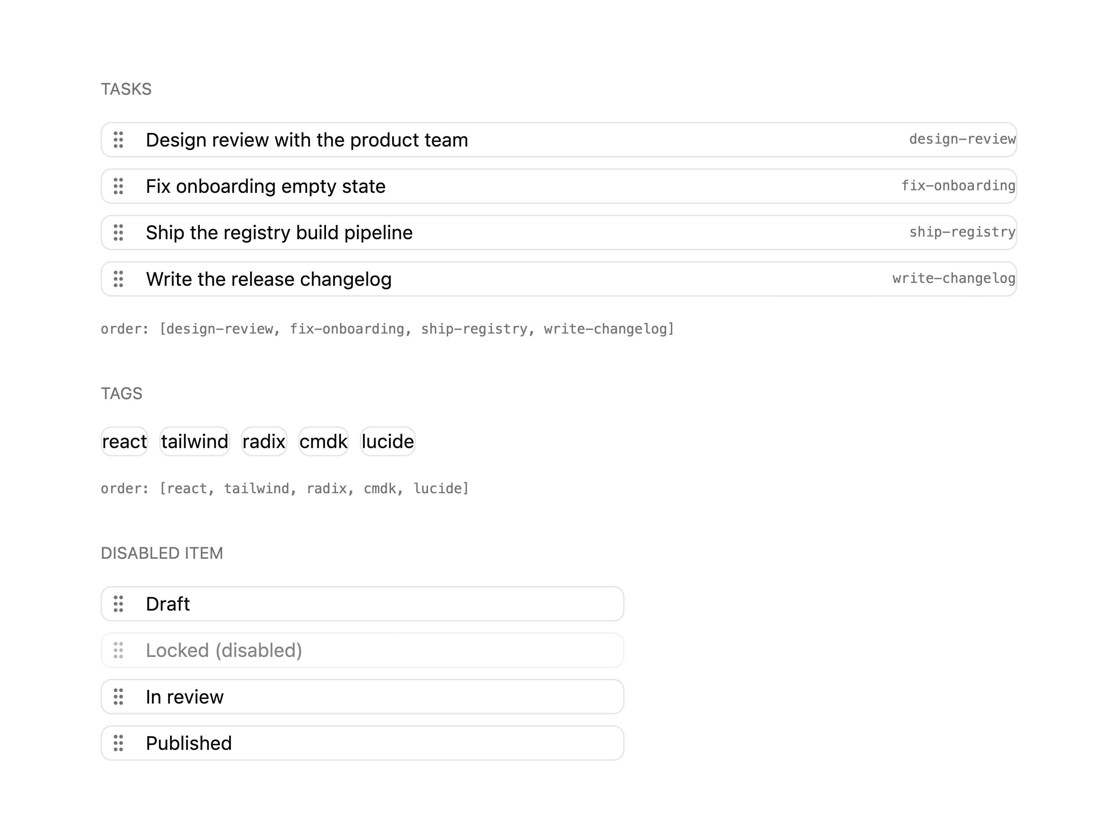
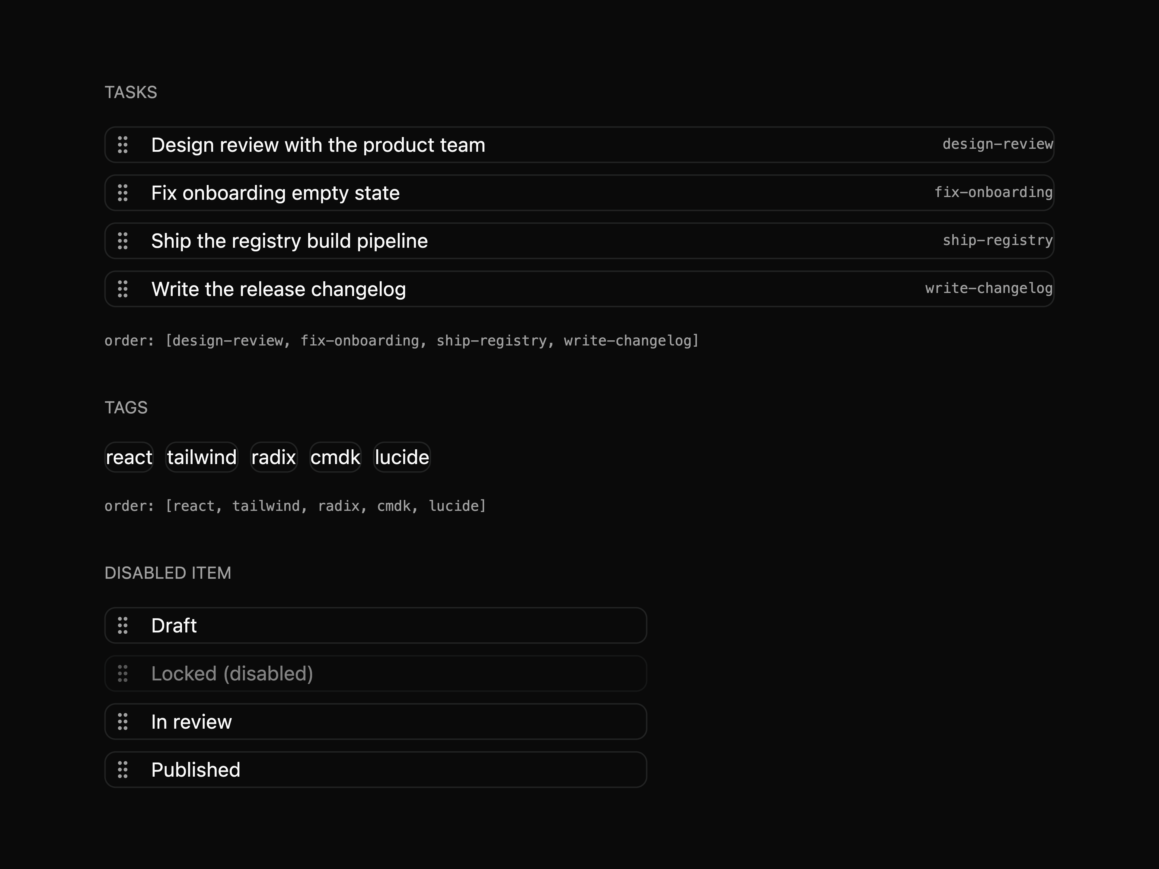
  • SortableSortable

    Sortable

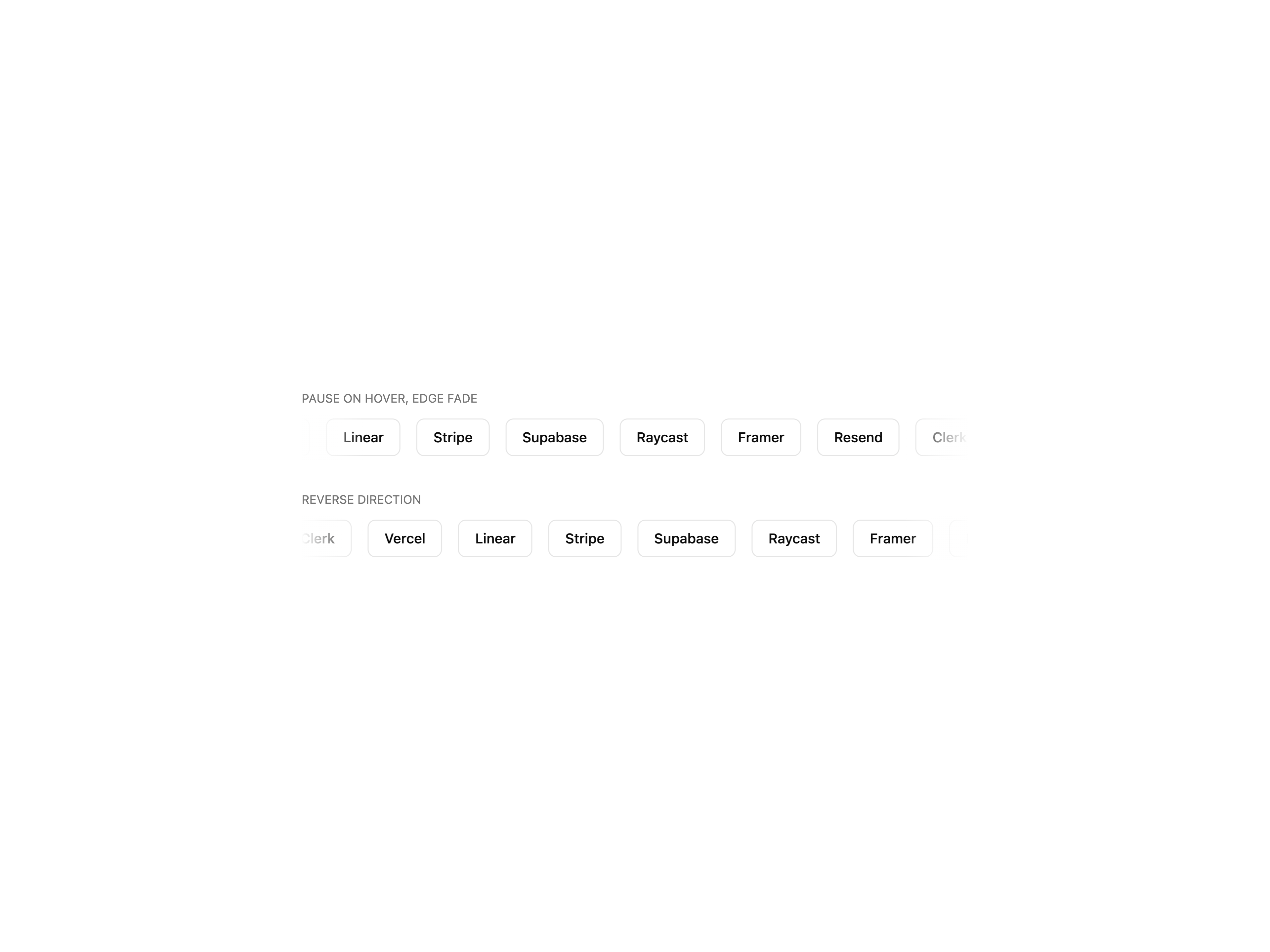
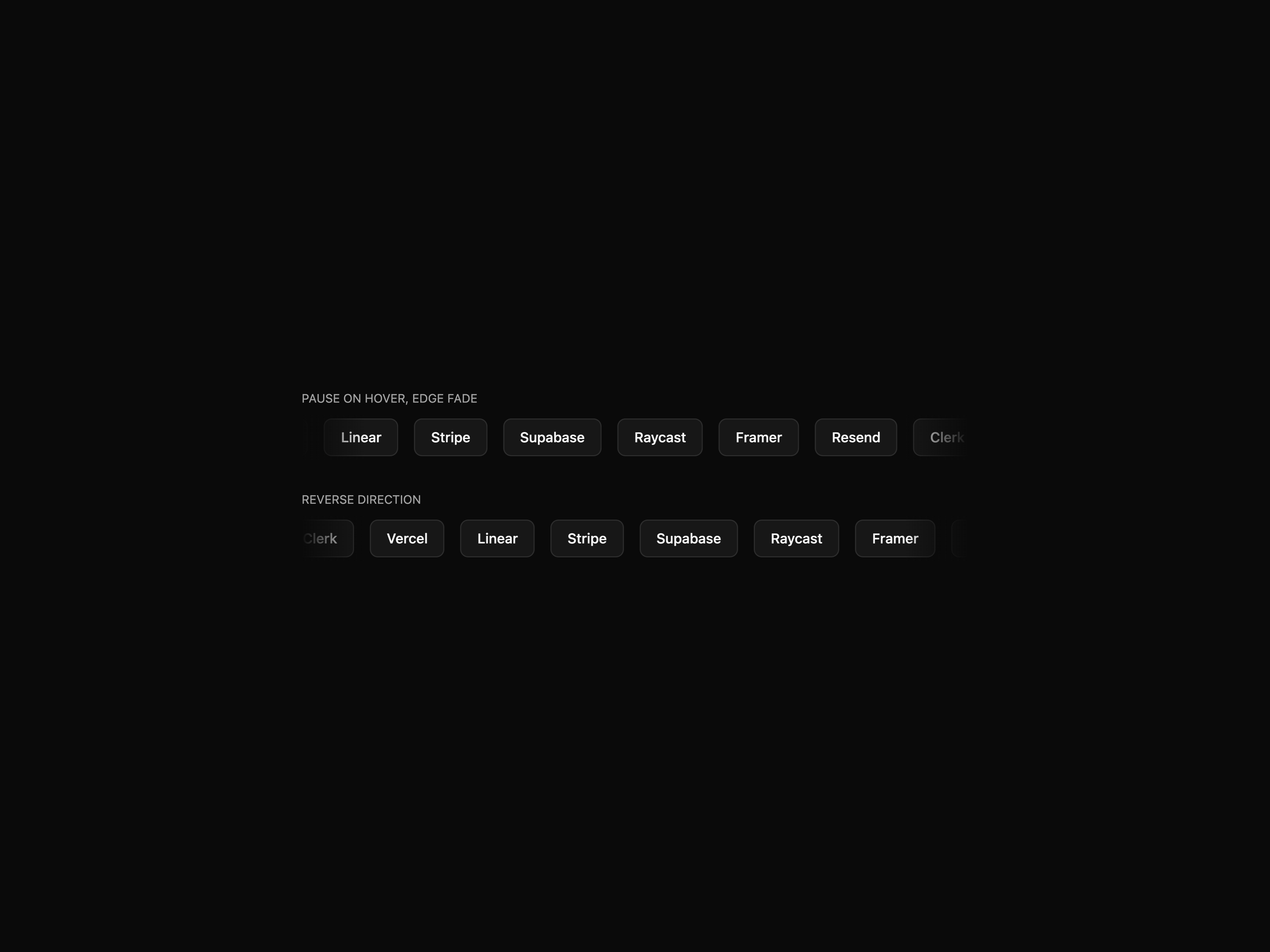
  • MarqueeMarquee

    Marquee

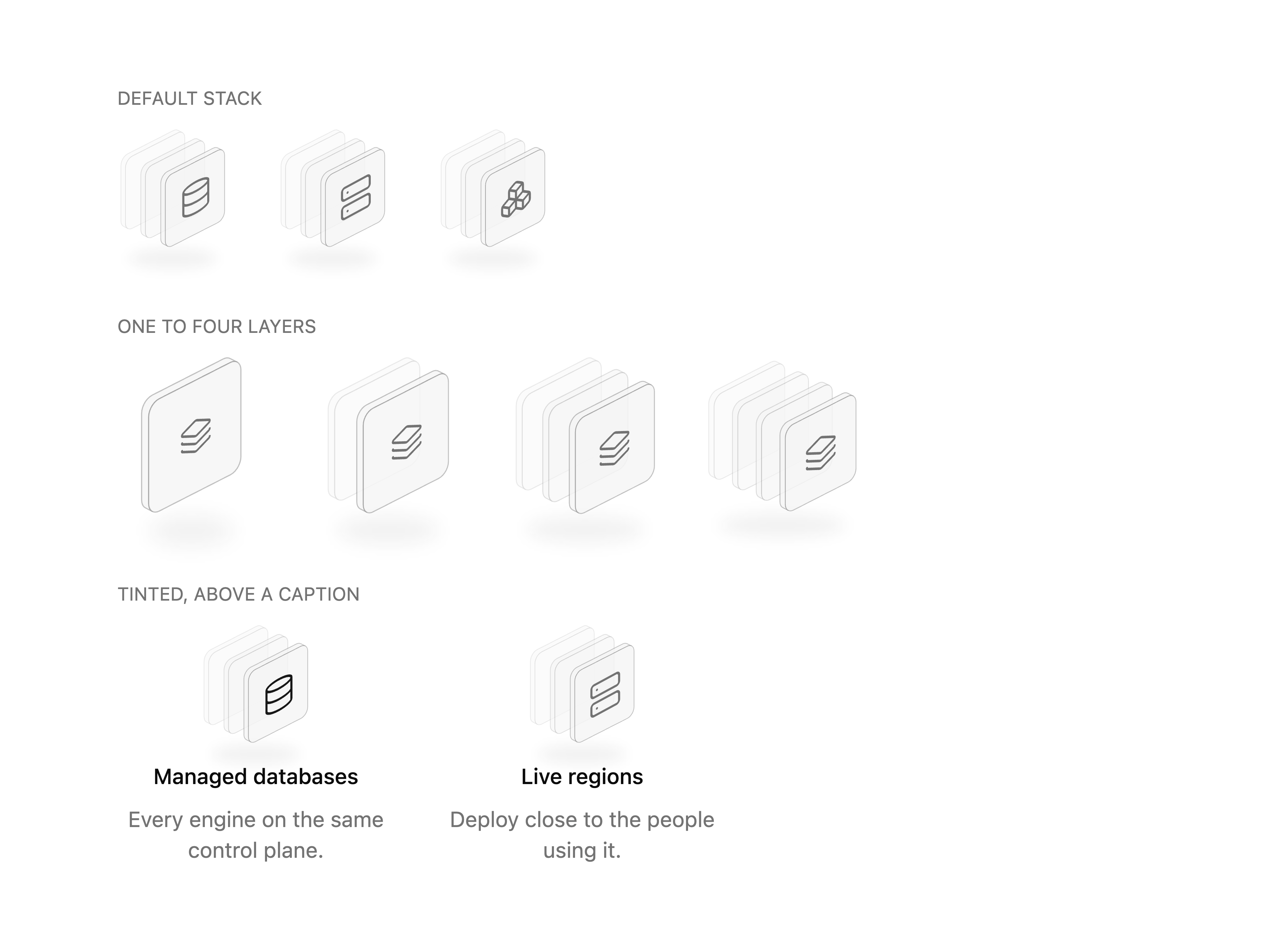
  • Icon Stack

    Icon Stack

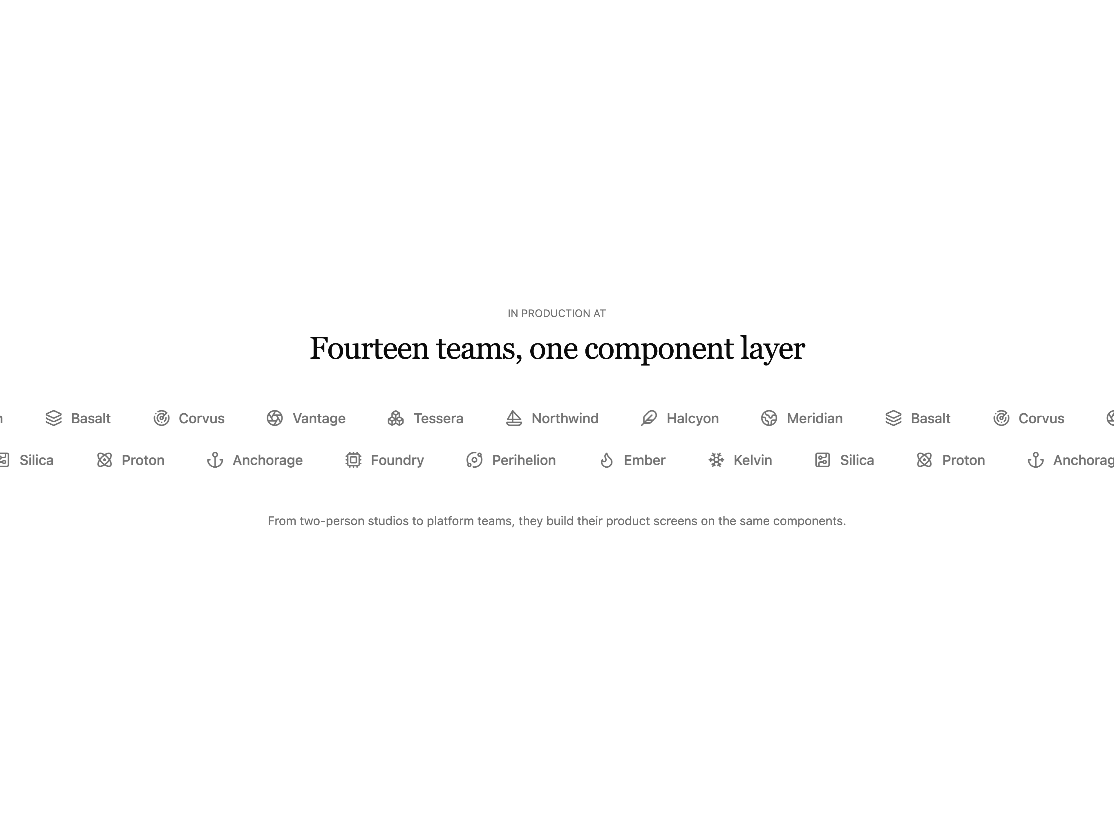
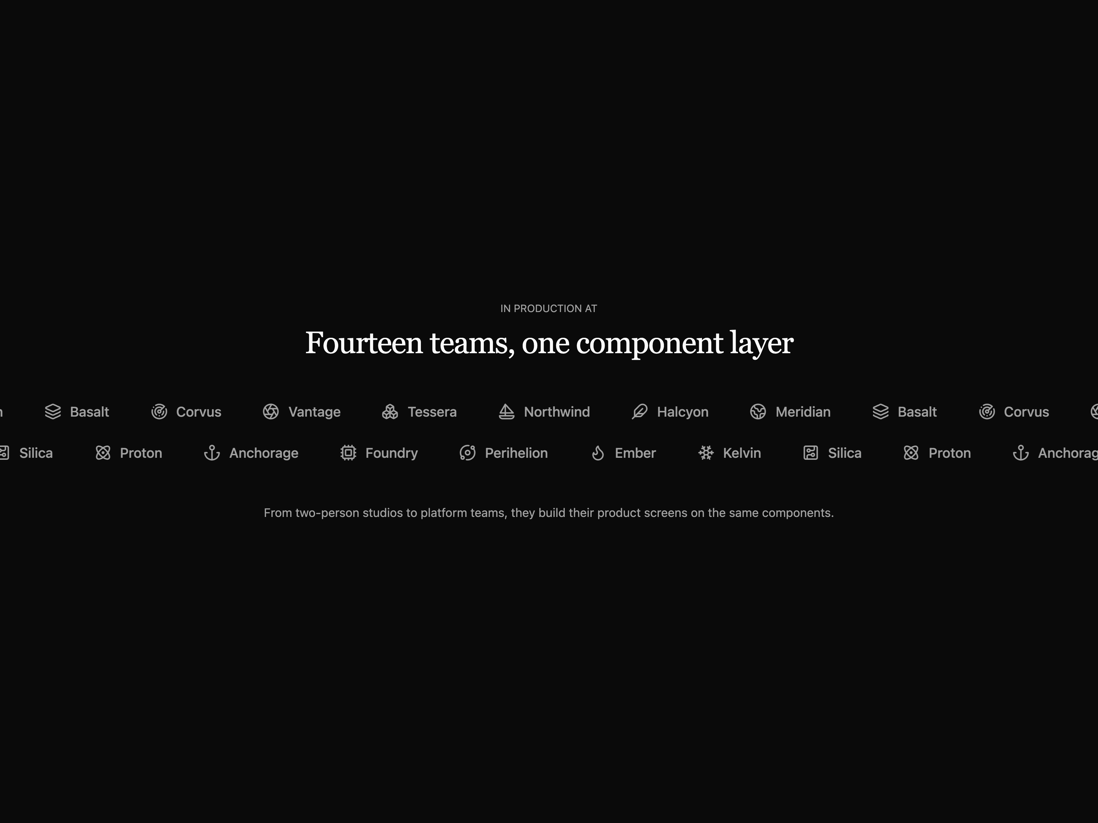
  • Marquee Logo CloudMarquee Logo Cloud

    Marquee Logo Cloud

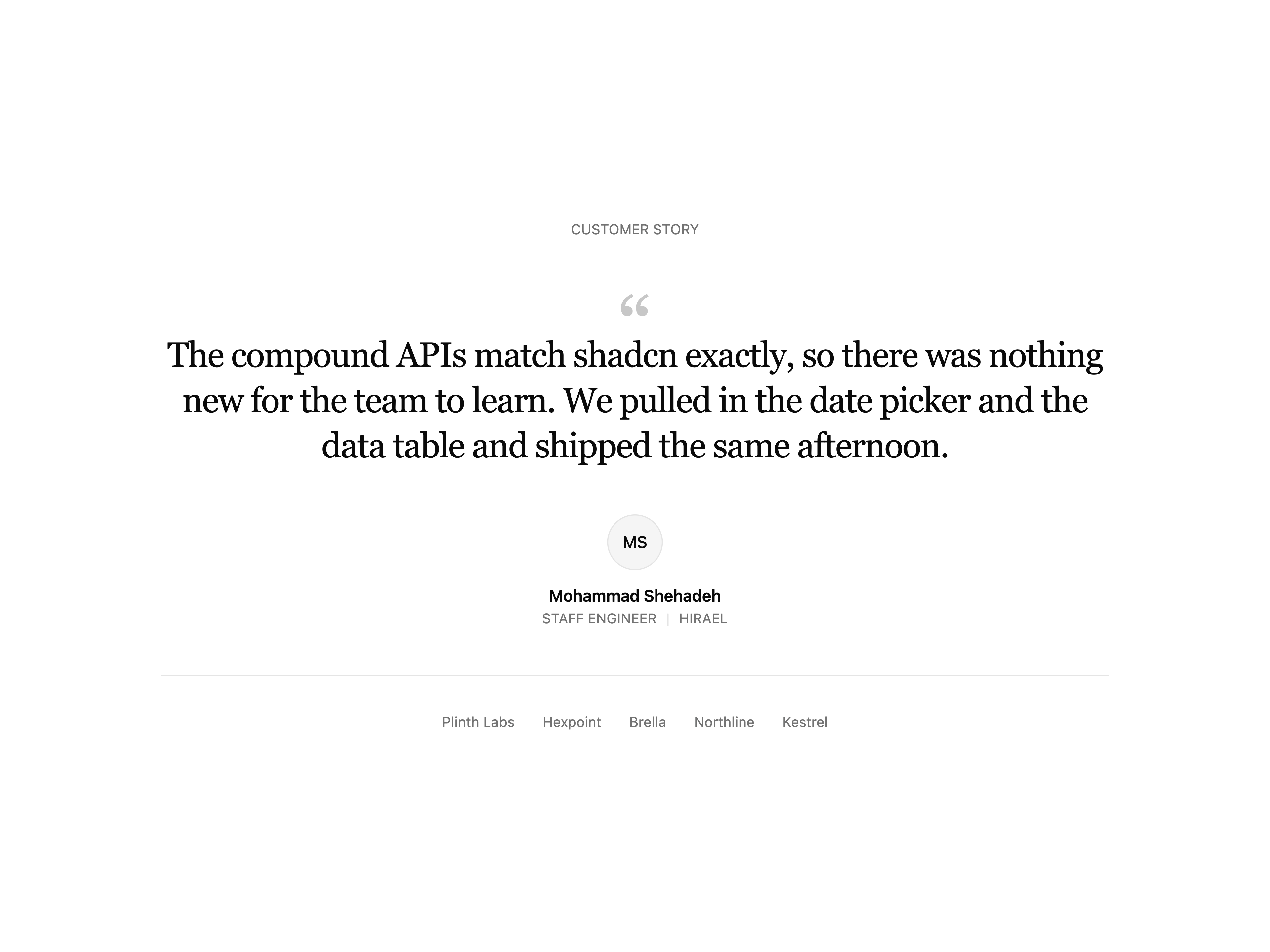
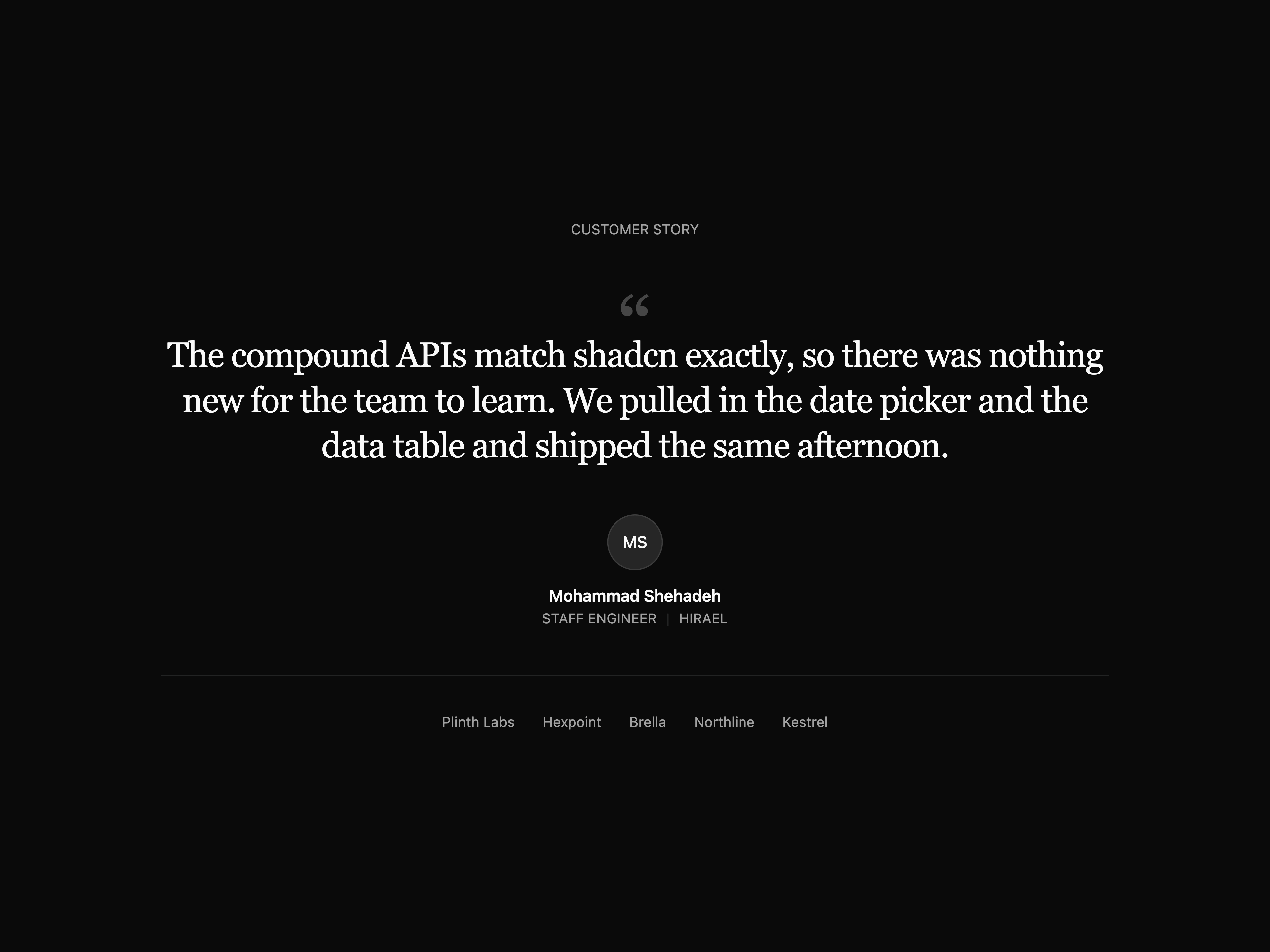
  • Single Quote TestimonialSingle Quote Testimonial

    Single Quote Testimonial

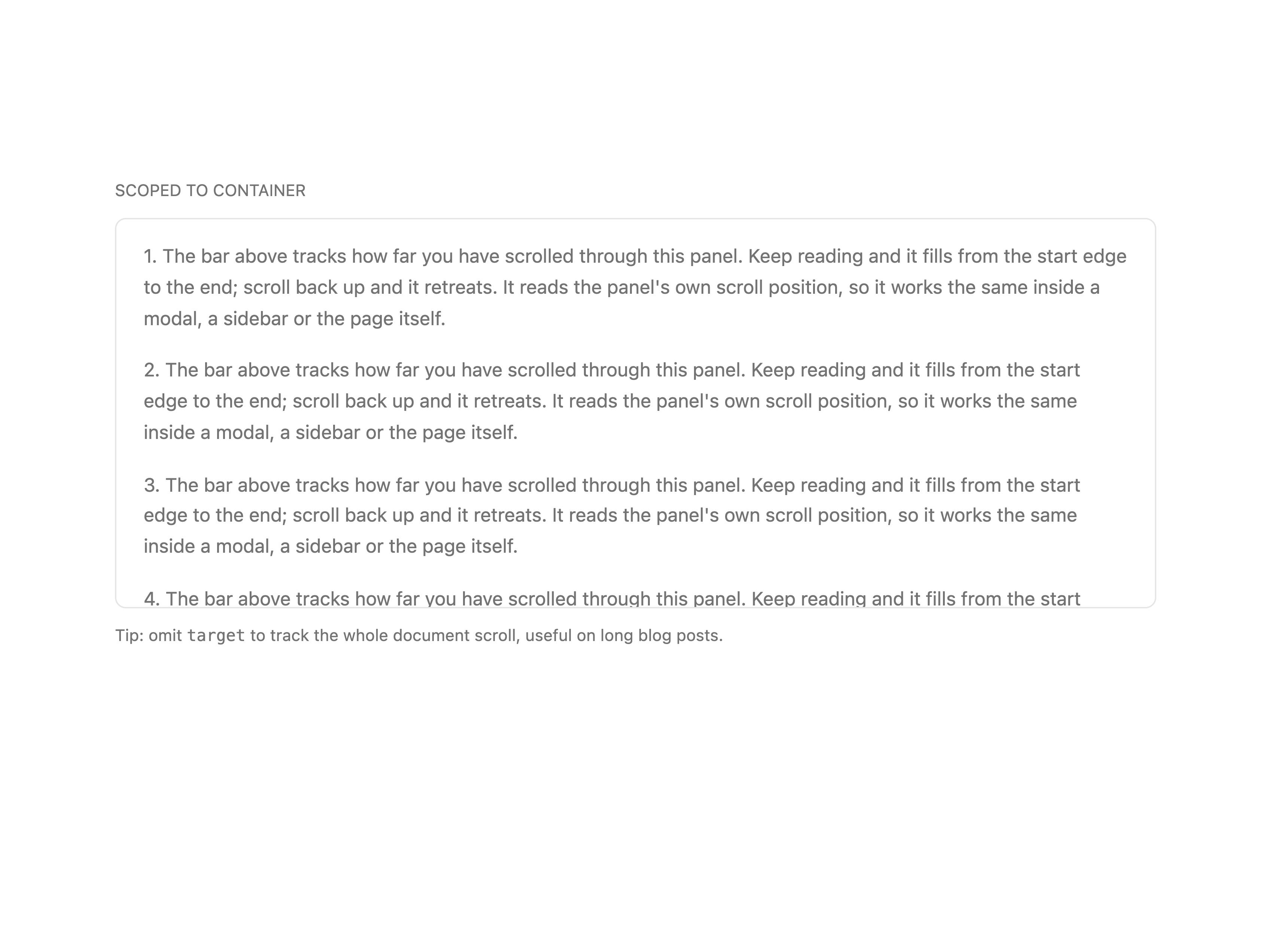
  • Scroll Progress

    Scroll Progress

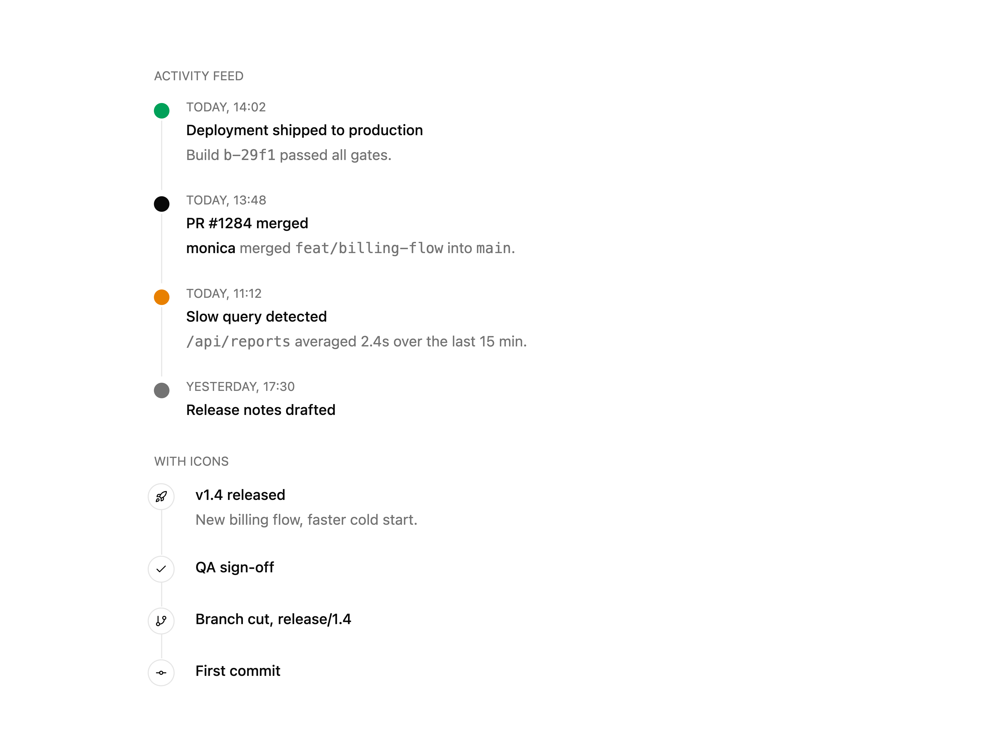
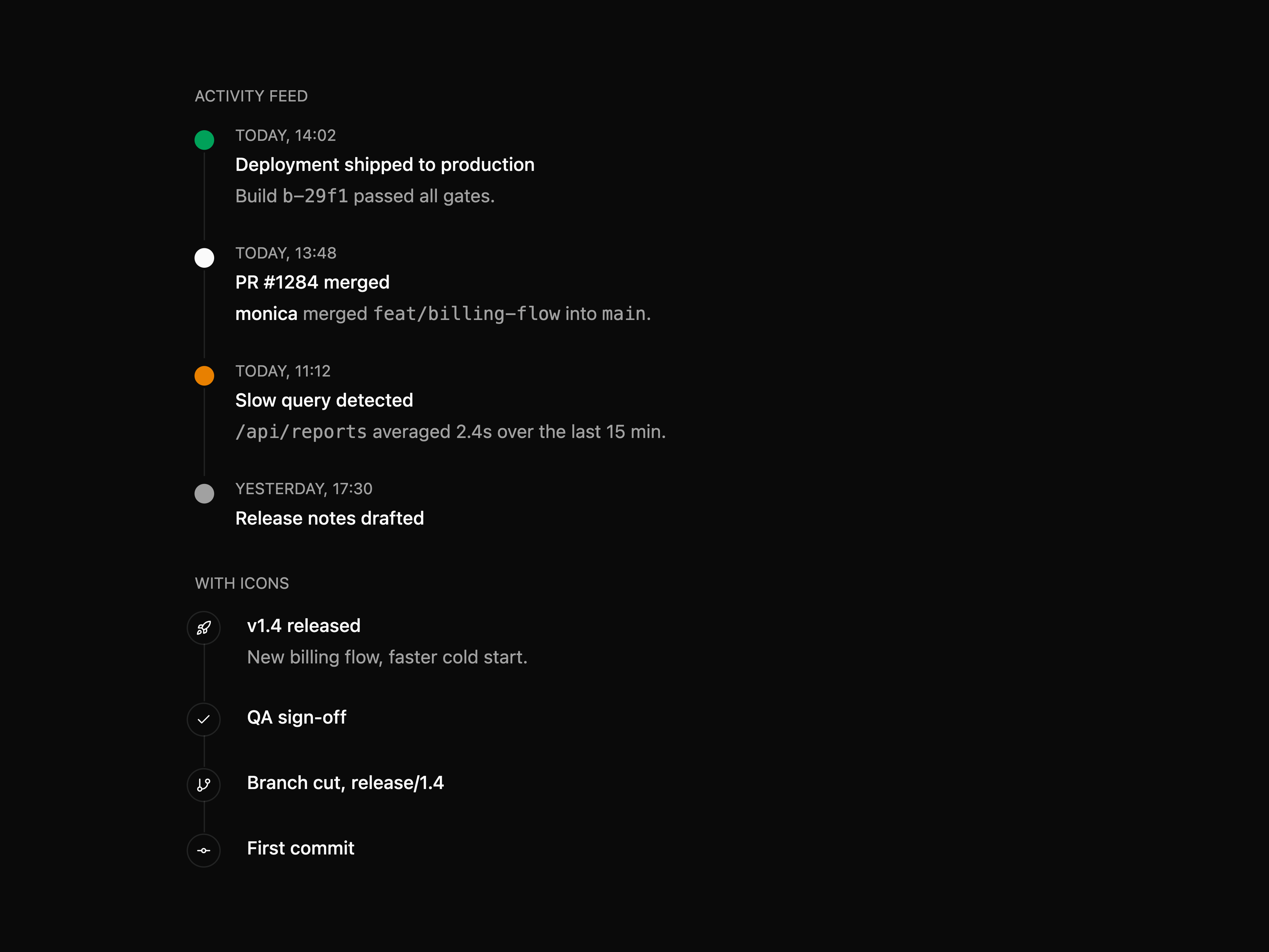
  • TimelineTimeline

    Timeline

  • Floating Tiles IntegrationsFloating Tiles Integrations

    Floating Tiles Integrations

  • Logo Row IntegrationsLogo Row Integrations

    Logo Row Integrations

  • About Hirael

    Hirael publishes a shadcn registry at hirael.com, with 296 components installable through the shadcn CLI.

    Components
    296
    GitHub stars
    39
    Last commit
    Oct 24, 2026
    Repository
    MohammadShehadeh/hirael

    Also in the Hirael registry

    Copy a prompt for your agent, copy the install command, or open the docs that ship it.

    • address-input

      field, input
    • Agency Landing

      agency-landing

      Bright, shader-lit agency landing page: a full-viewport hero with an animated WebGL backdrop and pill navigation, an editorial about section, a featured-work grid of autoplaying video cards, and a dark closing footer with a call to action. Built on the shaders package, with a self-contained light palette.

      lucide-react, shaders7 files
    • akor

      button
    • Animated Number

      animated-number

      Count-up number that tweens to its target with easing, Intl formatting (currency, compact, percent), prefix/suffix and reduced-motion support.

      1 file
    • App Shell 1

      app-shell-01

      Drop-in admin shell layout built on the shadcn Sidebar primitive: collapsible icon-rail sidebar with nav badges and a footer profile row, sticky topbar with breadcrumb, command-palette search and notification button, plus a live-filtering accounts table in the main area.

      lucide-react1 file
    • App Shell 3

      app-shell-03

      Split-pane inbox shell: icon rail with unread indicator, searchable conversation list with an unread filter, and a reading pane with star toggle and a reply composer that appends to the thread.

      lucide-react1 file
    • App Shell 4

      app-shell-04

      Starter shell on the shadcn Sidebar primitive (inset variant): workspace switcher and ⌘K search in the rail, icon-collapsible nav with tooltips, an inset header with trigger, notification count and avatar, and a welcome heading over dashed placeholder slots.

      lucide-react1 file
    • app-shell-06

      breadcrumb, direction, separator, sidebar
    • Asme

      Dark, liquid-glass marketing landing page: a full-viewport hero with a cross-fading background video, a frosted glass pill nav and an inline email form, then scroll-revealed about, featured-video, philosophy and services sections, closing on a multi-column footer. Framer Motion throughout, with a self-contained pure-black palette and Instrument Serif accents.

      lucide-react, motion11 files
    • Audio Player

      audio-player

      Composable audio player with play/pause, scrub-safe seek with buffered tint, skip, time readouts, volume and playback rate.

      lucide-react1 file
    • aurael

      button
    • autocomplete

      compose-refs, input-group, popover, spinner
    • bento-02

      avatar, button, input, switch
    • blog-02

      button, empty, tabs
    • bottom-nav

    • Calendar Heatmap

      calendar-heatmap

      GitHub-style contribution heatmap with month and weekday labels, tooltips, configurable intensity scale and a legend.

      tooltip1 file
    • chat-04

      avatar, button, dropdown-menu, empty
    • checkbox-group

      checkbox, input-group, label
    • comment-thread

      avatar, button, popover, textarea
    • Confirm

      Imperative confirmation dialog: a root provider plus a useConfirm hook that resolves a promise on confirm or cancel. Default or destructive tone, an optional icon, and an async confirm action with a pending spinner.

      alert-dialog, button, spinner1 file
    • Copy Button

      copy-button

      Click-to-copy button with copied feedback, icon-only or labelled, ghost / outline variants and a non-secure-context clipboard fallback.

      lucide-react1 file
    • Creative Studio

      creative-studio

      Dark, cinematic creative-studio landing page: a full-viewport hero with an animated backdrop and pull-up wordmark, a scroll-revealed about section, and a staggered feature-card grid. Framer Motion throughout, with a self-contained warm-cream palette.

      lucide-react, motion7 files
    • cron-editor

      button, field, input, native-select
    • Dashboard 1

      dashboard-01

      Operations dashboard with Tabs date-range switcher (1d / 7d / 30d / 90d), 4-up metric strip, weekly bar chart and a recent-activity feed. Data switches live with the range.

      lucide-react1 file
    • Date Range Picker

      date-range-picker

      Dual-month range picker with hover preview, presets, min/max bounds and keyboard nav. Includes an inline DateRangeCalendar, no date library.

      lucide-react1 file
    • description-list

    • empty-state-03

      badge, button, empty, skeleton
    • FAQ 2

      faq-02

      Centered heading with two-column accordion grid below. Each row tagged with a Qn index.

      1 file
    • file-card

      format-bytes
    • filter-builder

      button, calendar, command, dropdown-menu
    • Hero 6

      hero-06

      Centered personal hero: a live "available for work" badge, a serif headline with a primary-tinted emphasis span, a sub-line, a three-stat row with hairline dividers, dual rounded CTAs, and a tooltip-backed core-stack icon row framed by gradient rules. Rotated geometric border accents fade in behind it (and stay still under reduced motion).

      lucide-react, motion1 file
    • hero-09

      button
    • image-gallery-02

      toggle-group
    • Inline Edit

      inline-edit

      Click-to-edit text with preview, validation, async submit and confirm/cancel controls. Input and textarea modes.

      lucide-react1 file
    • kanban

    • kbd-button

    • KPI Grid

      kpi-grid

      Hairline-joined grid of KPI tiles with label, value, an up/down/flat delta chip and a dependency-free sparkline. Ships composable parts.

      lucide-react1 file
    • language-switcher

      button, dropdown-menu
    • Lightbox

      Fullscreen image lightbox on Radix Dialog with gallery navigation, zoom and pan, swipe gestures, captions and a thumbnail strip.

      @radix-ui/react-dialog, lucide-react1 file
    • login-04

      button, card, field, input
    • login-05

      button, field, input, spinner
    • masked-input

      compose-refs, input
    • members-01

      alert-dialog, avatar, badge, button
    • Mindloop

      Dark, monochrome newsletter landing page: a full-screen video hero with an inline subscribe form, an answer-engine section, scroll-revealed mission copy, a four-up feature grid and a streaming-video call to action. Framer Motion throughout, with a self-contained pure-black palette and liquid-glass accents.

      hls.js, motion11 files
    • model-selector

      button, command, popover
    • Morphing Dialog

      morphing-dialog

      A trigger card that morphs into a centered dialog via shared-layout animation, with focus trapping, scroll lock, Esc to close and reduced-motion support.

      lucide-react, motion1 file
    • Multi Select

      multi-select

      Chip-based multi-select with command-palette dropdown, search, select-all and async loader. Compound and single-prop APIs.

      lucide-react1 file
    • NexaCore

      Light enterprise-infrastructure landing page: a floating pill navbar that shrinks on scroll, a full-screen video hero, a dark service-card grid that unfolds on hover, a chaos-versus-control split around a circular streaming video, and a four-pillar delivery staircase. Self-contained navy-and-lavender palette with multi-stop brand gradients, driven by hls.js and lucide-react.

      hls.js, lucide-react11 files
    • novael

      button
    • Portfolio

      Dark, single-page personal portfolio: a counter loading screen, an HLS video hero with a floating nav and a cycling role line, a bento work grid, a journal list, a scroll-pinned parallax gallery with lightbox, count-up stats and a video contact footer. Self-contained dark palette, driven by GSAP and Framer Motion.

      gsap, hls.js, motion12 files
    • pricing-04

      badge, button, toggle-group
    • prism

      button
    • pull-to-refresh

      spinner
    • Quick Actions

      quick-actions

      Grid of dashboard shortcut tiles with icon, label and description. Each tile is a button or, via asChild, a link. Ships composable parts.

      @radix-ui/react-slot, lucide-react1 file
    • reasoning

      collapsible
    • relative-time

    • Rivr

      DeFi staking landing page for a fluid-asset protocol: a video hero on a rounded card with glass stat cards and a carved documentation corner, a metrics band, a bento feature grid, a video call to action and a light footer. Self-contained light palette, Helvetica system type, Framer Motion throughout.

      lucide-react, motion9 files
    • search-02

      avatar, input-group, kbd
    • Signature Pad

      signature-pad

      Canvas signature capture with velocity-based ink, per-stroke undo, theme-aware re-inking and PNG/JPEG export via ref.

      lucide-react1 file
    • sources

      collapsible, hover-card
    • stats-02

      toggle-group
    • status-01

      badge, tooltip
    • Stepper

      Multi-step progress indicator with horizontal and vertical orientation, completed / active / inactive states, clickable steps and a compound API.

      lucide-react1 file
    • survey-01

      button, kbd, questionnaire
    • swipe-actions

      compose-refs
    • team-02

      badge
    • text-shimmer

    • theme-toggle

      button, dropdown-menu
    • time-slot-picker

      calendar
    • tool-call

      badge, button, collapsible
    • upload-queue

      button, format-bytes, progress
    • USD Halo

      usd-halo

      Premium fintech landing page for a stablecoin: a full-bleed video hero with a custom halo wordmark and an infinite brand marquee, a meet-the-product card grid, a backers marquee, and a use-modes split with an autoplaying video panel, closing on a dark anchor footer. Self-contained light palette.

      lucide-react9 files
    • Velorah

      Dark, premium landing page for an electric RV brand: a full-screen video hero with liquid-glass navigation, a centered tagline, a split feature card with switchable tabs, an HLS streaming statement with a stats row, a video preorder call to action and a multi-column footer. Self-contained pure-black palette, Inter + Instrument Serif type.

      hls.js12 files
    • virtual-list

    From the Hirael readme

    The components shadcn/ui doesn't ship.

    80+ components, 140+ section blocks and 10+ full-page templates. Built on shadcn primitives, installed with the shadcn CLI, owned by you.

    Website · Components · Blocks · Templates · Changelog

    npx shadcn@latest add @hirael/multi-select
    

    No setup needed. Hirael is listed in shadcn's registry directory, so any project that uses shadcn/ui can install from it right away.

    Previews

    Every preview is live on hirael.com, with light, dark and RTL toggles.

    Why Hirael

    • You own the code. The shadcn CLI copies each component's source into your project and adjusts the imports to match your setup. There is no package to keep updated, and you can change anything you like.
    • It works like shadcn/ui. Components are built from small parts you put together, the same way shadcn/ui's own components are. They use the shadcn primitives already in your project.
    • Radix UI or Base UI. Every component, block and template comes in both versions, so you can use whichever library your project is built on.
    • Your theme, in light, dark and right-to-left. Colors come from your shadcn/ui theme, so everything matches your design without extra styling. Layouts also work in right-to-left languages like Arabic.
    • Easy to use with AI editors. Every component has a Markdown page with its install command, usage, source code and props, and the whole library is summarized in . Share a link with Cursor, Claude or v0 and it has everything it needs.
    llms.txt

    What's inside

    Inputsmulti-select, tag input, phone, currency, address, credit card, mention, password, duration, number range
    Pickersdate, date range, time, month, year, color, emoji, country
    Files and mediafile dropzone, image cropper, avatar upload, signature pad, lightbox, image compare, audio player
    Datadata table, kanban, tree view, JSON viewer, diff viewer, YAML editor, cron editor, calendar heatmap, sparkline
    Overlays and flowscommand palette, product tour, dock, stepper, confirm dialog, unsaved-changes guard, table of contents
    Motionmarquee, text reveal, scroll reveal, animated number, spotlight card, tilt card, morphing dialog
    Blockshero, feature, pricing, FAQ, auth, dashboard, app shell, ecommerce, AI chat, cloud console, changelog and more
    Templatescomplete landing pages, portfolios and SaaS sites, ready to edit

    Quick start

    1. Set up shadcn/ui if your project doesn't use it yet.

    npx shadcn@latest init
    

    2. Add the components you need. The CLI also installs anything they depend on, including the shadcn/ui components they're built from.

    npx shadcn@latest add @hirael/multi-select @hirael/date-range-picker @hirael/pricing-04
    

    3. Use them in your code.

    'use client';
    
    import { useState } from 'react';
    
    import { MultiSelect, MultiSelectContent, MultiSelectTrigger } from '@/components/multi-select';
    
    const frameworks = [
      { value: 'next', label: 'Next.js' },
      { value: 'remix', label: 'Remix' },
      { value: 'astro', label: 'Astro' },
    ];
    
    export function FrameworkPicker() {
      const [value, setValue] = useState([]);
    
      return (


      );
    }
    

    Using Base UI

    The commands above install the Radix UI version. If your project uses Base UI, install from the base path instead:

    npx shadcn@latest add https://hirael.com/r/base/multi-select.json
    

    Support Hirael

    Hirael is free and MIT licensed. If it saved you a few hours:

    • Star the repo. It is the main way other developers find it.
    • Share a link to a component or block you liked.
    • Sponsor the work to keep new components coming.
    • Request a component shadcn/ui doesn't have.

    Sponsored by Sahabti, 404 skill and Mohammad Shehadeh.

    Contributing

    Contributions are welcome, from bug fixes to new components and blocks. Please read the contributing guide to learn how the project is organized and how to submit a change, and follow our Code of Conduct.
    Running the site locally

    This repository is the Hirael website. It previews every component, block and template, and serves the files the shadcn CLI installs from. You'll need Node.js 24 and pnpm 12.

    git clone https://github.com/MohammadShehadeh/hirael.git
    cd hirael
    pnpm install
    pnpm dev
    

    The site runs at http://localhost:3000.

    CommandWhat it does
    pnpm devStarts the development server
    pnpm buildBuilds the registry and exports the static site to out/
    pnpm testRuns the tests
    pnpm lintChecks the code with ESLint
    pnpm typecheckChecks the TypeScript types

    See the contributing guide for how the code is organized.

    Security

    Please report security vulnerabilities privately, as described in SECURITY.md.

    License

    MIT © Mohammad Shehadeh. See LICENSE.

    Read the rest on GitHub →

    What Hirael builds on

    The packages and primitives its components pull in, counted across the registry.

    button174badge61toggle-group40field39input37input-group33spinner31empty27popover24avatar22card22separator22

    Hooks and utilities

    • accordion
    • data-table
    • date-picker
    • use-controllable-state
    • use-copy-to-clipboard
    • use-debounce
    • use-media-query
    • use-reduced-motion

    What Hirael shipped recently

    Every appearance and removal our crawl has seen in the registry index.

    • bottom-navaddedOct 7, 2026
    • app-shell-06addedOct 3, 2026
    • calendar-utilsremovedSep 26, 2026
    • autocompleteaddedSep 25, 2026
    • bento-01addedSep 25, 2026
    • bento-02addedSep 25, 2026
    • bento-03addedSep 25, 2026
    • bento-04addedSep 25, 2026
    • chart-01addedSep 25, 2026
    • chart-02addedSep 25, 2026
    • chart-03addedSep 25, 2026
    • akoraddedSep 20, 2026
    • blog-02addedSep 15, 2026
    • careers-02addedSep 15, 2026
    • changelog-02addedSep 15, 2026
    • address-inputaddedSep 8, 2026
    • auraeladdedAug 29, 2026
    • ai-chat-01addedAug 27, 2026
    • avatar-uploadaddedAug 27, 2026
    • changelog-01addedAug 27, 2026

    Registries like Hirael

    UI Layouts

    UI Layouts

    by UI Layouts

    127

    components

    Chánh Đại

    Chánh Đại

    by Chánh Đại

    18

    components

    Tailark

    Tailark

    by Méschac Irung

    56

    components

    8bitcn

    8bitcn

    by OrcDev

    103

    components

    Eldora UI

    Eldora UI

    by Mudunuri bhaskara karthikeya varma

    13

    components

    Launch UI

    Launch UI

    by Mikolaj Dobrucki

    6

    components

    Browse every shadcn registry we track →

    1. Components
    2. /
    3. Mohammad Shehadeh
    4. /
    5. Hirael

    Related libraries

    Cnippet

    Cnippet

    by Cnippet

    347

    components

    uiable

    uiable

    by uiable

    168

    components

    ReUI

    ReUI

    by Sean Hello

    262

    components

    lndev-ui

    lndev-ui

    by LN

    59

    components

    Tailark

    Tailark

    by Méschac Irung

    56

    components

    shadcn/ui

    shadcn/ui

    by shadcn

    87

    components

    About Hirael

    Hirael is a component library on 21st.dev by Mohammad Shehadeh with 217 public React components. Every component ships with a live interactive preview and full TSX source — copy the code, install it through the shadcn CLI, or pull it into Cursor or Claude Code over MCP.

    All 217 Hirael components

    • Account Settings Page
    • Activity Feed
    • AI Chat Screen
    • Analytics Bento
    • Analytics Dashboard
    • Analytics Page Header
    • Animated Beam Hero
    • Animated Pricing Cards
    • Announcement Bar
    • API Keys Manager
    • App Preview Hero
    • App Shell Settings

    Browse all component libraries →

  • App Shell with Documents
  • Audit Log
  • Aurora Shader Hero
  • Avatar Stack
  • Avatar Upload
  • Beam Shader Hero
  • Billing Card
  • Blur Reveal
  • Boxed Panel Footer
  • Callout
  • Cancellation Survey
  • Careers List
  • Centered Hub Integrations
  • Centered Install CTA
  • Changelog
  • Channel Donut Chart
  • Cluster Map
  • Code Block
  • Color Picker
  • Coming Soon Launch Page
  • Coming Soon Launch Teaser
  • Command Palette
  • Commerce Operations Dashboard
  • Comparison Section
  • Comparison Table
  • Contact 2
  • Contact Form
  • Contact Section with Email and WhatsApp CTA
  • Conversational Survey
  • Conversion Funnel Chart
  • Cookie Consent
  • Countdown Timer
  • Country Select
  • Credit Card Input
  • CTA Banner
  • CTA Footer
  • Currency Input
  • Cursor Glow
  • Deployment History
  • Developer Platform Bento
  • Dithered Shader CTA
  • Dock
  • Duration Input
  • E-commerce Cart
  • Ecommerce Category Page
  • E-commerce Product Grid
  • Editorial Blog Grid
  • Email and Call CTA
  • Emoji Picker
  • Env Editor
  • Error 500 Page
  • Faceted Docs Search
  • FAQ Accordion Reveal
  • FAQ Split Accordion
  • FAQ Two Column
  • Feature 06
  • Feature Bento Grid
  • Feature Catalog Grid
  • Featured Tool Integrations
  • Feature Grid Section
  • Feature Grid Spotlight Cards
  • Feature Overview Bento
  • Feature Problem Cards
  • Feature Showcase Block
  • Feature Tab Switcher
  • Feedback Survey
  • File Dropzone
  • First-Run Empty State
  • Floating Action Button
  • Floating Card Footer
  • Floating Shrink Header
  • Floating Tiles Integrations
  • Floating Toolbar
  • Forgot Password Card
  • Four Column Footer
  • Framed 404 Page
  • Gauge
  • Get In Touch CTA
  • Glow Border CTA
  • Gradient Stripe Hero
  • Grouped FAQ Accordion
  • Header 3
  • Help Center Search
  • Hero 10
  • Hero Banner with Image Backdrop
  • Hero with Logo Cloud
  • Icon Stack
  • Image Compare
  • Image Cropper
  • Image Gallery Masonry
  • Inspector Panel
  • Integrations Card Grid
  • Integrations Orbit Section
  • Integrations Section
  • Invite Members Empty State
  • Job Application Page
  • JSON Viewer
  • Kubernetes Pod Table
  • Lazy Select
  • Login Card
  • Login Testimonial Panel
  • Logo Cloud 3
  • Logo Cloud Story Tabs
  • Logo Cloud with Stats
  • Logo Row Integrations
  • Log Viewer
  • Magnetic Button
  • Marquee
  • Marquee Logo Cloud
  • Masonry
  • Masonry Testimonial Wall
  • Media Input
  • Mention Input
  • Message Thread
  • Meter
  • Metric Card
  • Month Picker
  • Network Topology
  • Newsletter Footer
  • Newsletter Signup Panel
  • No Results Empty State
  • Not Found 404 Page
  • Notifications Panel
  • Number Field
  • Number Range
  • Observability Dashboard
  • Offline Maintenance Page
  • Onboarding Wizard
  • OTP Verification Card
  • Ownership Comparison Panel
  • Password Input
  • PDF Viewer
  • Phone Input
  • Pipeline Dashboard
  • Plan Comparison Table
  • Pricing Comparison Table
  • Pricing Toggle Cards
  • Process Steps
  • Process Steps Install Flow
  • Product Detail Page
  • Prompt Input
  • QR Code
  • Rating
  • Referral Waitlist
  • Resource Status
  • Revenue Bar Chart
  • Revenue Dashboard
  • Rich Text Editor
  • Roadmap Board
  • Rounded Top Footer
  • Scheduled Maintenance Page
  • Scroll Progress
  • Scroll Reveal
  • Searchable FAQ
  • Search Results Page
  • Security Compliance Bento
  • Segmented Control
  • Server Card
  • Service Health Grid
  • Services Feature Grid
  • Settings Panel with Password Strength & Sessions
  • Signup Card
  • Single Quote Testimonial
  • Sortable
  • Sparkles
  • Sparkline
  • Split Install CTA
  • Split Login
  • Split View
  • Spotlight Card
  • Statement Testimonial
  • Stats Band
  • Stats Growth Toggle
  • Sticky Blur Header
  • Sticky Numbered FAQ
  • Storage Browser
  • Subscription Plans
  • Support Chat Widget
  • Support Contact Section
  • Table of Contents
  • Tag Input
  • Team Channel with Threads
  • Team Directory with Time Zones
  • Team Section with Department Filter
  • Tenant Switcher
  • Terminal
  • Testimonial Carousel
  • Testimonial Quote Grid
  • Text Reveal
  • Tilt Card
  • Timeline
  • Time Picker
  • Tour
  • Traffic Area Chart
  • Tree View
  • Two-Factor Setup
  • Two-Way Sync Integrations
  • Unsaved Guard
  • Usage Dashboard
  • Usage Pricing Calculator
  • Values Feature Grid
  • Video Player
  • VM Table
  • YAML Editor
  • Year Picker