
About
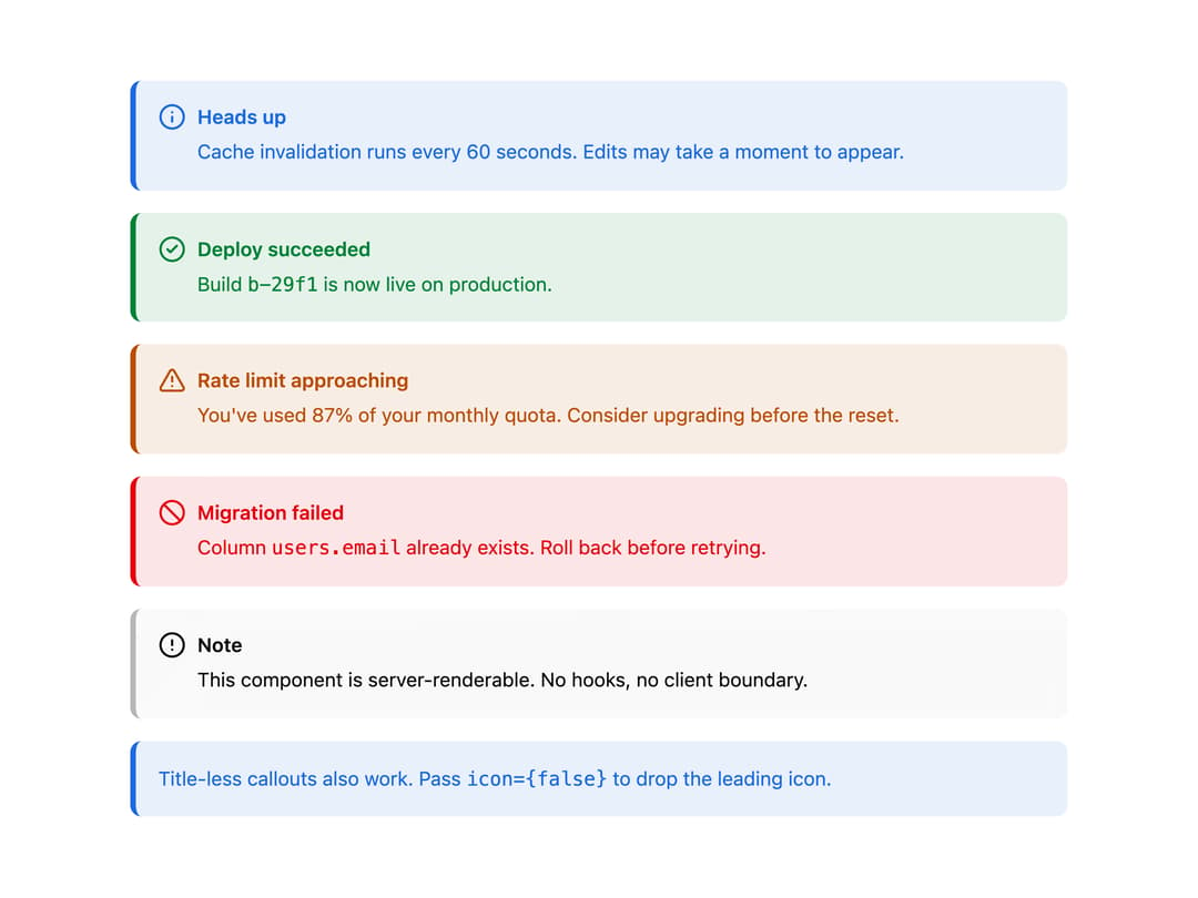
MDX-style admonition with neutral / info / success / warning / destructive variants, CalloutTitle and CalloutDescription parts, and an optional icon override. Ships --info / --success / --warning theme tokens.
Built with React and Tailwind. Copy the prompt and paste it into Claude Code, Cursor or Lovable: your agent adds Callout to your project and fits it to your theme.
Code
How Callout is used: the demo's code. The component's own source comes with a free account.
Usage.tsx
import {
  Callout,
  CalloutDescription,
  CalloutTitle,
} from "@/components/ui/callout";

export default function CalloutDemo() {
  return (
    <div className="grid w-full max-w-2xl gap-4">
      <Callout variant="info" title="Heads up">
        Cache invalidation runs every 60 seconds. Edits may take a moment to
        appear.
      </Callout>

      <Callout variant="success" title="Deploy succeeded">
        Build <code className="font-mono">b-29f1</code> is now live on
        production.
      </Callout>

      <Callout variant="warning" title="Rate limit approaching">
        You've used 87% of your monthly quota. Consider upgrading before the
        reset.
      </Callout>

      <Callout variant="destructive" title="Migration failed">
        Column <code className="font-mono">users.email</code> already exists.
        Roll back before retrying.
      </Callout>

      <Callout variant="neutral">
        <CalloutTitle>Note</CalloutTitle>
        <CalloutDescription>
          This component is server-renderable. No hooks, no client boundary.
        </CalloutDescription>
      </Callout>

      <Callout variant="info" icon={false}>
        Title-less callouts also work. Pass{" "}
        <code className="font-mono">{"icon={false}"}</code> to drop the leading
        icon.
      </Callout>
    </div>
  );
}
Dependencies
More by Mohammad Shehadeh
View all
Feature Problem Cards
84
Feature Grid Spotlight Cards
70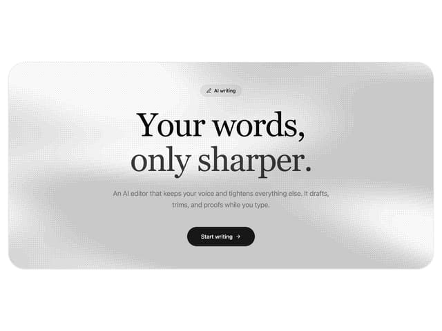
Dithered Shader CTA
63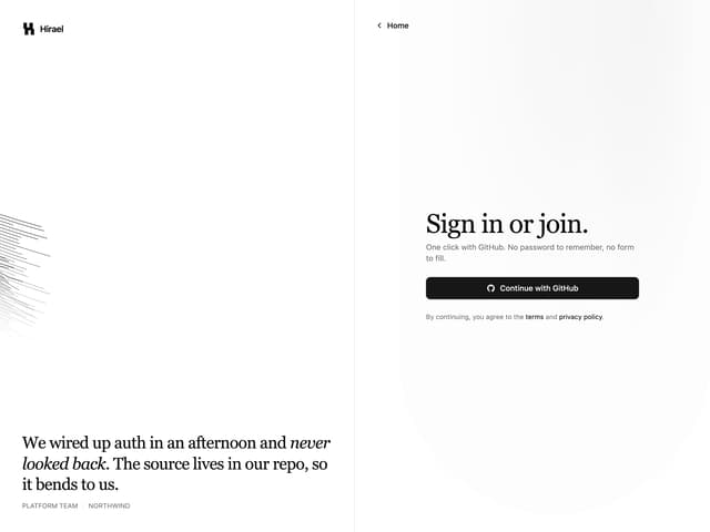
Split Login
60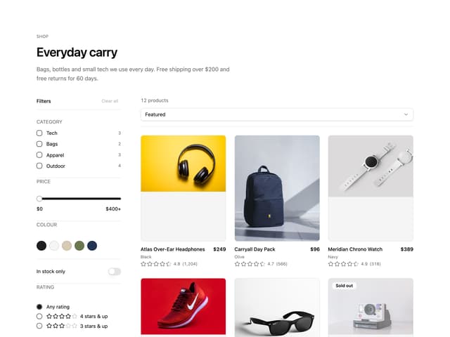
Ecommerce Category Page
59
FAQ Two Column
59
Comparison Table
58
Comparison Section
57