
About
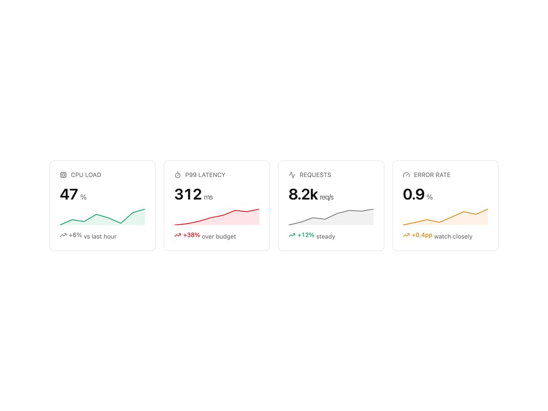
Compact metric card with a value and unit, a tone-aware sparkline and an up / down trend line. Compound API.
Built with React and Tailwind. Copy the prompt and paste it into Claude Code, Cursor or Lovable: your agent adds Metric Card to your project and fits it to your theme.
Code
How Metric Card is used: the demo's code. The component's own source comes with a free account.
Usage.tsx
'use client';

import {
  MetricCard,
  MetricCardFooter,
  MetricCardHeader,
  MetricCardSpark,
  MetricCardTrend,
  MetricCardValue,
} from '@/components/ui/metric-card';
import { Activity, Cpu, Gauge, Timer } from 'lucide-react';

export default function MetricCardDemo() {
  return (
    <div className="grid w-full max-w-4xl gap-4 sm:grid-cols-2 lg:grid-cols-4">
      <MetricCard>
        <MetricCardHeader icon={<Cpu className="size-3.5" aria-hidden />}>CPU load</MetricCardHeader>
        <MetricCardValue unit="%">47</MetricCardValue>
        <MetricCardSpark tone="success" points={[38, 41, 40, 44, 42, 39, 45, 47]} />
        <MetricCardFooter>
          <MetricCardTrend direction="up" tone="neutral">
            +6%
          </MetricCardTrend>{' '}
          vs last hour
        </MetricCardFooter>
      </MetricCard>

      <MetricCard>
        <MetricCardHeader icon={<Timer className="size-3.5" aria-hidden />}>p99 latency</MetricCardHeader>
        <MetricCardValue unit="ms">312</MetricCardValue>
        <MetricCardSpark tone="destructive" points={[180, 190, 210, 240, 260, 300, 290, 312]} />
        <MetricCardFooter>
          <MetricCardTrend direction="up" tone="destructive">
            +38%
          </MetricCardTrend>{' '}
          over budget
        </MetricCardFooter>
      </MetricCard>

      <MetricCard>
        <MetricCardHeader icon={<Activity className="size-3.5" aria-hidden />}>Requests</MetricCardHeader>
        <MetricCardValue unit={'req/s'}>8.2k</MetricCardValue>
        <MetricCardSpark tone="neutral" points={[6, 6.4, 7, 6.8, 7.6, 8, 7.9, 8.2]} />
        <MetricCardFooter>
          <MetricCardTrend direction="up" tone="success">
            +12%
          </MetricCardTrend>{' '}
          steady
        </MetricCardFooter>
      </MetricCard>

      <MetricCard>
        <MetricCardHeader icon={<Gauge className="size-3.5" aria-hidden />}>Error rate</MetricCardHeader>
        <MetricCardValue unit="%">0.9</MetricCardValue>
        <MetricCardSpark tone="warning" points={[0.3, 0.4, 0.5, 0.4, 0.6, 0.8, 0.7, 0.9]} />
        <MetricCardFooter>
          <MetricCardTrend direction="up" tone="warning">
            +0.4pp
          </MetricCardTrend>{' '}
          watch closely
        </MetricCardFooter>
      </MetricCard>
    </div>
  );
}
Dependencies
More by Mohammad Shehadeh
View all
Feature Problem Cards
84
Feature Grid Spotlight Cards
70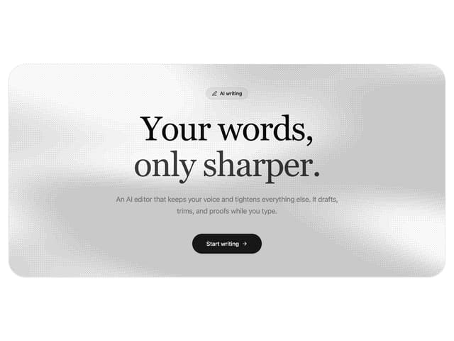
Dithered Shader CTA
63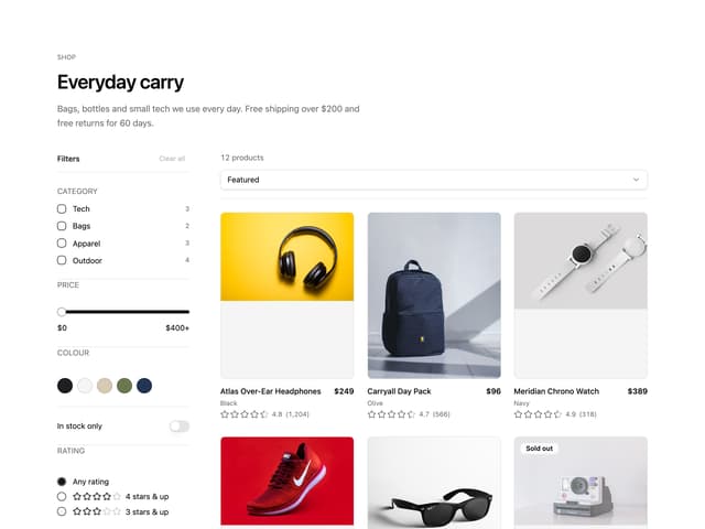
Ecommerce Category Page
61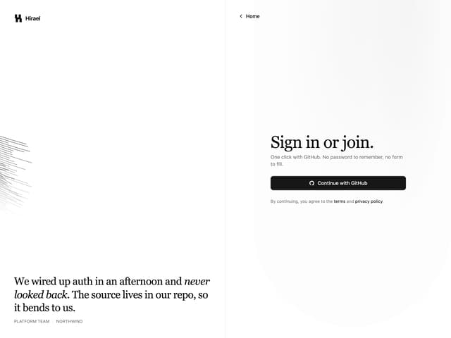
Split Login
60
Comparison Table
59
FAQ Two Column
59
Comparison Section
57