
About
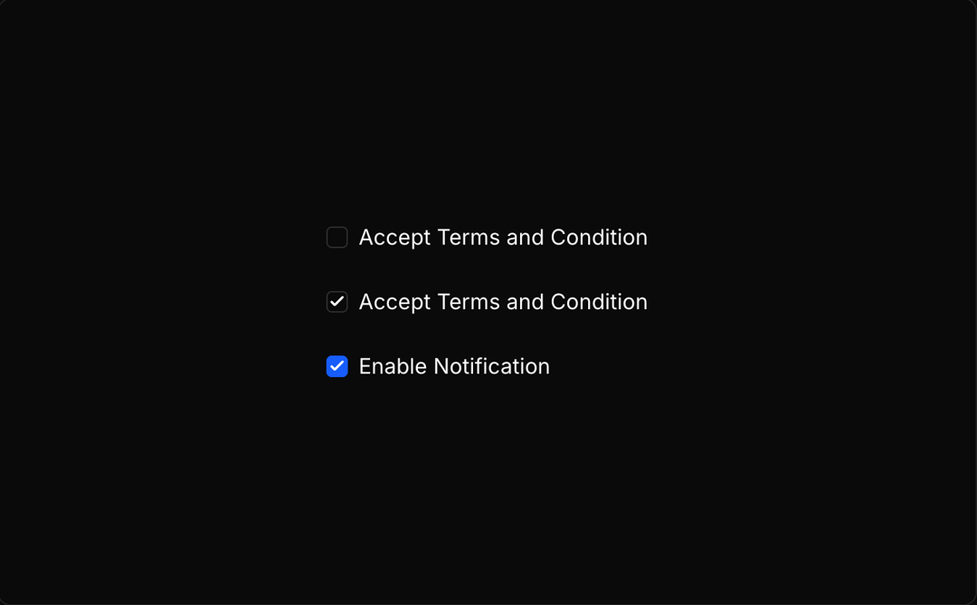
An animated checkbox component with smooth transitions and hover effects built on Radix UI primitives.
Built with React and Tailwind. Copy the prompt and paste it into Claude Code, Cursor or Lovable: your agent adds Animate Checkbox to your project and fits it to your theme.
Code
How Animate Checkbox is used: the demo's code. The component's own source comes with a free account.
Usage.tsx
import { Checkbox } from "@/components/ui/animate-checkbox";

export default function DemoOne() {
  return <div className="flex flex-col gap-6">
      <div className="flex items-center gap-2">
        <Checkbox />
        <div><a className='underline pointer-cursor' target="_blank" href="https://moleculeui.design" variant='link'>Checkout Molecule UI</a></div>
      </div>

      <div className="flex items-center gap-2">
        <Checkbox defaultChecked />
        <div><a className='underline pointer-cursor'  target="_blank" href="https://moleculeui.design" variant='link'>Checkout Molecule UI</a></div>
      </div>

      <div className="flex items-center gap-2">
        <Checkbox
          defaultChecked
          className="data-[state=checked]:border-blue-600 data-[state=checked]:bg-blue-600 data-[state=checked]:text-white "
        />
        <div>Enable Notification</div>
      </div>

    </div>;
}
Dependencies
More by Rushil Dhinoja
View all

Morphing Square
435
Voice Input
311
Warp Dialog
264
Orbital Loader
204
Bouncing Dots
193
Vignette Grid Background
190
Wave Loader
131
Discussion
85
More in Forms
View all

Premium Auth
500

Login 2
7
Authentication Card
47

Login 1
52

Contact Card
1K
Login Form
6

Form
16

Book A Demo 3
83
