
About
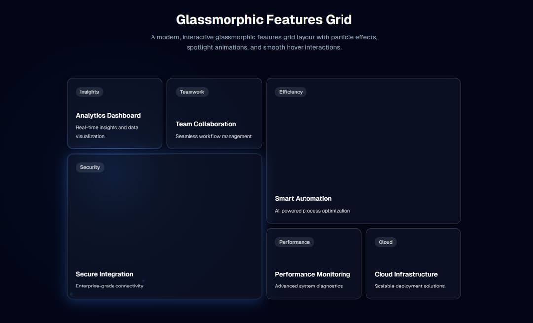
A modern, interactive glassmorphic features grid layout with particle effects, spotlight animations, and smooth hover interactions.
Built with React and Tailwind. Copy the prompt and paste it into Claude Code, Cursor or Lovable: your agent adds Glassmorphic Features Grid to your project and fits it to your theme.
Code
How Glassmorphic Features Grid is used: the demo's code. The component's own source comes with a free account.
Usage.tsx
import Component from "@/components/ui/glassmorphic-features-grid"

export default function DemoOne() {
  return (<main className="py-12">
        <div className="container mx-auto px-4">
        <div className="text-center mb-12">
          <h1 className="text-4xl font-bold text-white mb-4">Glassmorphic Features Grid</h1>
          <p className="text-slate-400 text-lg max-w-2xl mx-auto">
             A modern, interactive glassmorphic features grid layout with particle effects, spotlight animations, and smooth hover
            interactions.
          </p>
        </div>

        <Component
          enableStars={true}
          enableSpotlight={true}
          enableBorderGlow={true}
          enableTilt={false}
          enableMagnetism={true}
          clickEffect={true}
          particleCount={8}
          spotlightRadius={300}
          glowColor="59, 130, 246"
        />
      </div>
    </main>)
}
Dependencies
More by M.bin Salman
View all

Ethereal Beams Hero
1.1K
Rainbow Borders Button
462
Waitlist Landing Page with Countdown Timer
335
Shiny Button
329
Shiny Borders Button
317
Stardust Button
274
Shiny Button
266
Boxy App Icons
158
More in Features
View all

Features 8
3.1K

Feature Sections
107

Grid Feature Cards
1.9K

Feature 72
122
Features 2
322
Feature Modern
9
Features 4
368
Features Card
201

