
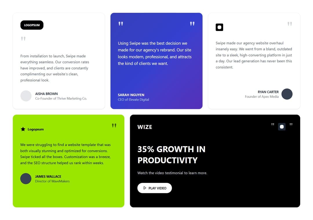
A modern, responsive testimonials section featuring a unique asymmetric grid layout with five customer testimonials. The component displays three equal-width testimonials in the top row and two testimonials in the bottom row (30/70 split). Features diverse styling including gradient overlays, background images, vibrant color schemes, and interactive elements like video testimonials. Perfect for showcasing client success stories, agency portfolios, and SaaS products. Built with React and Tailwind CSS with smooth hover effects and mobile-responsive design. Key Features: Asymmetric grid layout (3 equal top, 2 split bottom) Multiple design variants (white cards, gradient overlays, colored backgrounds) Customer profile integration with avatars and company details Video testimonial with play button Fully responsive across all screen sizes Modern UI with rounded corners, shadows, and smooth transitions Ready-to-use with placeholder content that can be easily customized
Built with React and Tailwind. Copy the prompt and paste it into Claude Code, Cursor or Lovable: your agent adds Premium Testimonials Section to your project and fits it to your theme.
Code
How Premium Testimonials Section is used: the demo's code. The component's own source comes with a free account.
Usage.tsx
import TestimonialSection from "@/components/ui/premium-testimonials-section";

export default function DemoOne() {
  return <TestimonialSection />;
}
Dependencies
More by M.bin Salman
View all

Ethereal Beams Hero
1.1K
Rainbow Borders Button
462
Waitlist Landing Page with Countdown Timer
335
Shiny Button
329
Shiny Borders Button
317
Stardust Button
274
Shiny Button
266
Boxy App Icons
158
More in Testimonials
View all

Testimonial
41
Testimonial 2
32

Staggered Testimonials Grid
143
testimonial
798
Testimonials Section
241
Testimonial Card
69
Testimonials Section
152

Testimonials
245


