
About
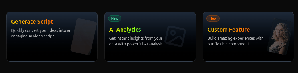
A modern, interactive feature card component with video preview capabilities, designed for showcasing product features, services, or content in an engaging way.
Built with React and Tailwind. Copy the prompt and paste it into Claude Code, Cursor or Lovable: your agent adds FeatureCardWithVideo to your project and fits it to your theme.
Code
How FeatureCardWithVideo is used: the demo's code. The component's own source comes with a free account.
Usage.tsx
import { FeatureCardWithVideo } from "@/components/ui/feature-card-with-video";

export default function DemoOne() {
 return (
        <div className="min-h-screen p-8 flex flex-wrap gap-6 items-center justify-center">
            <FeatureCardWithVideo
                title="Generate Script"
                description="Quickly convert your ideas into an engaging AI video script."
                videoSrc="https://commondatastorage.googleapis.com/gtv-videos-bucket/sample/BigBuckBunny.mp4"
                videoPoster="https://cdn.21st.dev/assets/mirror/02/0204be31ac91de05dc9a78ea3438dda481ff3deaaffa40cb28e3bc1822ba3650.jpg"
                isNew={false}
                gradientType="theme"
                onClick="https://google.com"
            />

            <FeatureCardWithVideo
                title="AI Analytics"
                description="Get instant insights from your data with powerful AI analysis."
                isNew={true}
                gradientType="custom"
                onClick="https://google.com"
            />

            <FeatureCardWithVideo
                title="Custom Feature"
                description="Build amazing experiences with our flexible component."
                videoSrc="https://commondatastorage.googleapis.com/gtv-videos-bucket/sample/ElephantsDream.mp4"
                isNew={true}
                 videoPoster="https://cdn.21st.dev/assets/mirror/b1/b1e3120d49307c1e99ec979e6d05e79f67d7ecea727b27eb716a2b7bff5fe0bb.jpg"
                gradientType="theme"
                onClick="https://google.com"
            />
        </div>
    );
}
More by Muneeb ul Hassan
View all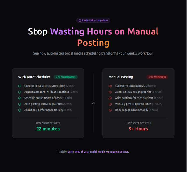
Comparison
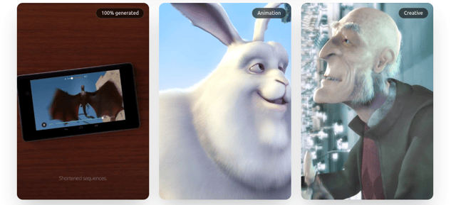
VideoShowCaseCard
More in Features
View all

Features 8
3.1K

Feature Sections
107

Grid Feature Cards
1.9K

Feature 72
122
Features 2
322
Features 4
368
Feature Modern
9
Features Card
201

