
About
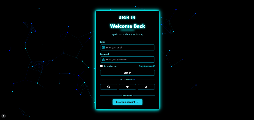
This component implements a sleek and modern sign-in interface with a neon aesthetic. It features a full-screen dark background with a custom animated canvas layer to create a visually dynamic experience. The main content is wrapped inside a centered card with elevated styling, ensuring the form remains the focal point while maintaining a clean and immersive user experience. The layout uses precise positioning and layering for optimal responsiveness and design clarity.
Built with React and Tailwind. Copy the prompt and paste it into Claude Code, Cursor or Lovable: your agent adds Neon Sign In to your project and fits it to your theme.
Code
How Neon Sign In is used: the demo's code. The component's own source comes with a free account.
Usage.tsx
import NeonSignIn from "@/components/ui/neon-sign-in";

const DemoOne = () => {
  return (
    <div className="flex w-full h-screen justify-center items-center">
      <NeonSignIn />
    </div>
  );
};

export { DemoOne };
Dependencies
More by Naman Bansal
View all
3d Globe Animated
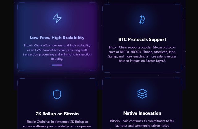
Animated Feature Cards
More in Sign-in
View all

Modern & Stunning sign in
1.6K
SignInPage
631

Sign In Form
201
Clean & Minimal sign in
617
Sign In
97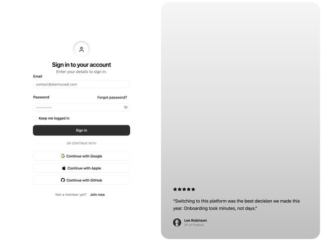

Split Sign In Form
16
Authentication Card
47
Modern Animated Sign In
1.1K


