

About
Animated feature cards are interactive UI components that highlight key features or services of a product using motion effects. They typically include an icon or image, a title, and a brief description, and animate (e.g., slide, fade, zoom, flip) when hovered over or scrolled into view. These cards enhance user engagement and improve visual appeal by making the content more dynamic and noticeable.
Built with React and Tailwind. Copy the prompt and paste it into Claude Code, Cursor or Lovable: your agent adds Animated Feature Cards to your project and fits it to your theme.
Code
How Animated Feature Cards is used: the demo's code. The component's own source comes with a free account.
Usage.tsx
import FeatureCards from "@/components/ui/animated-feature-cards";

const DemoOne = () => {
  return (
    <div className="flex w-full h-screen justify-center items-center">
      <FeatureCards />
    </div>
  );
};

export { DemoOne };
Dependencies
More by Naman Bansal
View all
3d Globe Animated
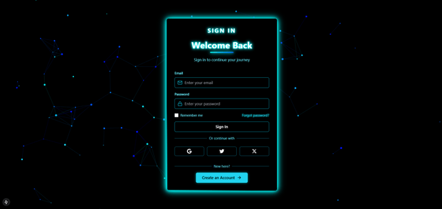
Neon Sign In
More in Features
View all

Features 8
3.1K

Feature Sections
107

Grid Feature Cards
1.9K

Feature 72
122
Features 2
322
Feature Modern
9
Features 4
368
Features Card
201

