About
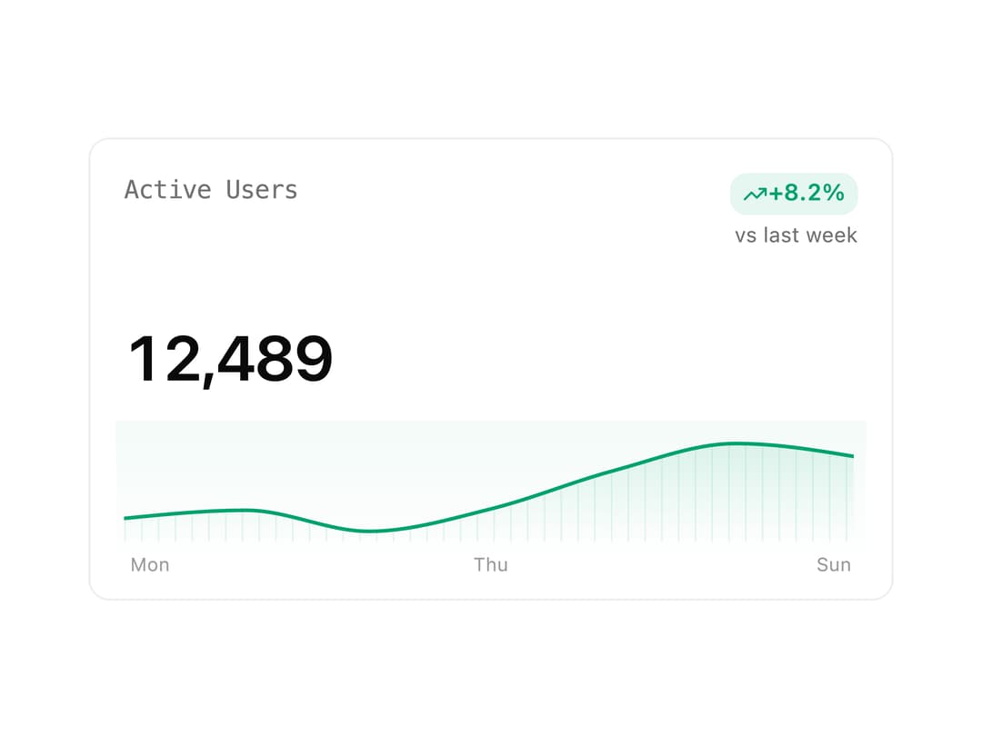
An analytics card that shows a formatted metric value, a signed percentage-change badge, and an interactive sparkline trend chart, with built-in loading and error states.
Built with React and Tailwind. Copy the prompt and paste it into Claude Code, Cursor or Lovable: your agent adds Metric Card to your project and fits it to your theme.
Code
How Metric Card is used: the demo's code. The component's own source comes with a free account.
Usage.tsx
import { MetricCard } from "@/components/ui/metric-card";

const trend = [
  { label: "Mon", value: 120 },
  { label: "Tue", value: 132 },
  { label: "Wed", value: 101 },
  { label: "Thu", value: 134 },
  { label: "Fri", value: 190 },
  { label: "Sat", value: 230 },
  { label: "Sun", value: 210 },
];

export default function Demo() {
  return (
    <div className="w-full max-w-sm">
      <MetricCard
        label="Active Users"
        value={12489}
        delta={8.2}
        comparisonLabel="vs last week"
        trend={trend}
        format="number"
      />
    </div>
  );
}
Dependencies
More by neondatabase
View all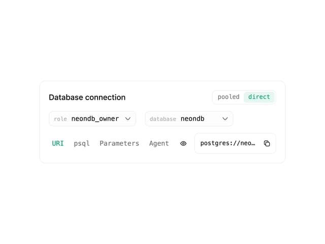

DB Connection Card
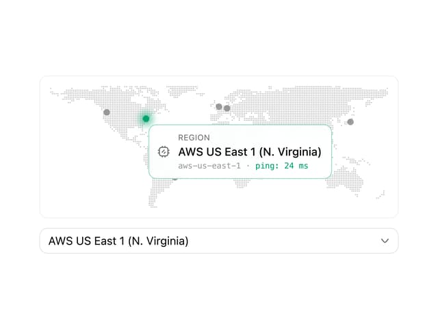
Region Select
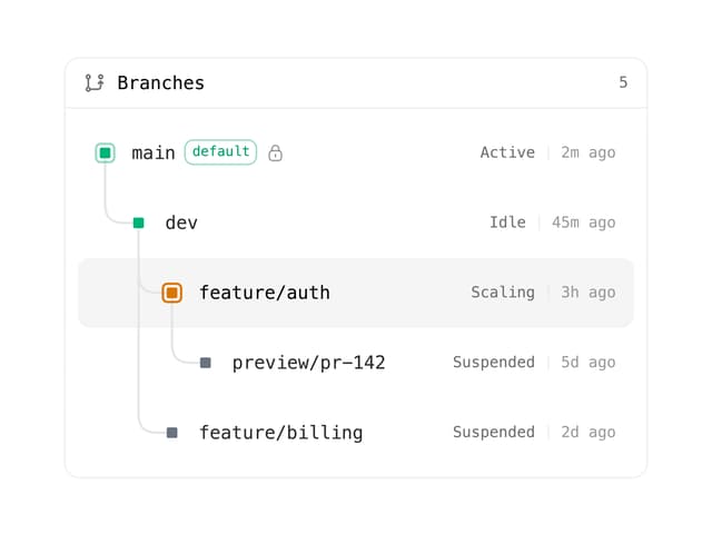
Branch Tree
Input
More in Dashboards
View all
Dashboard with Collapsible Sidebar
2.4K

Sidebar
235

SaaS Template
2.4K
Stats Bento
1.1K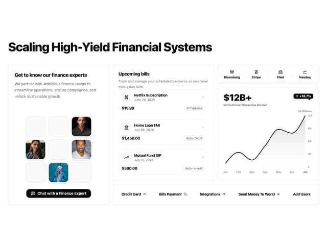

Financial Bento Grid
71
Stats cards with links
33

Course Design Cards
1.1K

Chat template
598


