
About
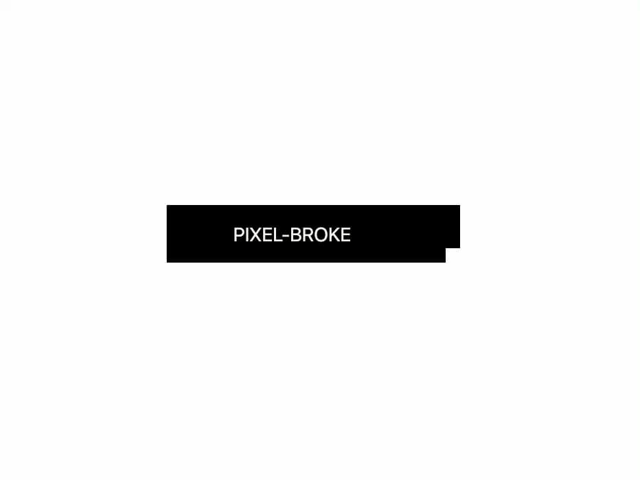
A glitchy pixel-styled button that mimics a broken or distorted look. Ideal for creative projects, retro game UIs, or playful error states, it adds a unique visual effect that stands out from traditional button designs.
Built with React and Tailwind. Copy the prompt and paste it into Claude Code, Cursor or Lovable: your agent adds Pixel Broke Button to your project and fits it to your theme.
Code
How Pixel Broke Button is used: the demo's code. The component's own source comes with a free account.
Usage.tsx
import { Button03 } from "@/components/ui/pixel-broke-button";

export default function DemoOne() {
  return <Button03 />;
}
More by nextjs shop
View all
Nextjsshop Button
116
Arrow Dots Button
89
Animated Arrow Button
68
Sneaky Button
64
Icon Accordion
58
Pixel Button
24
Tags Breadcrumb
9
More in Buttons
View all

Button
14
Button
34
Texture Button
92
Button Save
46

Button
64

Button Group
3

App Store Button
454

Notification Button
103

