
About
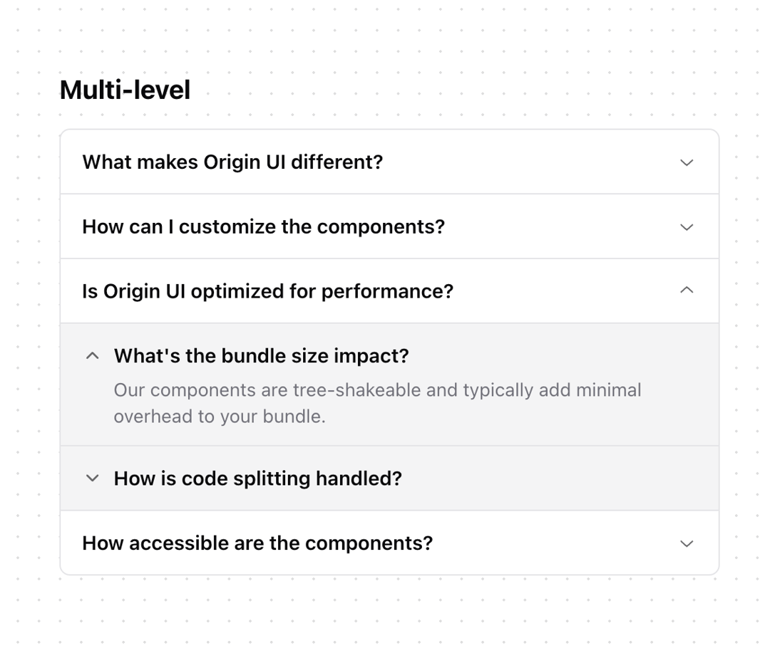
Enchanced shadcn/ui accordion
Built with React and Tailwind. Copy the prompt and paste it into Claude Code, Cursor or Lovable: your agent adds Accordion to your project and fits it to your theme.
Code
How Accordion is used: the demo's code. The component's own source comes with a free account.
Usage.tsx
import {
  Accordion,
  AccordionContent,
  AccordionItem,
  AccordionTrigger,
} from "@/components/ui/accordion";
import {
  Collapsible,
  CollapsibleContent,
  CollapsibleTrigger,
} from "@/components/ui/collapsible";
import { ChevronDown } from "lucide-react";

const items = [
  {
    id: "1",
    title: "What makes Origin UI different?",
    collapsibles: [
      {
        title: "What about performance?",
        content: "We optimize every component for maximum performance and minimal bundle size.",
      },
      {
        title: "How is the documentation?",
        content:
          "Our documentation is comprehensive and includes live examples for every component.",
      },
    ],
  },
  {
    id: "2",
    title: "How can I customize the components?",
    collapsibles: [
      {
        title: "Can I use custom themes?",
        content:
          "Yes, our theming system is fully customizable and supports both light and dark modes.",
      },
      {
        title: "What about Tailwind support?",
        content: "We have first-class support for Tailwind CSS with custom utility classes.",
      },
    ],
  },
  {
    id: "3",
    title: "Is Origin UI optimized for performance?",
    collapsibles: [
      {
        title: "What's the bundle size impact?",
        content:
          "Our components are tree-shakeable and typically add minimal overhead to your bundle.",
        open: true,
      },
      {
        title: "How is code splitting handled?",
        content: "We support automatic code splitting for optimal loading performance.",
      },
    ],
  },
  {
    id: "4",
    title: "How accessible are the components?",
    collapsibles: [
      {
        title: "Which screen readers are supported?",
        content: "We test with NVDA, VoiceOver, and JAWS to ensure broad compatibility.",
      },
      {
        title: "What about keyboard navigation?",
        content:
          "Full keyboard navigation support is implemented following WAI-ARIA best practices.",
      },
    ],
  },
];

function Component() {
  return (
    <div className="space-y-4 max-w-[500px]">
      <h2 className="text-xl font-bold">Multi-level</h2>
      <Accordion type="single" collapsible className="w-full -space-y-px" defaultValue="3">
        {items.map((item) => (
          <AccordionItem
            value={item.id}
            key={item.id}
            className="overflow-hidden border bg-background first:rounded-t-lg last:rounded-b-lg"
          >
            <AccordionTrigger className="px-4 py-3 text-[15px] leading-6 hover:no-underline">
              {item.title}
            </AccordionTrigger>
            <AccordionContent className="p-0">
              {item.collapsibles.map((collapsible, index) => (
                <CollapsibleDemo
                  key={index}
                  title={collapsible.title}
                  content={collapsible.content}
                  open={collapsible.open}
                />
              ))}
            </AccordionContent>
          </AccordionItem>
        ))}
      </Accordion>
    </div>
  );
}

function CollapsibleDemo({
  title,
  content,
  open,
}: {
  title: string;
  content: string;
  open?: boolean;
}) {
  return (
    <Collapsible
      className="space-y-1 border-t border-border bg-accent px-4 py-3"
      defaultOpen={open}
    >
      <CollapsibleTrigger className="flex gap-2 text-[15px] font-semibold leading-6 [&[data-state=open]>svg]:rotate-180">
        <ChevronDown
          size={16}
          strokeWidth={2}
          className="mt-1 shrink-0 opacity-60 transition-transform duration-200"
          aria-hidden="true"
        />
        {title}
      </CollapsibleTrigger>
      <CollapsibleContent className="overflow-hidden ps-6 text-sm text-muted-foreground transition-all data-[state=closed]:animate-collapsible-up data-[state=open]:animate-collapsible-down">
        {content}
      </CollapsibleContent>
    </Collapsible>
  );
}

export { Component };
Dependencies
More by Origin UI
View all
Dialog
1.2K
Avatar
952
useImageUpload
926
usePagination
622
Popover
384
Button
364
Command
321
Calendar [React Day Picker]
256