
About
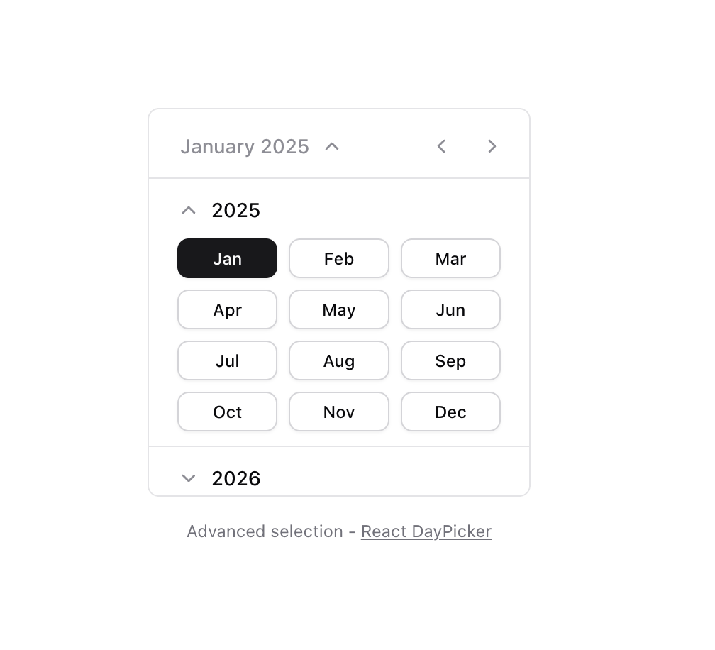
Calendar [React Day Picker]
Built with React and Tailwind. Copy the prompt and paste it into Claude Code, Cursor or Lovable: your agent adds Calendar [React Day Picker] to your project and fits it to your theme.
Code
How Calendar [React Day Picker] is used: the demo's code. The component's own source comes with a free account.
Usage.tsx
"use client";

import { Button } from "@/components/ui/button";
import { Calendar } from "@/components/ui/calendar";
import {
  Collapsible,
  CollapsibleContent,
  CollapsibleTrigger,
} from "@/components/ui/collapsible";
import { ScrollArea } from "@/components/ui/scroll-area";
import {
  eachMonthOfInterval,
  eachYearOfInterval,
  endOfYear,
  format,
  isAfter,
  isBefore,
  startOfYear,
} from "date-fns";
import { ChevronDown } from "lucide-react";
import { useEffect, useRef, useState } from "react";
import { CaptionLabelProps, MonthGridProps } from "react-day-picker";

function Component() {
  const today = new Date();
  const [month, setMonth] = useState(today);
  const [date, setDate] = useState<Date | undefined>(today);
  const [isYearView, setIsYearView] = useState(false);
  const startDate = new Date(1980, 6);
  const endDate = new Date(2030, 6);

  const years = eachYearOfInterval({
    start: startOfYear(startDate),
    end: endOfYear(endDate),
  });

  return (
    <div>
      <Calendar
        mode="single"
        selected={date}
        onSelect={setDate}
        month={month}
        onMonthChange={setMonth}
        defaultMonth={new Date()}
        startMonth={startDate}
        endMonth={endDate}
        className="overflow-hidden rounded-lg border border-border p-2 bg-background"
        classNames={{
          month_caption: "ms-2.5 me-20 justify-start",
          nav: "justify-end",
        }}
        components={{
          CaptionLabel: (props: CaptionLabelProps) => (
            <CaptionLabel isYearView={isYearView} setIsYearView={setIsYearView} {...props} />
          ),
          MonthGrid: (props: MonthGridProps) => {
            return (
              <MonthGrid
                className={props.className}
                isYearView={isYearView}
                setIsYearView={setIsYearView}
                startDate={startDate}
                endDate={endDate}
                years={years}
                currentYear={month.getFullYear()}
                currentMonth={month.getMonth()}
                onMonthSelect={(selectedMonth: Date) => {
                  setMonth(selectedMonth);
                  setIsYearView(false);
                }}
              >
                {props.children}
              </MonthGrid>
            );
          },
        }}
      />
      <p
        className="mt-4 text-center text-xs text-muted-foreground"
        role="region"
        aria-live="polite"
      >
        Advanced selection -{" "}
        <a
          className="underline hover:text-foreground"
          href="https://daypicker.dev/"
          target="_blank"
          rel="noopener nofollow"
        >
          React DayPicker
        </a>
      </p>
    </div>
  );
}

function MonthGrid({
  className,
  children,
  isYearView,
  startDate,
  endDate,
  years,
  currentYear,
  currentMonth,
  onMonthSelect,
}: {
  className?: string;
  children: React.ReactNode;
  isYearView: boolean;
  setIsYearView: React.Dispatch<React.SetStateAction<boolean>>;
  startDate: Date;
  endDate: Date;
  years: Date[];
  currentYear: number;
  currentMonth: number;
  onMonthSelect: (date: Date) => void;
}) {
  const currentYearRef = useRef<HTMLDivElement>(null);
  const currentMonthButtonRef = useRef<HTMLButtonElement>(null);
  const scrollAreaRef = useRef<HTMLDivElement>(null);

  useEffect(() => {
    if (isYearView && currentYearRef.current && scrollAreaRef.current) {
      const viewport = scrollAreaRef.current.querySelector(
        "[data-radix-scroll-area-viewport]",
      ) as HTMLElement;
      if (viewport) {
        const yearTop = currentYearRef.current.offsetTop;
        viewport.scrollTop = yearTop;
      }
      setTimeout(() => {
        currentMonthButtonRef.current?.focus();
      }, 100);
    }
  }, [isYearView]);

  return (
    <div className="relative">
      <table className={className}>{children}</table>
      {isYearView && (
        <div className="absolute inset-0 z-20 -mx-2 -mb-2 bg-background">
          <ScrollArea ref={scrollAreaRef} className="h-full">
            {years.map((year) => {
              const months = eachMonthOfInterval({
                start: startOfYear(year),
                end: endOfYear(year),
              });
              const isCurrentYear = year.getFullYear() === currentYear;

              return (
                <div key={year.getFullYear()} ref={isCurrentYear ? currentYearRef : undefined}>
                  <CollapsibleYear title={year.getFullYear().toString()} open={isCurrentYear}>
                    <div className="grid grid-cols-3 gap-2">
                      {months.map((month) => {
                        const isDisabled = isBefore(month, startDate) || isAfter(month, endDate);
                        const isCurrentMonth =
                          month.getMonth() === currentMonth && year.getFullYear() === currentYear;

                        return (
                          <Button
                            key={month.getTime()}
                            ref={isCurrentMonth ? currentMonthButtonRef : undefined}
                            variant={isCurrentMonth ? "default" : "outline"}
                            size="sm"
                            className="h-7"
                            disabled={isDisabled}
                            onClick={() => onMonthSelect(month)}
                          >
                            {format(month, "MMM")}
                          </Button>
                        );
                      })}
                    </div>
                  </CollapsibleYear>
                </div>
              );
            })}
          </ScrollArea>
        </div>
      )}
    </div>
  );
}

function CaptionLabel({
  children,
  isYearView,
  setIsYearView,
}: {
  isYearView: boolean;
  setIsYearView: React.Dispatch<React.SetStateAction<boolean>>;
} & React.HTMLAttributes<HTMLSpanElement>) {
  return (
    <Button
      className="-ms-2 flex items-center gap-2 text-sm font-medium hover:bg-transparent data-[state=open]:text-muted-foreground/80 [&[data-state=open]>svg]:rotate-180"
      variant="ghost"
      size="sm"
      onClick={() => setIsYearView((prev) => !prev)}
      data-state={isYearView ? "open" : "closed"}
    >
      {children}
      <ChevronDown
        size={16}
        strokeWidth={2}
        className="shrink-0 text-muted-foreground/80 transition-transform duration-200"
        aria-hidden="true"
      />
    </Button>
  );
}

function CollapsibleYear({
  title,
  children,
  open,
}: {
  title: string;
  children: React.ReactNode;
  open?: boolean;
}) {
  return (
    <Collapsible className="border-t border-border px-2 py-1.5" defaultOpen={open}>
      <CollapsibleTrigger asChild>
        <Button
          className="flex w-full justify-start gap-2 text-sm font-medium hover:bg-transparent [&[data-state=open]>svg]:rotate-180"
          variant="ghost"
          size="sm"
        >
          <ChevronDown
            size={16}
            strokeWidth={2}
            className="shrink-0 text-muted-foreground/80 transition-transform duration-200"
            aria-hidden="true"
          />
          {title}
        </Button>
      </CollapsibleTrigger>
      <CollapsibleContent className="overflow-hidden px-3 py-1 text-sm transition-all data-[state=closed]:animate-collapsible-up data-[state=open]:animate-collapsible-down">
        {children}
      </CollapsibleContent>
    </Collapsible>
  );
}

export { Component };
Dependencies
More by Origin UI
View all
Dialog
1.2K
Avatar
952
useImageUpload
926
usePagination
622
Popover
384
Button
364
Command
321
Accordion
258