
About
Enhanced shadcn/ui dialog
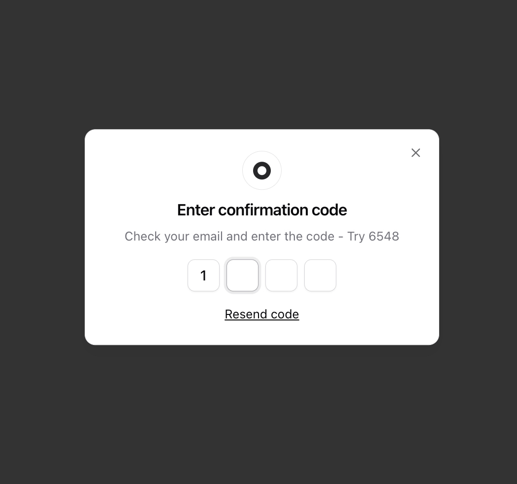
Built with React and Tailwind. Copy the prompt and paste it into Claude Code, Cursor or Lovable: your agent adds Dialog to your project and fits it to your theme.
Code
How Dialog is used: the demo's code. The component's own source comes with a free account.
Usage.tsx
"use client";

import { cn } from "@/lib/utils";
import { Button } from "@/components/ui/button";
import {
  Dialog,
  DialogClose,
  DialogContent,
  DialogDescription,
  DialogHeader,
  DialogTitle,
  DialogTrigger,
} from "@/components/ui/dialog";
import { OTPInput, SlotProps } from "input-otp";
import { useEffect, useRef, useState } from "react";

const CORRECT_CODE = "6548";

function Component() {
  const [value, setValue] = useState("");
  const [hasGuessed, setHasGuessed] = useState<undefined | boolean>(undefined);
  const inputRef = useRef<HTMLInputElement>(null);
  const closeButtonRef = useRef<HTMLButtonElement>(null);

  useEffect(() => {
    if (hasGuessed) {
      closeButtonRef.current?.focus();
    }
  }, [hasGuessed]);

  async function onSubmit(e?: React.FormEvent<HTMLFormElement>) {
    e?.preventDefault?.();

    inputRef.current?.select();
    await new Promise((r) => setTimeout(r, 1_00));

    setHasGuessed(value === CORRECT_CODE);

    setValue("");
    setTimeout(() => {
      inputRef.current?.blur();
    }, 20);
  }

  return (
    <Dialog>
      <DialogTrigger asChild>
        <Button variant="outline">OTP code</Button>
      </DialogTrigger>
      <DialogContent>
        <div className="flex flex-col items-center gap-2">
          <div
            className="flex size-11 shrink-0 items-center justify-center rounded-full border border-border"
            aria-hidden="true"
          >
            <svg
              className="stroke-zinc-800 dark:stroke-zinc-100"
              xmlns="http://www.w3.org/2000/svg"
              width="20"
              height="20"
              viewBox="0 0 32 32"
              aria-hidden="true"
            >
              <circle cx="16" cy="16" r="12" fill="none" strokeWidth="8" />
            </svg>
          </div>
          <DialogHeader>
            <DialogTitle className="sm:text-center">
              {hasGuessed ? "Code verified!" : "Enter confirmation code"}
            </DialogTitle>
            <DialogDescription className="sm:text-center">
              {hasGuessed
                ? "Your code has been successfully verified."
                : `Check your email and enter the code - Try ${CORRECT_CODE}`}
            </DialogDescription>
          </DialogHeader>
        </div>

        {hasGuessed ? (
          <div className="text-center">
            <DialogClose asChild>
              <Button type="button" ref={closeButtonRef}>
                Close
              </Button>
            </DialogClose>
          </div>
        ) : (
          <div className="space-y-4">
            <div className="flex justify-center">
              <OTPInput
                id="cofirmation-code"
                ref={inputRef}
                value={value}
                onChange={setValue}
                containerClassName="flex items-center gap-3 has-[:disabled]:opacity-50"
                maxLength={4}
                onFocus={() => setHasGuessed(undefined)}
                render={({ slots }) => (
                  <div className="flex gap-2">
                    {slots.map((slot, idx) => (
                      <Slot key={idx} {...slot} />
                    ))}
                  </div>
                )}
                onComplete={onSubmit}
              />
            </div>
            {hasGuessed === false && (
              <p
                className="text-center text-xs text-muted-foreground"
                role="alert"
                aria-live="polite"
              >
                Invalid code. Please try again.
              </p>
            )}
            <p className="text-center text-sm">
              <a className="underline hover:no-underline" href="#">
                Resend code
              </a>
            </p>
          </div>
        )}
      </DialogContent>
    </Dialog>
  );
}

function Slot(props: SlotProps) {
  return (
    <div
      className={cn(
        "flex size-9 items-center justify-center rounded-lg border border-input bg-background font-medium text-foreground shadow-sm shadow-black/5 transition-shadow",
        { "z-10 border border-ring ring-[3px] ring-ring/20": props.isActive },
      )}
    >
      {props.char !== null && <div>{props.char}</div>}
    </div>
  );
}

export { Component };
Dependencies
More by Origin UI
View all
Avatar
951
useImageUpload
926
usePagination
622
Popover
384
Button
364
Command
321
Accordion
258
Calendar [React Day Picker]
256